Cursed To Golf
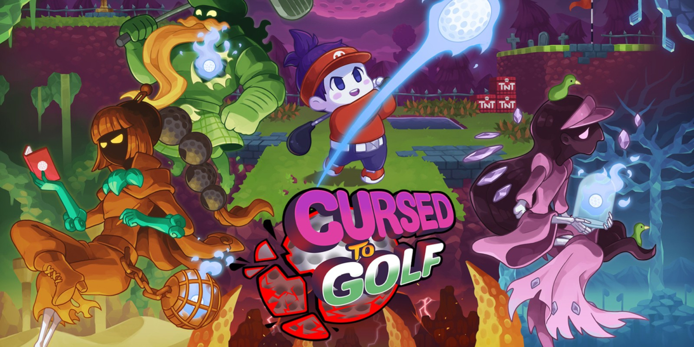

When it comes to the real-life sport – I hate golf. In fact, playing golf is my idea of hell. But offer me a golf videogame like Putt & Putter, Kirby’s Dream Course or Mario Golf and all that changes – I’m all-in. Where real golf is stiff and uninviting, videogame golf tends to be wacky and full of zany physics and rules changes that make it infinitely more appealing. And merging the idea of golfing-hell and crazy rules, the folks at Kyoto-based developer Chuhai Labs recently released Cursed to Golf, an intriguing blend of roguelike and golf sim, where you have to escape the afterlife using a nought but a putter.
At A Glance
| Scores | |
| Visuals | 7 /10 |
| Sound | 7 /10 |
| Gameplay | 8 /10 |
| Overall | 8 /10 |
| Positives | + Ingenious mix of roguelike & sports gameplay + Catchy soundtrack and SNES-inspired visuals + Fun characters and inspired boss levels |
| Negatives | – Difficulty could be frustrating – Hazards can be trial and error – No multiplayer |
| Price (When Reviewed) | £16.99 |
| Our Playtime | 8 hours |
| Available On | PS5, PS4, Xbox Series X|S, Xbox One, Nintendo Switch, PC |
The premise behind Cursed to Golf is terribly fun. On the cusp of securing a major tournament win, our protagonist is struck by lightning and tumbles down into Golf Purgatory, where he is forced to play unsuccessful rounds of golf for all eternity. (See, I told you that golf was hell…) Upon reaching the afterlife he’s welcomed by the other spiritual inhabitants of purgatory, who tell him that the only way back to the overworld is to to drive, chip and putt his way through 18 holes which no-one has ever managed before. That’s all thanks to the dastardly Greenskeeper, who builds all of the hellish holes and moves them around between rounds to keep the players guessing.
Eager to welcome you to the Golf Purgatory is the Scotsman, a be-kilted apparition who runs the aptly named Eterni-Tee golf store, placed before the tee-off at Hole 1. Playing golf in purgatory is a little different than up above, and the Scotsman kindly shows ‘wee one’ (as he affectionately names you) the ropes, taking you through your clubs, the courses, rules and everything else. It’s a thorough tutorial but one that’s made fun through its delivery, and teaches you everything you need to know about the game.
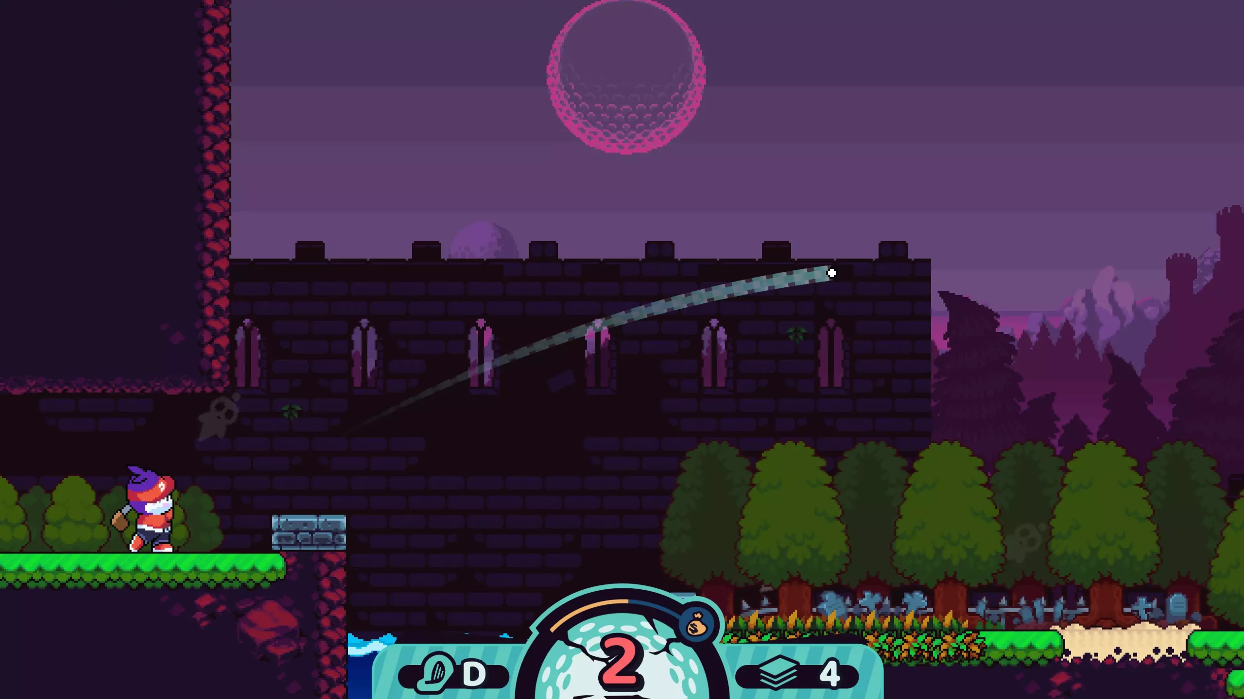
The first, and most eyebrow-raising thing you’ll notice about the game is the perspective – where most golf games use an isometric or 3D view to show you the layout of the course, Cursed to Golf throws sand in the face of tradition and uses a two-dimensional side view instead. This perspective gives the game a more platform-centric look, and surviving the courses is as much about deftly navigating up and down ledges as it is whacking your ball the length of the fairway. The courses are littered with a myriad of hazards too, from the traditional water traps, rough ground and bunkers to spike walls, trampolines and even cursed grave sites that make reaching the end incredibly tricky.
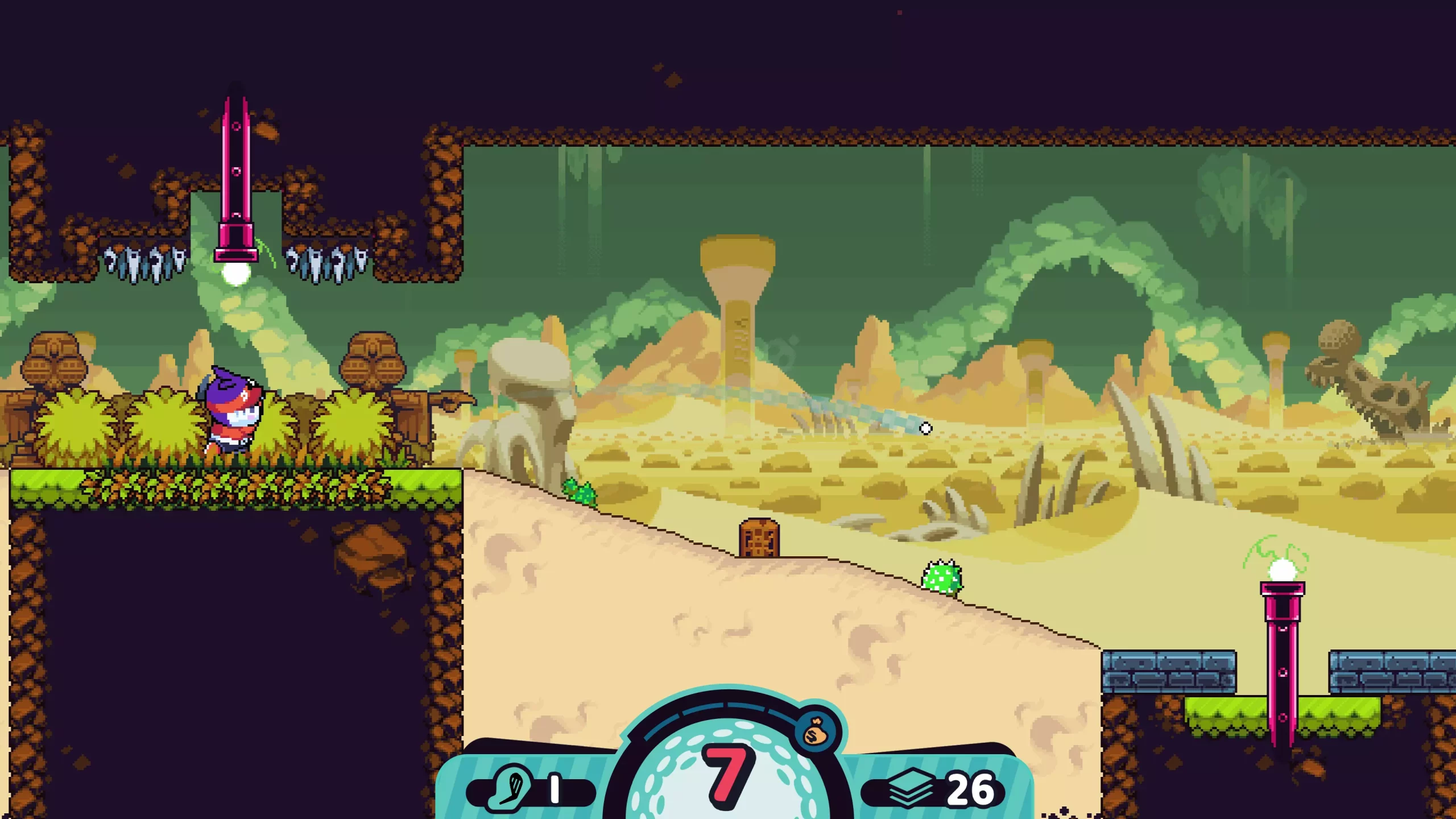
Selecting your shot power is done in pretty traditional fashion for a golf game; a bar moves up and down and you have to push a button to stop the metre at the right point – once you’ve done this you then have to do the same for direction, as the angle sweeps rhythmically up and down. What makes it more tricky is that the view ahead is pretty limited, and while you can scope out the course and the upcoming hazards before taking your shot, for longer attempts you’re asked to work a little from memory. It’s difficult, for sure, but I have to say that I liked it – there’s an element of judgement that comes into play that’s similar to real golf, only without the argyle-tedium of it all.
Unlike standard golf though, where you have an infinite number of attempts to reach the hole, Cursed to Golf grants you a limited number of shots – fail to get there in time and you’ll be dragged through a portal to begin your journey from Eterni-Tee again, in true roguelike fashion.
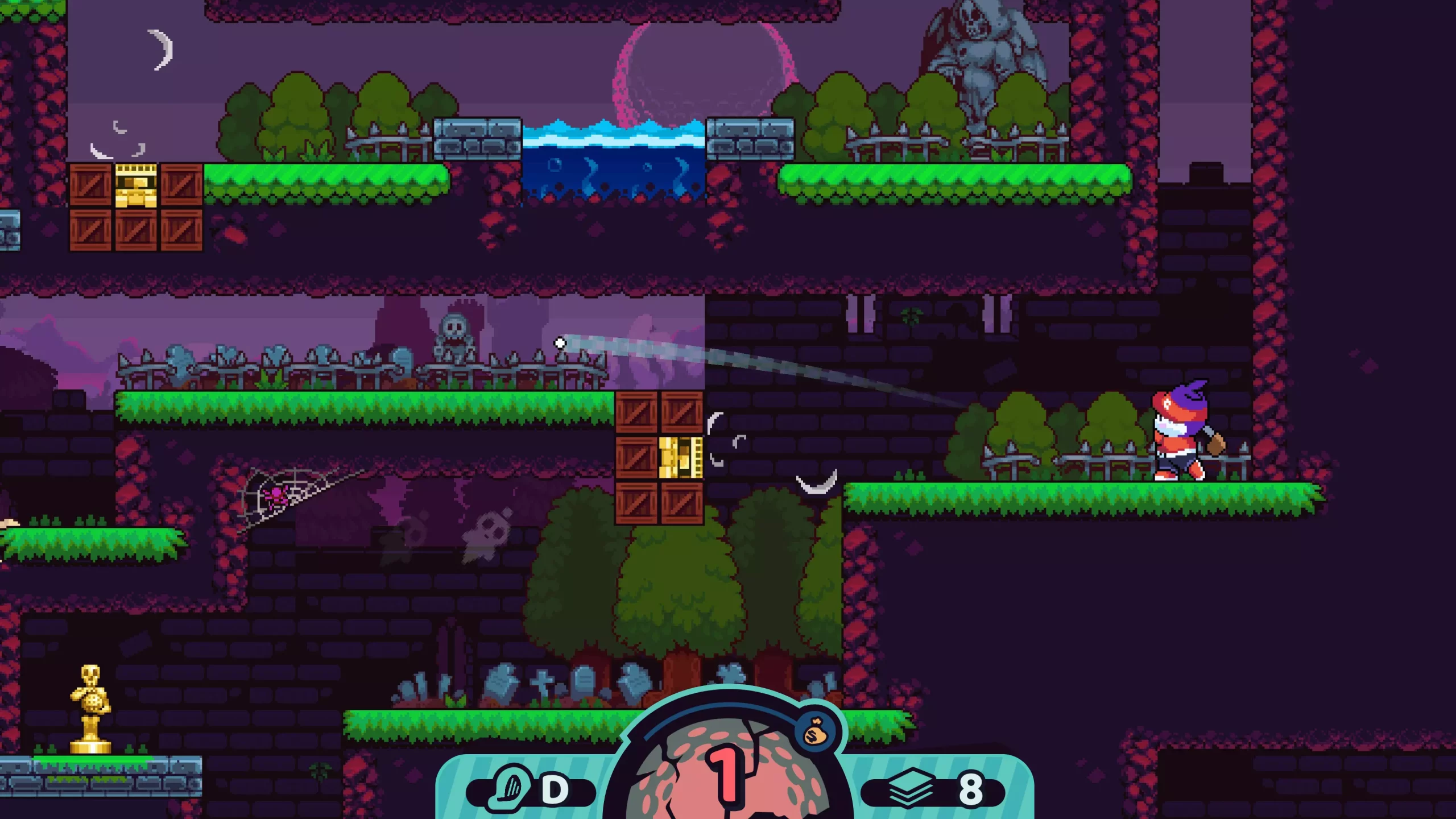
Since it would be impossible to get to the end of some of the huge courses in just a few shots, you can thankfully add more shots to your allowance by smashing your ball through statues that litter the course. You also have Ace Cards to help you make it to the hole; one-use items that have a huge variety of effects, whether it’s allowing you a practice shot that doesn’t count against your total, letting you change the direction of the ball mid-flight, or detonating pesky TNT boxes to open up a shortcut. You can even save unwanted Ace Cards in a binder to use on a later run – it’s a really handy feature that encourages you to spend your gold and rewards your persistence after a failed round.
The obstacles in the game can be problematic in more ways than one though, as annoyingly, there’s nowhere that explains them to you or lets you test out their effects until you’re in the heat of battle. This can feel a little unfair, especially when you finally make it to a new area and have to navigate around a difficult course in the dark, unsure of the mechanics of the hazards ahead. Good examples of this are the pipes and teleporters strewn throughout the first area; you can see the entrances and exits well enough, but the game doesn’t tell you which ones link together, making it a total risk to whack your ball into them, as it could be spit out in a number of different places – not all of which are beneficial. In a game that’s already pretty punishing, making your player gamble on their effects, or use their valuable cards to test them out, feels unnecessarily mean, especially when getting it wrong can result in having to replay a bunch of levels, some of which can be 20+ shots long and pretty time-consuming.
Finish a hole with shots to spare and you’ll be rewarded with gold to spend on Ace Cards at Eterni-Tee, and you can hop in your buggy and move on to the next hole. You’re even given a choice of route to take; the easier ones reward you with some basic rewards in between holes, but the best loot is stashed on the harder routes, where where you might have to complete a couple of holes in a row before replenishing your Ace Cards, and even take on Cursed Holes from time to time. The Cursed Holes are fun but challenging, as they introduce a specific rule to the course every few shots, like extra bouncy balls, or that you can only hit your next shot to the left! They add another wrinkle of variety that adds to the fun, though I personally opted to stay away from them, as I found the standard holes difficult enough!
The race-to-the-hole-style boss levels are another wonderful example of the amalgamation between golf game and roguelike, and the longer I played, the more I couldn’t believe that no-one had done it before. Each boss has a different ability that gives them an edge over ‘wee one’ too, so you’ll have to choose your shots wisely and make sure not to screw up. To help even the odds, there are additional statues for you to aim for, and smashing these will freeze your opponent for a turn and allow you to try and pull ahead. The bosses are really tough, but if you succeed in besting them you’ll be granted with a restart beacon that keeps you from having to restart all the way back at the beginning if you lose, offering a meaningful reward for your efforts.
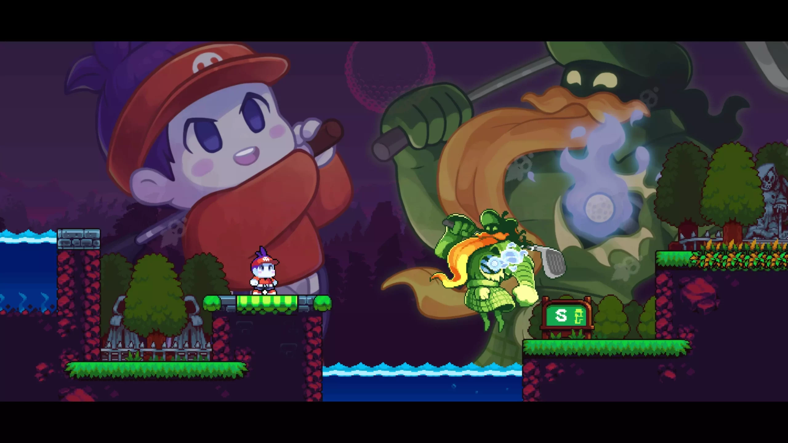
All of the action plays out amidst colourful pixel art backgrounds that are jam-packed with characterful sprites and fun environmental details. There’s a real SNES quality to the visuals and I mean that in the best possible sense; they’re wonderfully crafted and have bags of flair, but aren’t so uber-polished that they lose their style. The soundtrack too is incredibly catchy, and I find myself absently humming the Scotsman’s theme for a full day after each playthrough.
Cursed to Golf is incredibly fun, with easy controls and sturdy mechanics that feel incredibly reliable. I am… not very good at Cursed to Golf, to say the least, but that’s just testament to how enjoyable the gameplay is – even when I was sucking pretty hard, I was still having a good time and kept coming back for more, though the length of some courses did mean I wanted a break every few levels. Less patient players might struggle to get the most out of the game though, because Cursed to Golf is genuinely difficult. Like many roguelikes, things change from going swimmingly one minute to the game over screen the next, and it only takes a couple of poor decisions in a row to bring your round down like a house of cards.
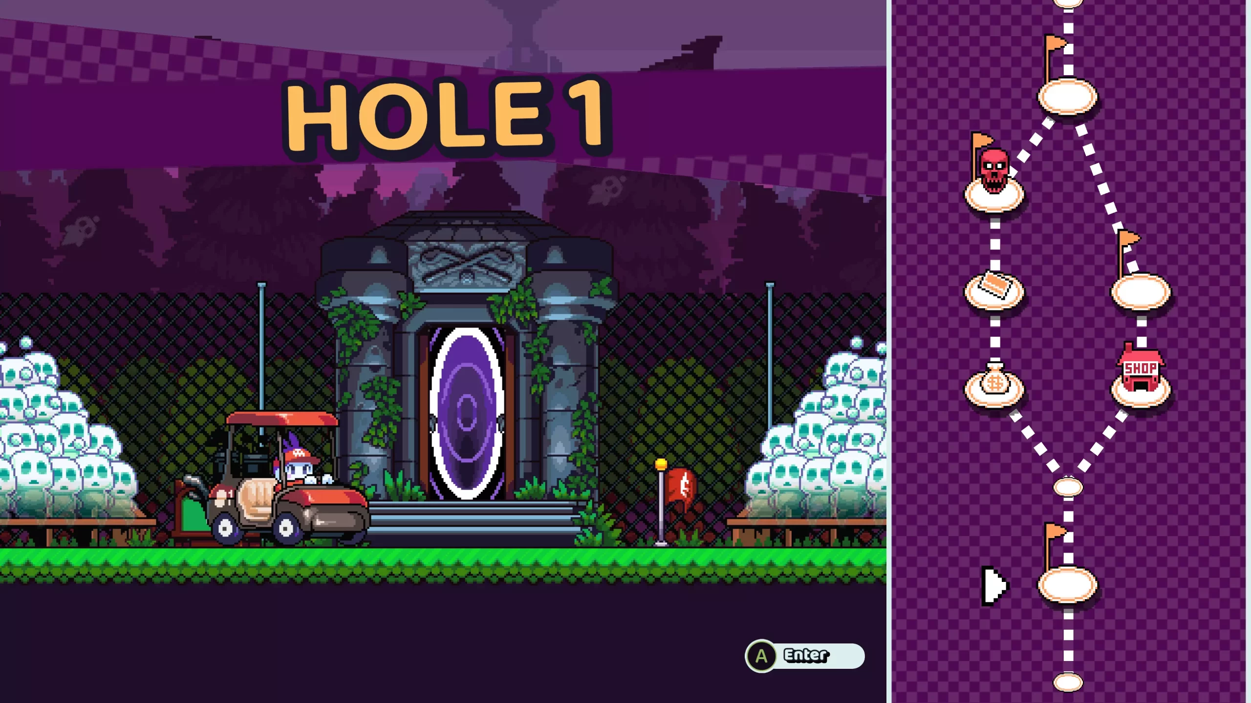
After getting to grips with the mechanics and playing a couple of boss battles, I was pretty amazed that Chuhai Labs hasn’t included a multiplayer mode which would be incredibly fun in either couch play or online. Sure, it would undo the roguelike mechanics and turn it into a straight-ish golf sim, but with the shot counter mechanics, Ace Cards and all the wacky hazards, I could see Cursed to Golf being a huge hit with groups of friends. I’d love to see it added in a later update.
Merging a roguelike and a golf sim should not be nearly as fun as Cursed to Golf undoubtedly is. The retro-inspired visuals and bouncy soundtrack belie a truly stout challenge that takes a lot of practice to overcome. You’ll rue every poor shot choice and curse every mistimed button press, but battling through the trials of Golf Purgatory is an incredible gameplay experience that will have coming back for more time and time again. The only real thing missing is a multiplayer mode, but even without it, Chuhai Labs has undoubtedly hit a hole-in-one.


In the interest of full disclosure, VGamingNews was provided with a copy of the game in order to conduct this review.
The Tarnishing of Juxtia

The Tarnishing of Juxtia is a new entry to the competitive 2D soulslike genre. If you’re at all familiar with the tropes you’ll find yourself quickly at home – explore a dead/dying kingdom, collect souls from defeated enemies to level up, rest at a bonfire (fountain) to restore health/healing items and resurrect the enemies, tough boss battles… it’s all quite by-the-numbers which, depending on your level of saturation into this kind of game, could be either a pro or con for what you’ll get out of it.
At A Glance
| Scores | |
| Visuals | 7 /10 |
| Sound | 5 /10 |
| Gameplay | 7 /10 |
| Overall | 7 /10 |
| Positives | + Competent, solid combat + Good weapon variety introduced early + Interesting world design |
| Negatives | – No real USP to combat – World design hidden behind tropes – Some technical issues |
| Price (When Reviewed) | £20.24 |
| Our Playtime | 4-5 hours |
| Available On | PC |
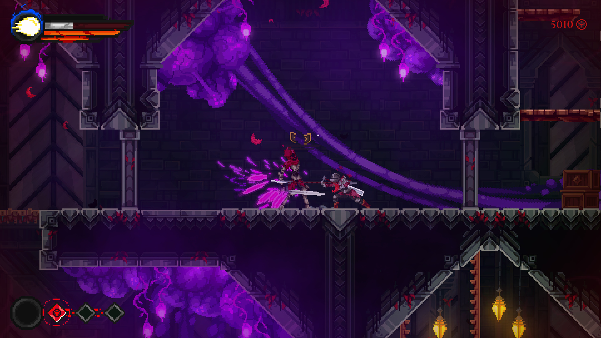
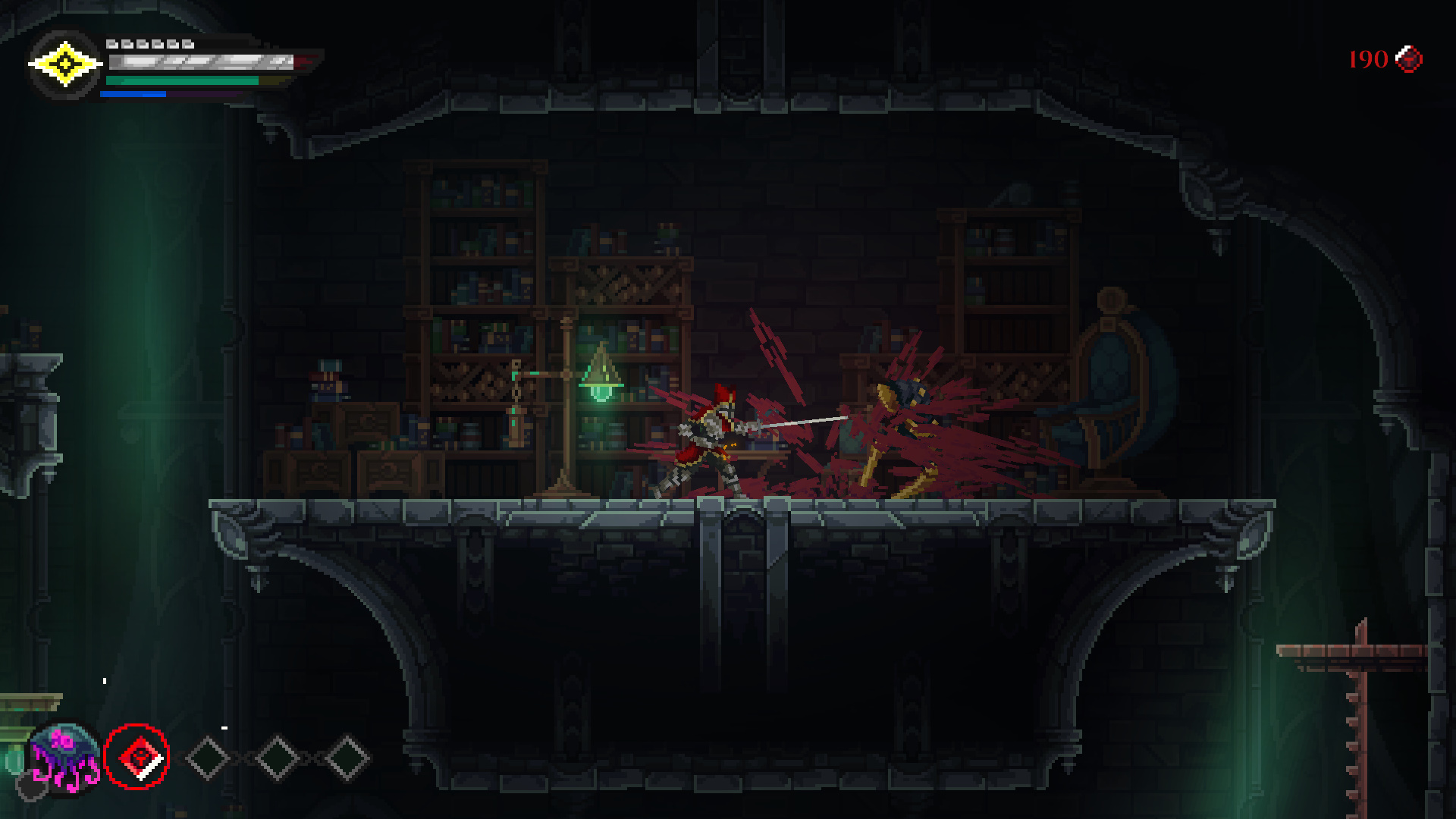
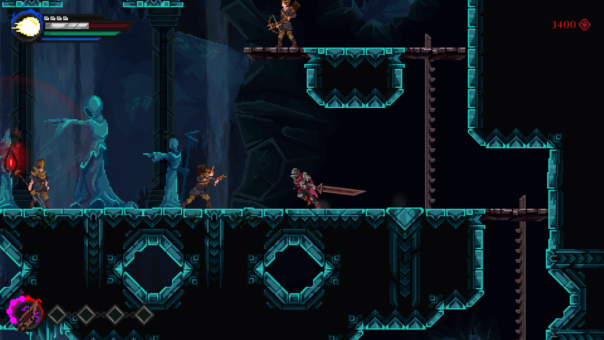
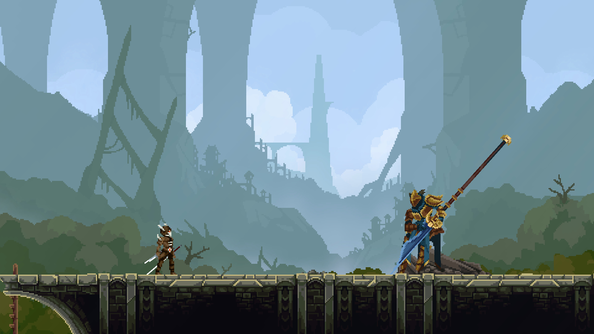
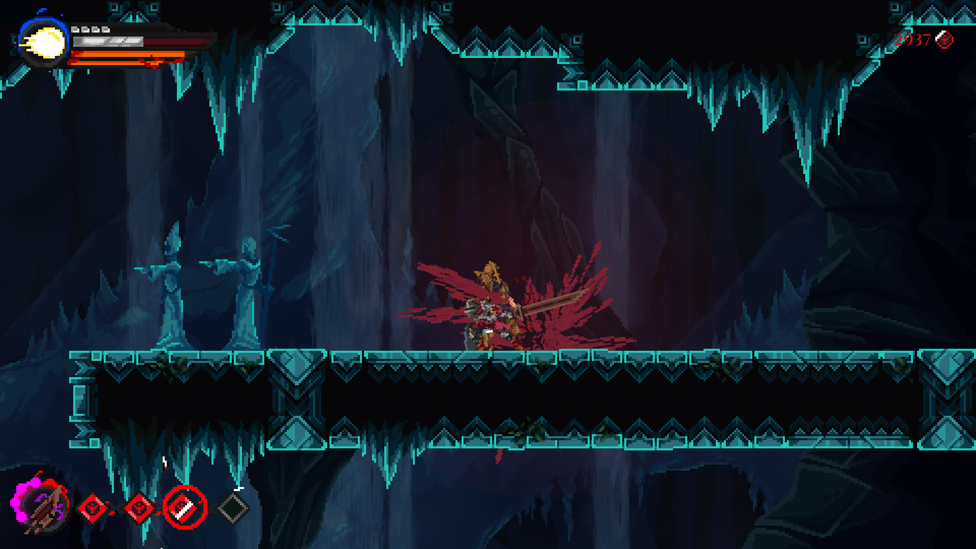
The gameplay of Tarnishing of Juxtia will feel immediately familiar to anyone who has played a 2D soulslike in the last few years – the closest comparison would probably be 2019’s Blasphemous, with the strict adherence to Dark Souls orthodoxy and deliberate, weighty combat. Tarnishing’s combat felt to me a little too slow in places, with the attack speed of some weapons seeming too sluggish to ever be really viable, but the mid-size range of swords and spears certainly felt comfortable. Weapons do feel meaningfully different from each other as well, which is certainly a positive given the wide range you’re quickly introduced to.
The game is lacking in the exploration aspects that some of the more metroidvania-esque soulslikes have embraced (as far back as Demon’s Souls itself, I’d argue), instead opting for more linear paths between bonfires fountains and the next boss. There are a few hidden items behind some platforming puzzles, though these are usually quite obvious and not particularly challenging. Combat is very much the focus here, with other aspects filed down.
That the game has a focus in its design is no bad thing, and the focus on combat does give Tarnishing a good sense of pace, with little to distract between combat encounters. There’s good variety of enemies and weapons, and experimentation is certainly encouraged with the early access to most basic weapon types – something I frequently find myself wishing FromSoftware’s games would embrace.
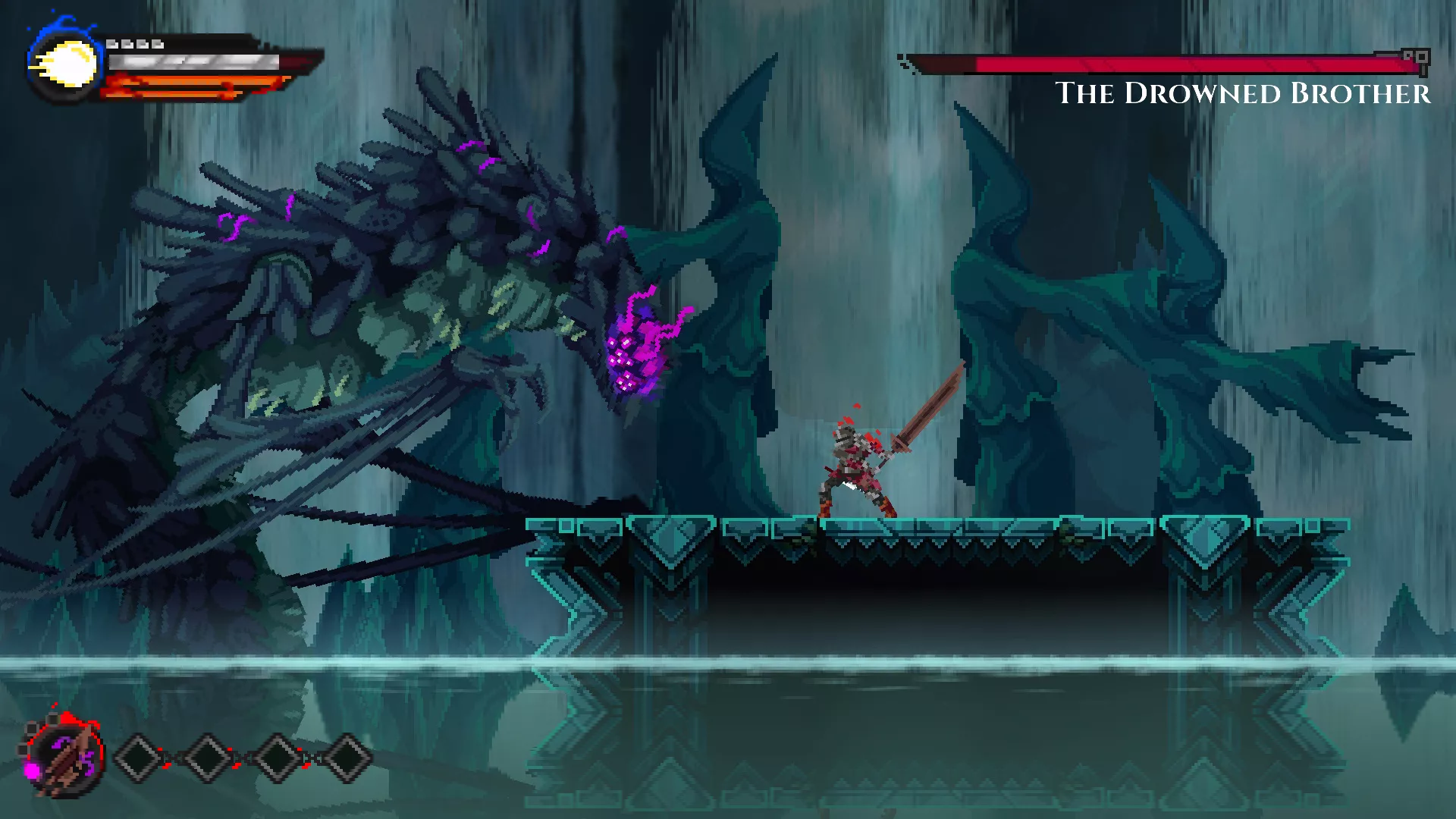
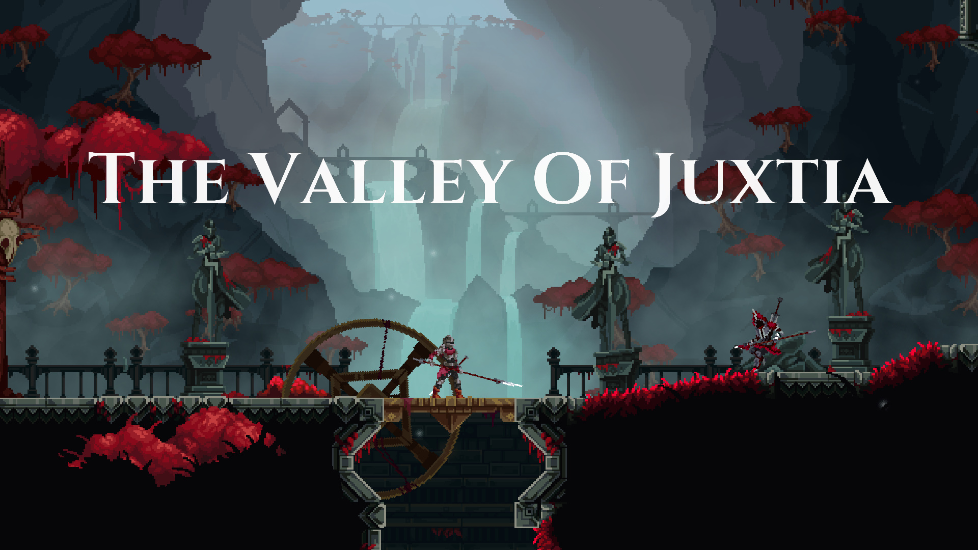
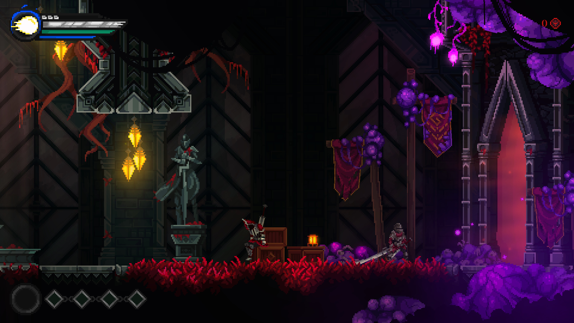
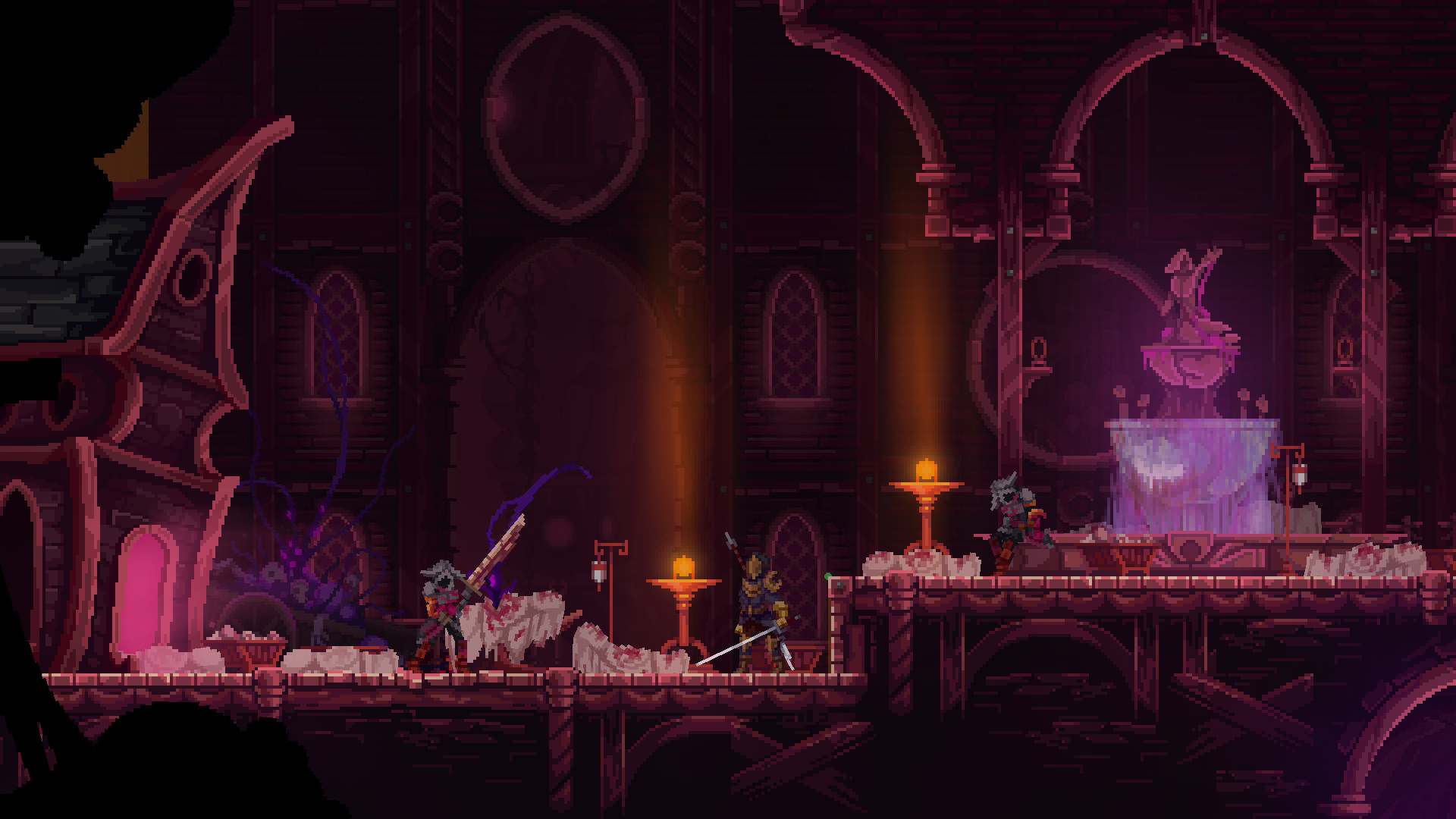
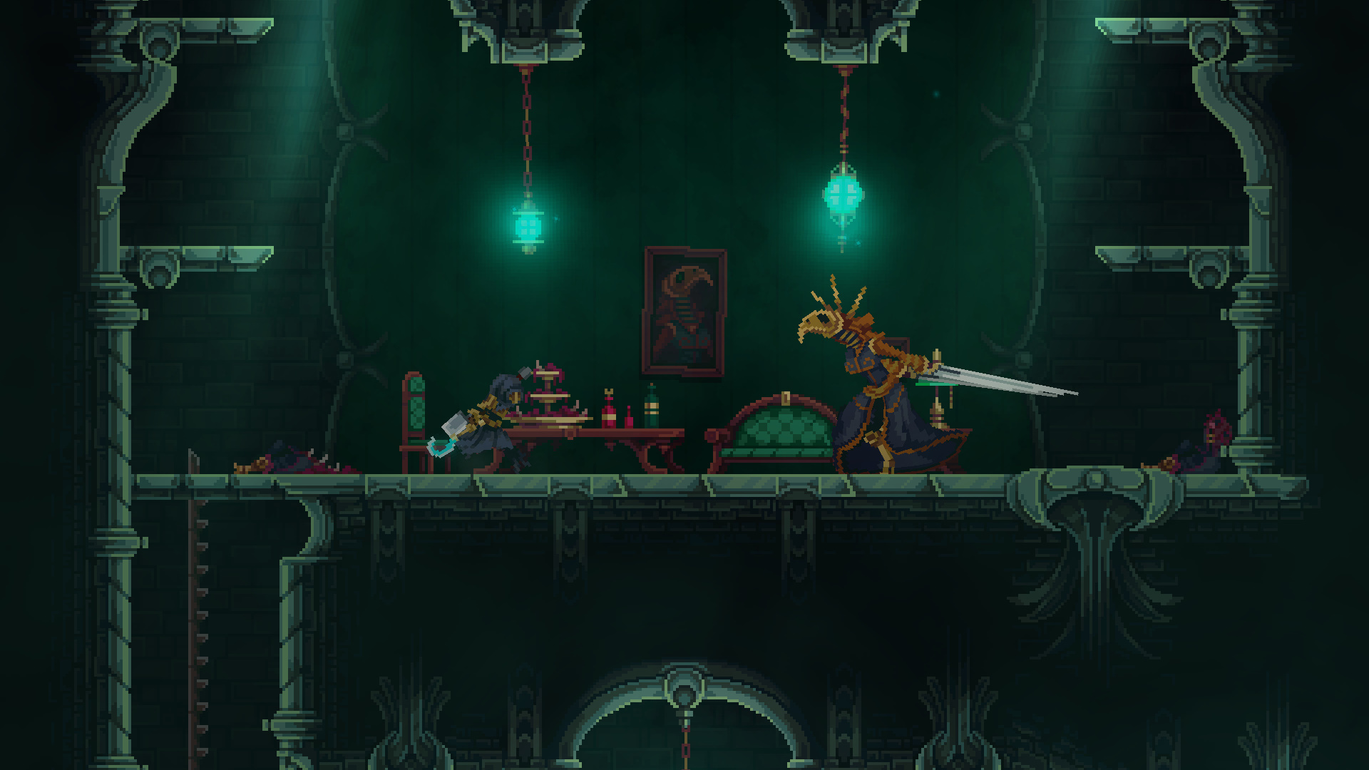
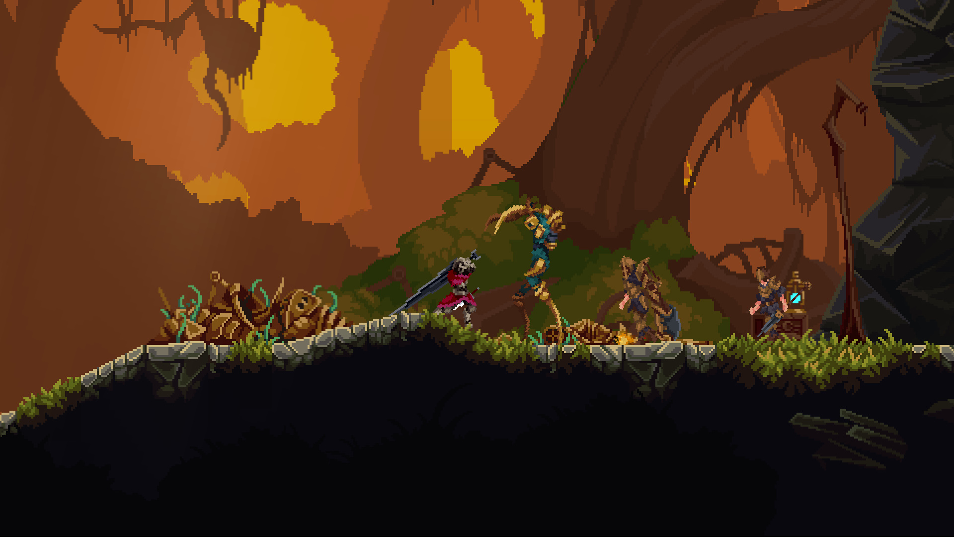
The graphical style is nice; less retro than Blasphemous’ heavy lean into the 16-bit aesthetic and more along the lines of Dead Cells, though without that game’s fast pacing or humour. Enemy and environment designs are interesting and characterful, and different enough to be easily readable, though it does tend to be a little overly dark which can cause issues if you’re playing in a well-lit room (or, you know, daytime). Some combat animations could be a little clearer, with a few bosses able to change direction during a wind-up that felt a little unfair.
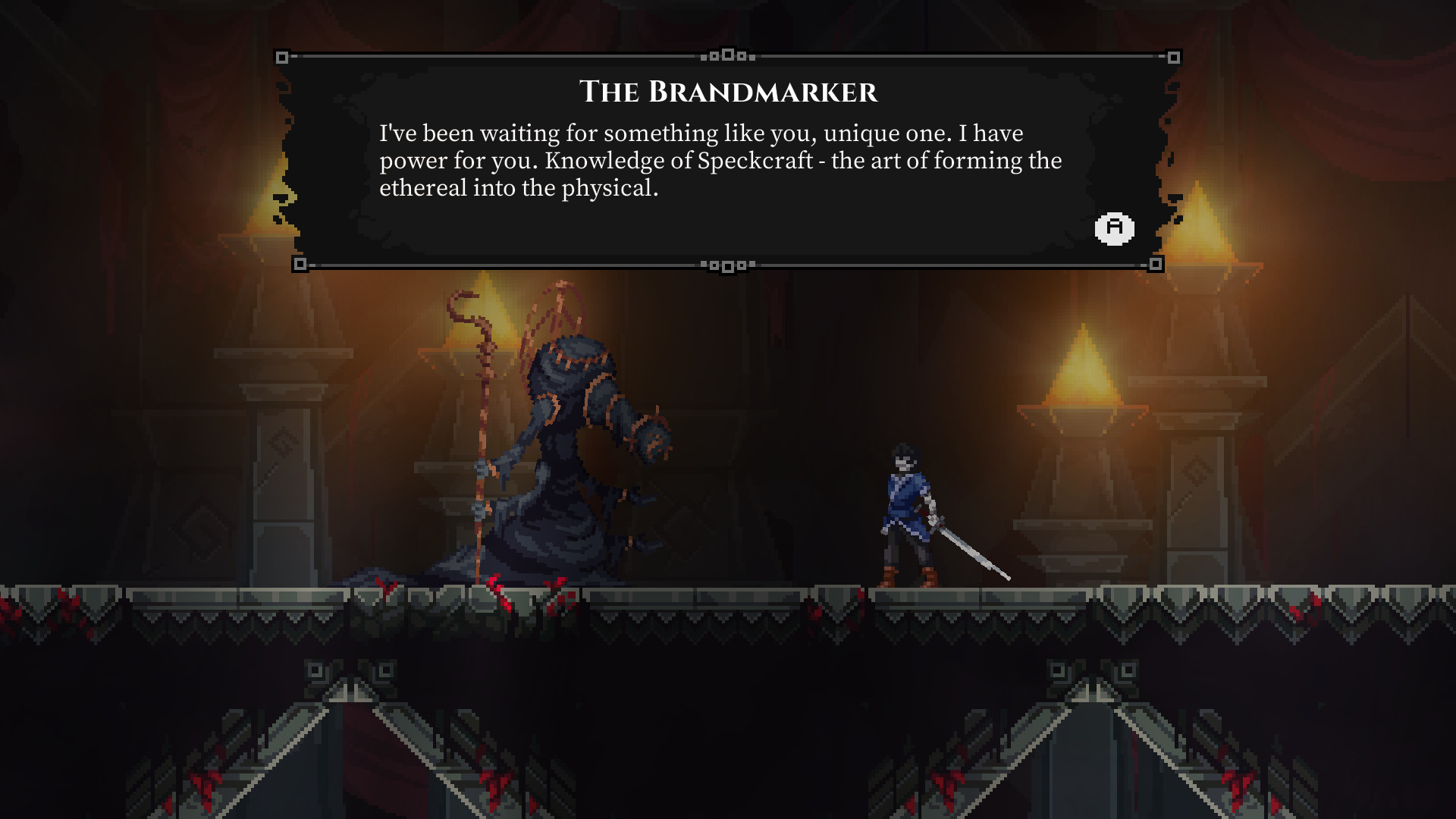
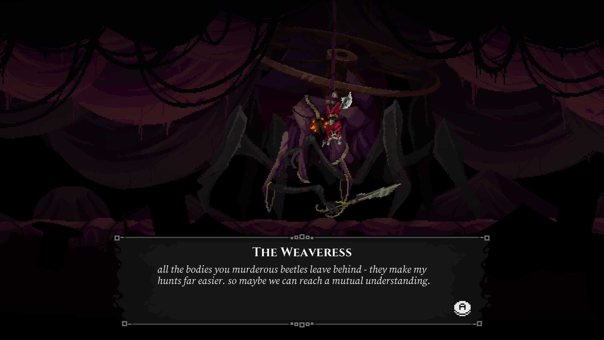
There is some intriguing world design going on in The Tarnishing of Juxtia, and that it is buried behind so many well-used prompts is almost a shame. I think there is a great missed opportunity in this kind of game for exploring a dying, rather than dead, world – last year’s Tails of Iron did this very well, with a hub town and castle that changed and rebuilt over the course of the story. Tarnishing is very firmly in the Lordran camp, with a world that does not feel especially responsive to your actions, occasional NPCs who speak in riddles and few signs of non-hostile life.
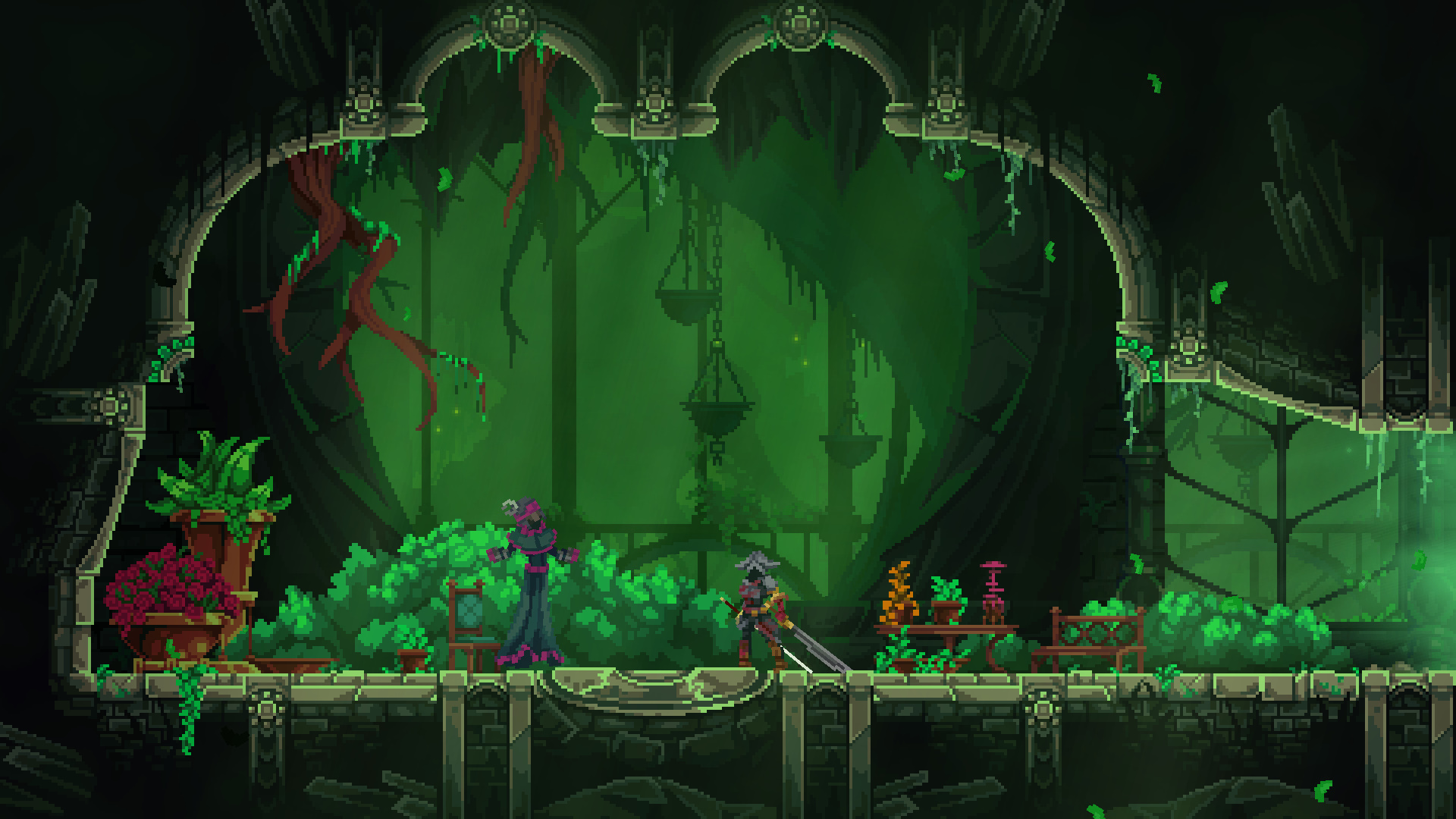
I had a few technical issues with the game. My first attempt at it had no sound, and crashed out at the end of the tutorial dungeon, meaning I had to replay it. Thankfully this did not repeat. The game also does not support any 16:10 resolutions, meaning due to my setup that I was only able to play it in a small window or have the edges of the screen cut off if attempting fullscreen. I feel it would be greatly at home on a handheld device and, while there’s no Switch release scheduled that I’m aware of, the Steam store page does state that it is fully compatible with the Steamdeck (though I have not been able to test that). It is certainly better played with a controller than keyboard, and helpfully does allow you to fully remap the controls to fit what you’re used to.
Tarnishing of Juxtia is an interesting if unoriginal entry to the genre. It’s hard to recommend over other entries, as it feels a little bareboned compared to the atmosphere of Hollowknight, the fluidity of Dead Cells or the world design of Tails of Iron, nevermind the epic expanse of Elden Ring. But if you’re looking for another challenge (or if it’s on sale) you might find something to pique your interest in its workmanlike but enjoyable combat, or the hidden depths to its world-building and narrative.

In the interest of full disclosure, VGamingNews was provided with a copy of the game in order to conduct this review.
SENSEs: Midnight

The second game I reviewed after coming back on staff at VGamingNews was 2.5D 90’s-inspired survival-horror, Sense: A Cyberpunk Ghost Story by Suzaku. While the game had its problems, the roster of antagonists was interesting and the setting showed definite promise, so I jumped at the chance to play SENSEs: Midnight, Suzaku’s follow up title. Sadly, it didn’t take me long to realise that there was very little to connect the two games, and that almost everything I enjoyed about the debut entry was absent from the sequel.
At A Glance
| Scores | |
| Visuals | 4 /10 |
| Sound | 4 /10 |
| Gameplay | 3 /10 |
| Overall | 3 /10 |
| Positives | + 90’s survival-horror nostalgia + Group-chat concept adds context and interaction + Graciously short runtime |
| Negatives | – Painfully slow & completely lacking atmosphere – Repeated camera cuts are incredibly disorientating – Yet another questionable portrayal of a female protagonist |
| Price (When Reviewed) | £9.29 |
| Our Playtime | 3 hours 30 minutes |
| Available On | PC |
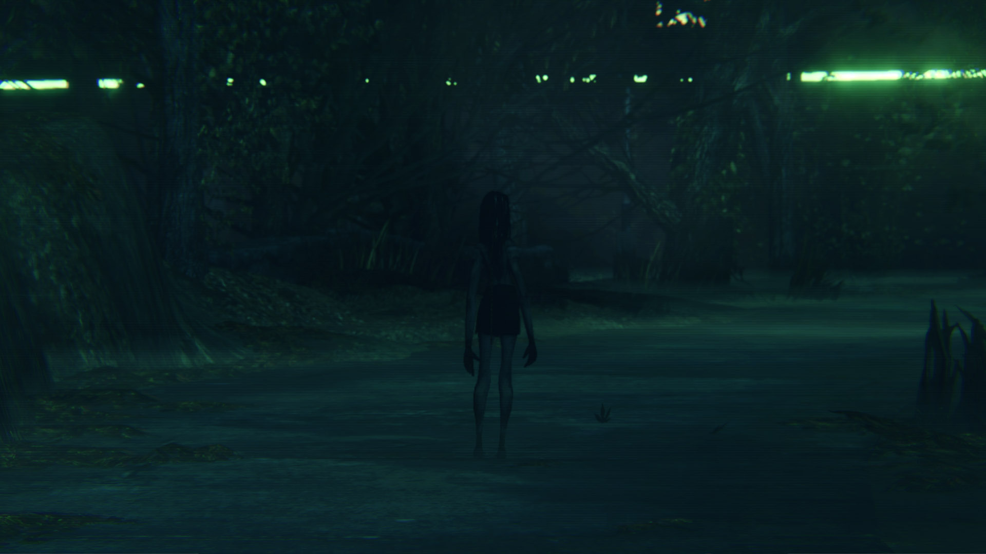
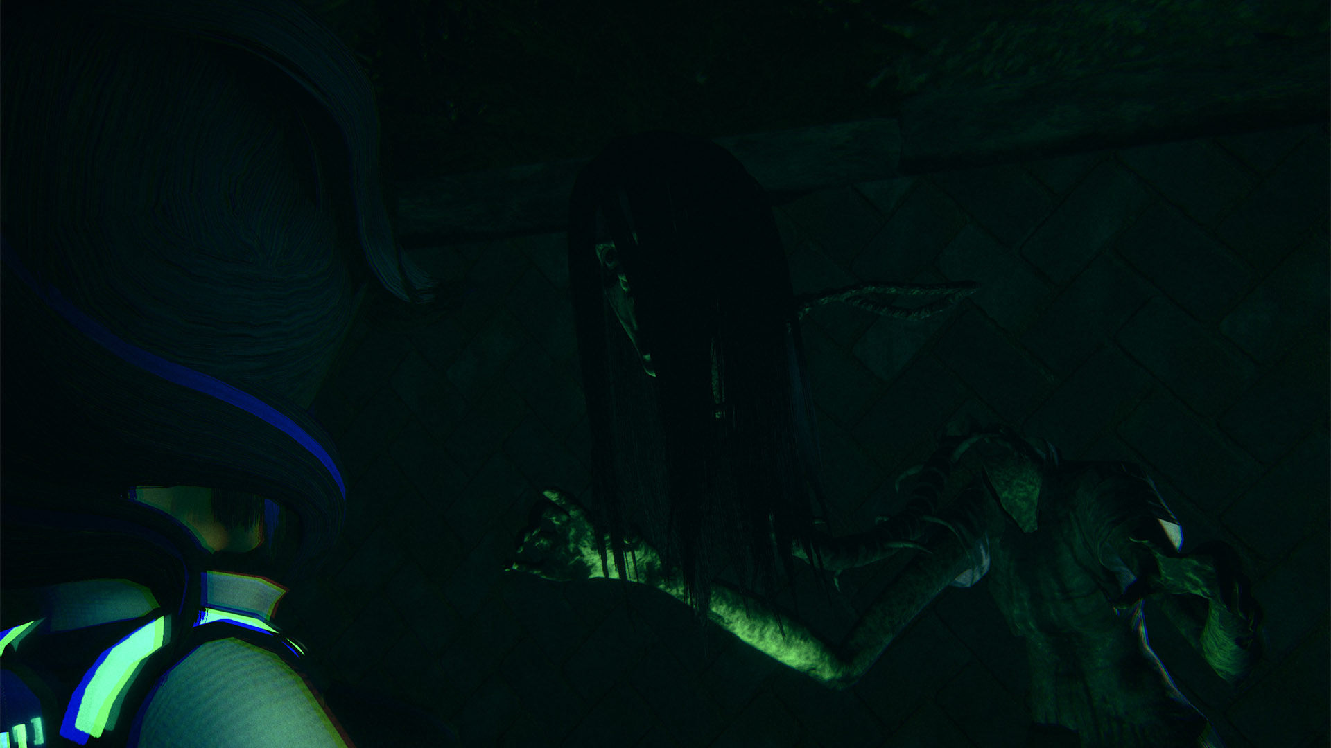
The plot is a trope-ridden teen-horror affair that centres around the young female protagonist Uesugi Kaho. The year is 2084 and, egged on by her occult-obsessed friends, Kaho breaks into the abandoned Ikebukuro public park in order to try out a ritual from an old wives’ tale. The story says that a young woman once hung herself in the restrooms of the park and that someone posted pictures of her body online; her vengeful spirit then exacted revenge on the perpetrator, along with anyone else who knocks on the door of the bathroom at exactly midnight – leading to it being dubbed ‘The Midnight Door’. Whilst sceptical, Kaho completes the ritual as her friends look on via a livestream, unleashing the spirit of the centipede woman, Okiku, who stalks her around the abandoned park.
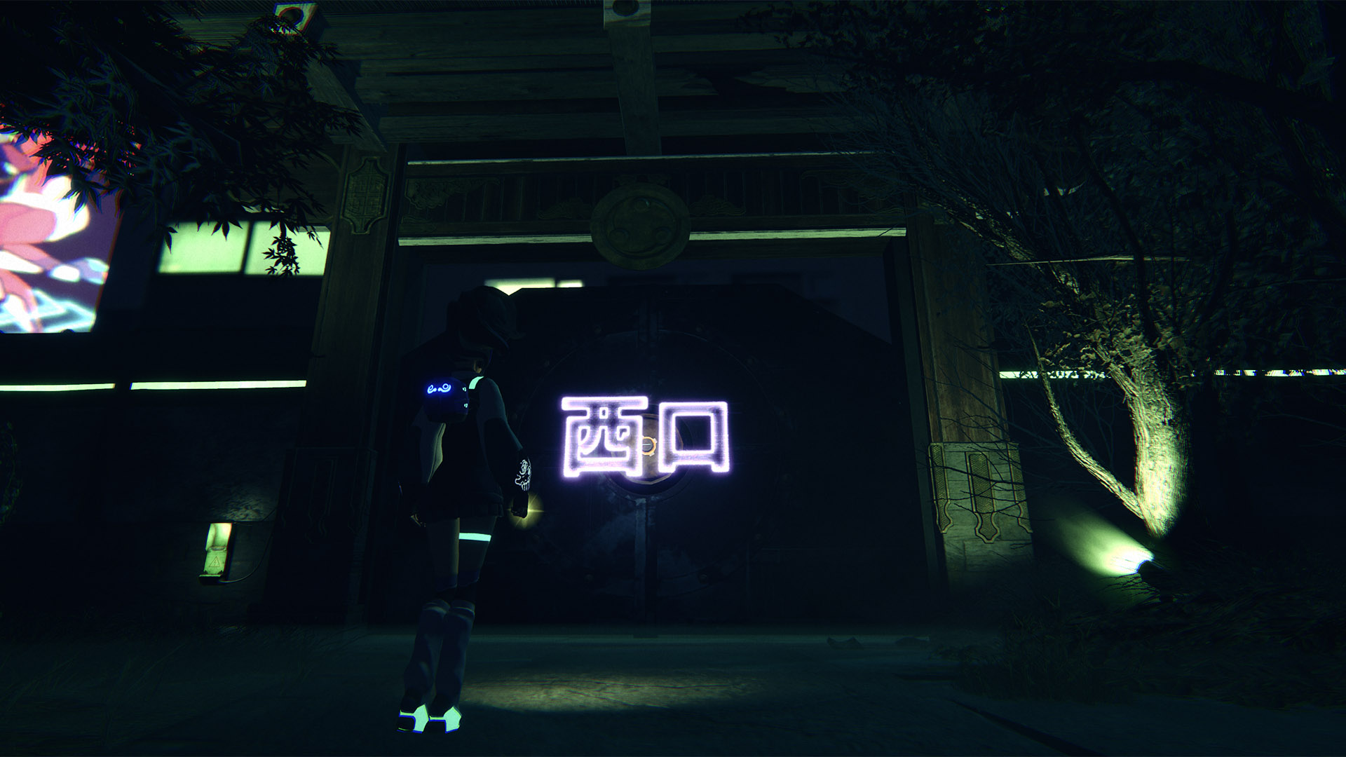
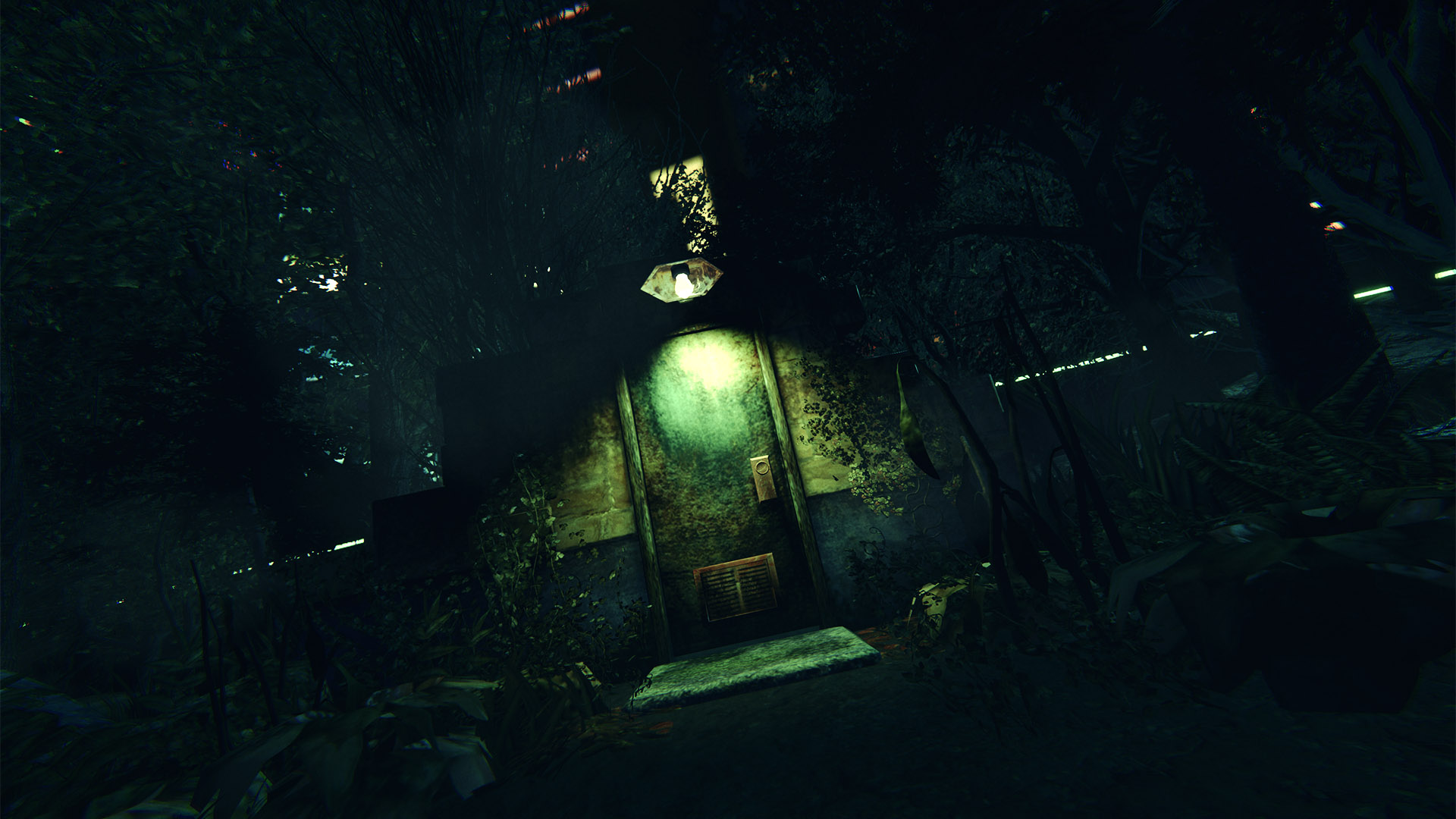
Suzaku have banished the 2.5 dimensional style from their debut game and have replaced it with a ‘more modern’ 3D depiction that allows free roaming. It’s not entirely more modern though, as the developer has opted for a retro-inspired aesthetic – and by that I mean “the 3D graphics look old”. The comic book style art direction that allowed the Chong Sing apartments to be depicted in relative detail in A Cyberpunk Ghost Story is long gone, and the models and textures in SENSEs: Midnight aren’t nearly as effective, despite hitting their PS3-inspired brief on the nose.
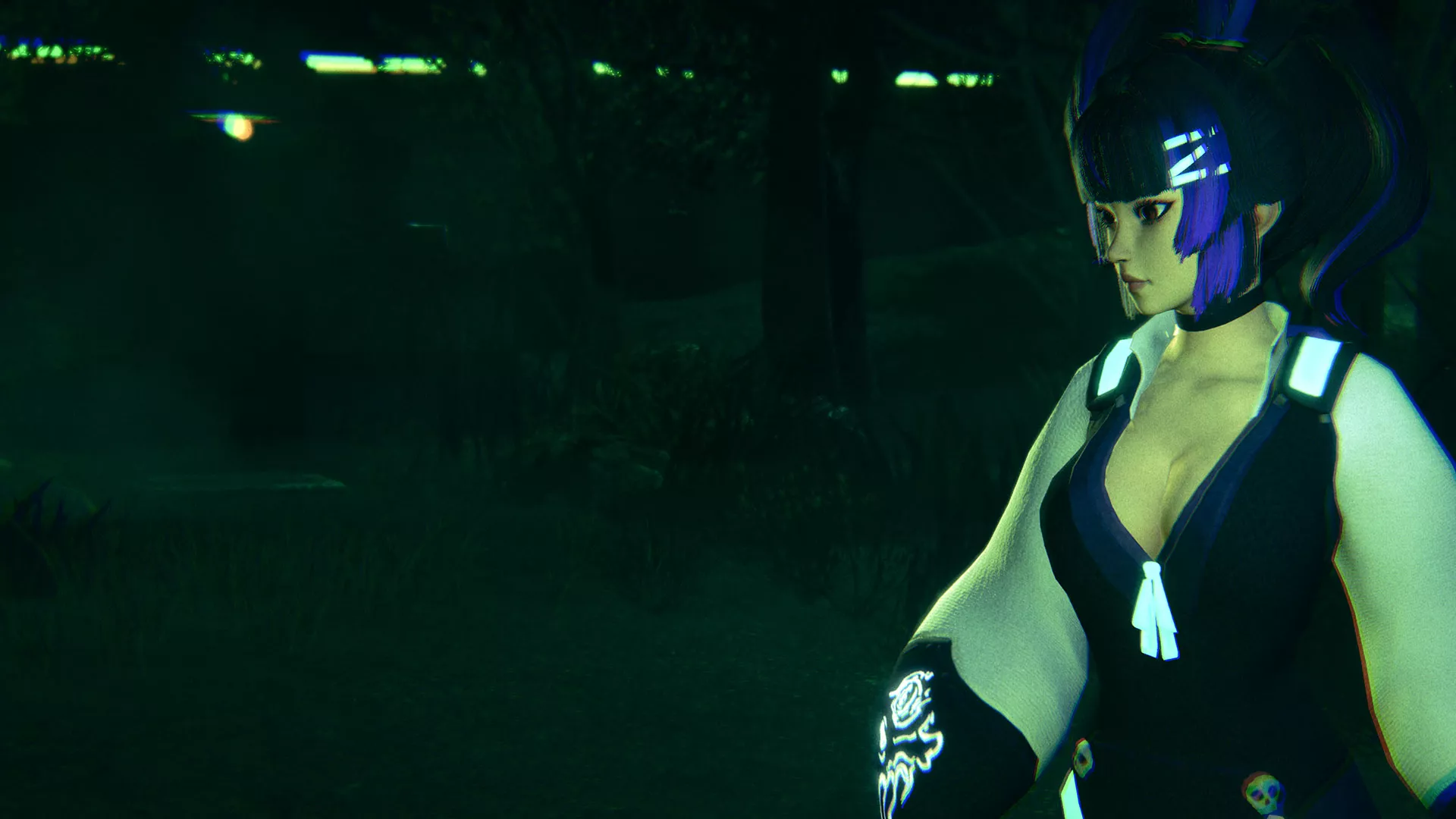
The one visual area that has been given a spit and polish is the character model for Kaho, which is sadly in keeping with my main critique from the original game. Kaho totters around Ikebukuro Park in a skimpy outfit and is depicted as being foolishly busty, just as Mei-Lin had been in A Cyberpunk Ghost Story. Despite being a horror game, there has been no effort put into animations to add emotion to her face, but time has been taken to ensure that her breasts heave up and down with every step she takes, of course. Kaho is regularly inferred to be a beautiful but clumsy young woman who can hardly take care of herself, and it’s infuriating that we’re continuing to portray women in such a negative light in 2022.
Perhaps this portrayal wouldn’t be quite so hard to swallow if there was any meaningful substance to the rest of the game, but sadly, this is not the case at all. While Suzaku have opted to take on a number of survival-horror staples from the 1990s like fixed camera angles, limited inventory space and quirky puzzle-solving, the way the features have been implemented leaves a lot to be desired.
The fixed camera shots worked in Resident Evil because they could build tension around blind corners and give a cinematic look to tight and oppressive areas. Ikebukuro Park, while tiny in comparison to the maps in most modern games, is too large to carry this off, and the number and frequency of the camera cuts makes it impossible to understand how areas fit together, or even where you’re going most of the time. The camera gives perspective to where Kaho is headed in maybe 10% of shots, and the rest of the time you’re wandering around, unable to see where you’re going or what’s around you. I flatout missed two important areas for well over an hour because I didn’t know they existed – I quite simply couldn’t tell there were further areas to explore due to the camera angle. You are able to change to the first-person camera mode to look around which might help you navigate, but with the mechanic entirely surplus to the gameplay, I completely forgot that it was there for most of the game.
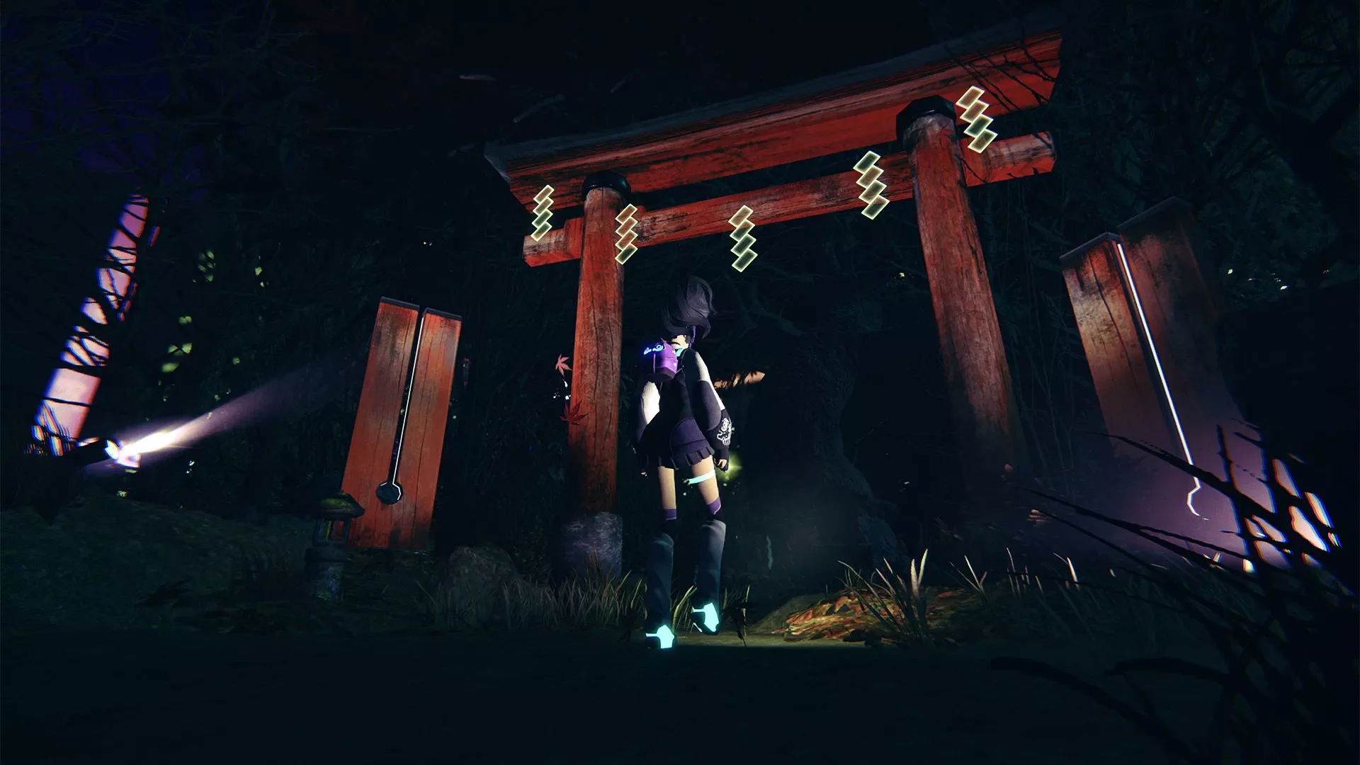
I’m not going to crap on the puzzle-solving in SENSEs: Midnight, as it’s no more silly than the ridiculous hoops that the Resident Evil series has made us jump through over the years (though making a molotov cocktail out of a beer might have set a new low). Genuinely ridiculous though is the limited inventory, which for SENSEs: Midnight is set at a laughably low four items. Passed off as “well women do have tiny handbags” (sigh), you’re routinely forced to put items back on the ground -and remember where you put them!- because your little backpack is filled to the brim with two different types of coins, a dirty rag and a cog.
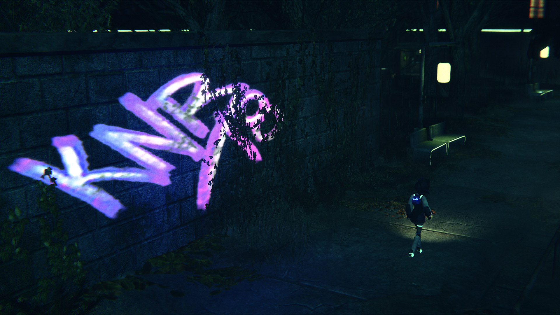
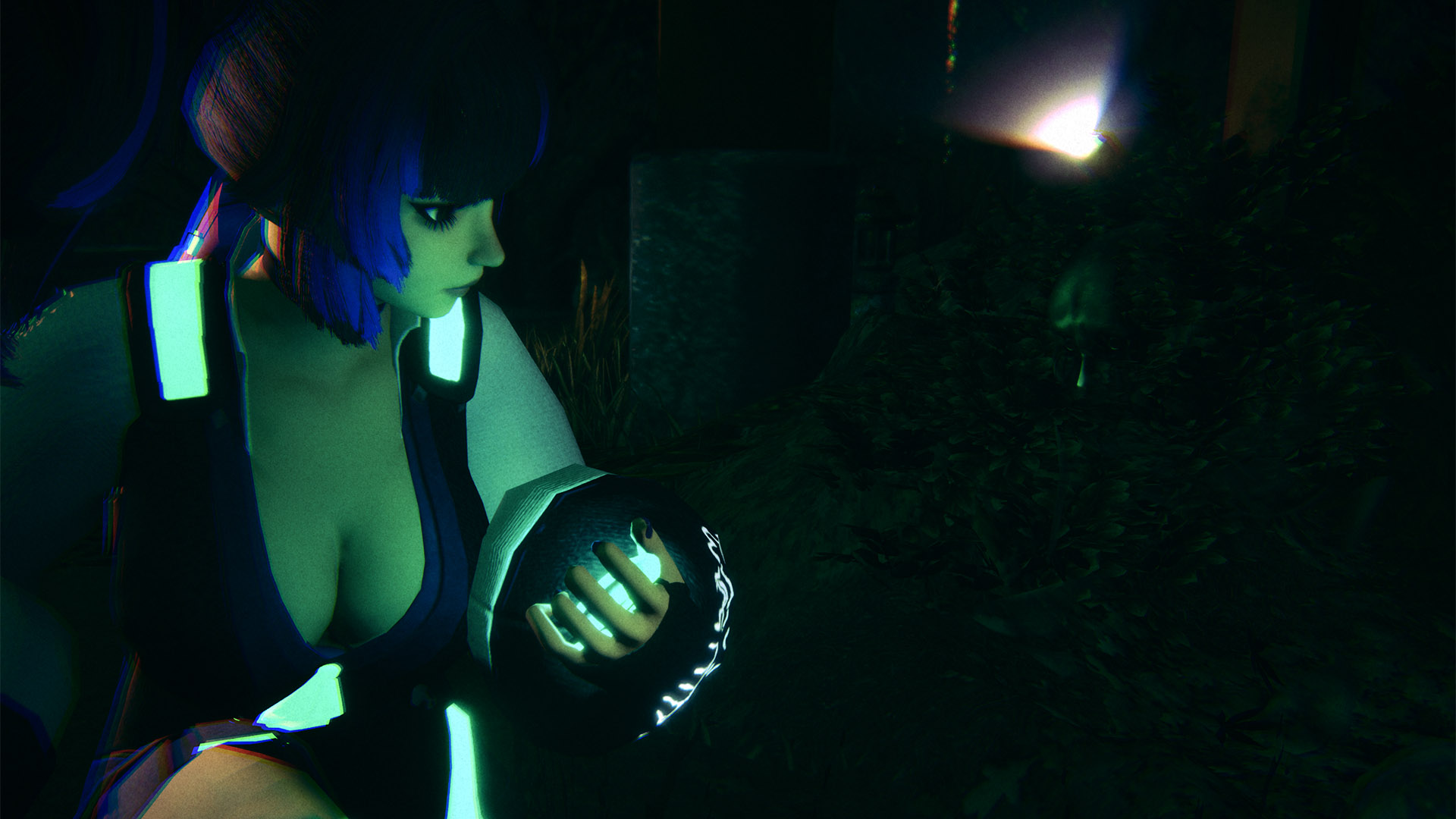
Aside from Okiku who was at least a little disconcerting, the enemies that stalk you through the park make up a who’s who of tired spirit-tropes – a disembodied spectre, a will ‘o’ the wisp energy ball and a collection of ghost hands that reach out and grab you. The ghosts are simple green outlines that I found almost impossible to see, and that might have been a problem had they been designed with any sort of threat level at all. As it happens, all of the enemies -including the big bad Okiku- can be avoided with a simple side-step throughout the entirety of the game. The tragic disenfranchised spirits (or Shinrei Shashin) that you can photograph return from the first game, but like everything else, aren’t implemented half as well as the first time and go completely ignored.
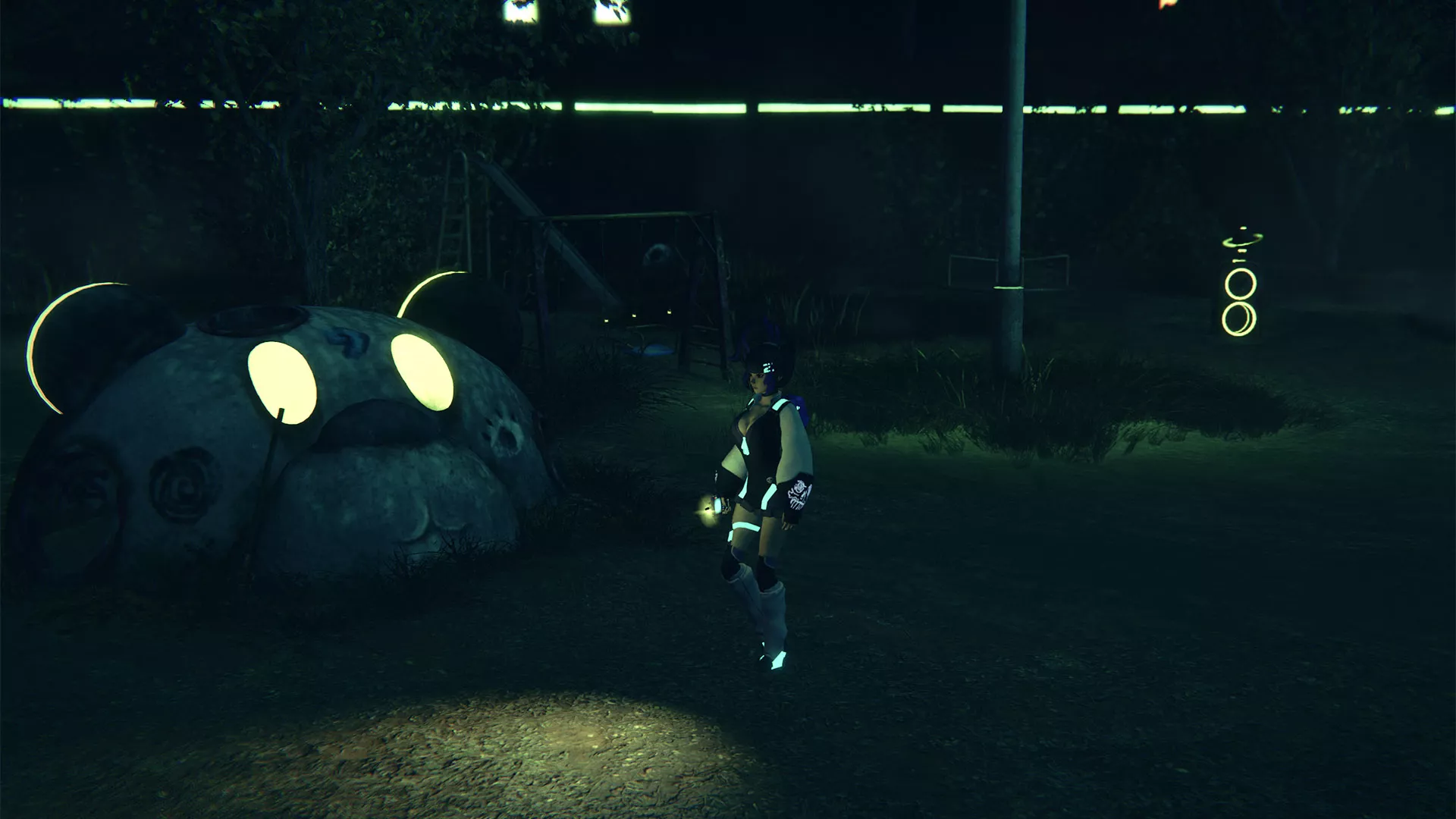
If you get tired of the ghosts ineffectively chasing you around then you can make use of the game’s stealth mechanics to try and shake them off. This involves running to a hide spot which are highlighted by glowing moths (for some reason), where you can play a droll mini-game to try and keep yourself calm until the ghost gets bored and wanders off. There’s no need to break line of sight or get a solid distance from the spook before you can hide from them – they’re literally so stupid that they can’t see you squat down in a crowd of glowing moths, holding your hand over your mouth no more than six inches in front of them…
While the story itself is well-worn, straight-to-VCR stuff (yep, not even straight-to-DVD), I have to say that I do like the way that it’s delivered. While Kaho is exploring the park alone, she is able to interact with her friends through a group chat on her phone that will regularly pop up on the left of the screen. There’s a myriad of people in the chat who each offer their own opinions and outlooks – some are trying to be helpful while others are just being goofy or shooting off insults. This allows Suzaku to add narration to the events of the game with some context, and while it’s not perfect, it’s an interesting concept that I could see utilised elsewhere to great effect.
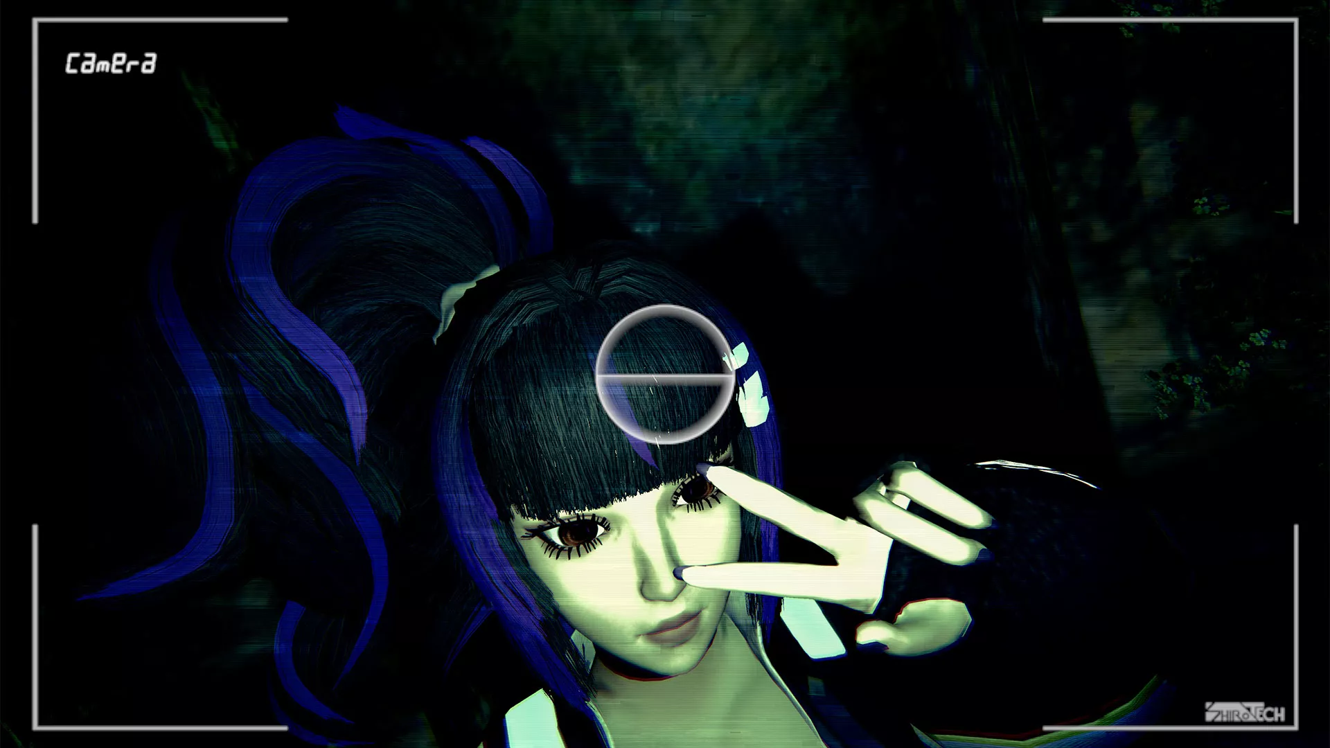
SENSEs: Midnight manages to take all of the ingredients that made 1990s survival-horror games fun and bake them into a hellish experience with few redeeming features. There’s zero atmosphere to accompany you as you (slowly) backtrack across Ikebukuro Park, avoiding bland, almost-invisible enemies as you go. With a protagonist who is entirely inanimate except for her breasts, dizzying camera angles and a complete lack of quality gameplay, SENSEs: Midnight should stand as a warning of what not to do for developers looking to capture 90’s survival-horror nostalgia. This is a huge step back from an opening title that, while flawed, at least showed some promise.
In the interest of full disclosure, VGamingNews was provided with a copy of the game in order to conduct this review.
Meet me at NooN
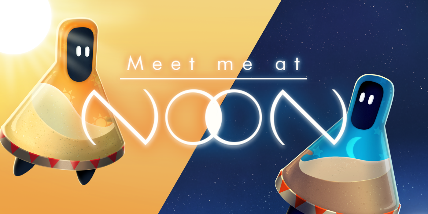
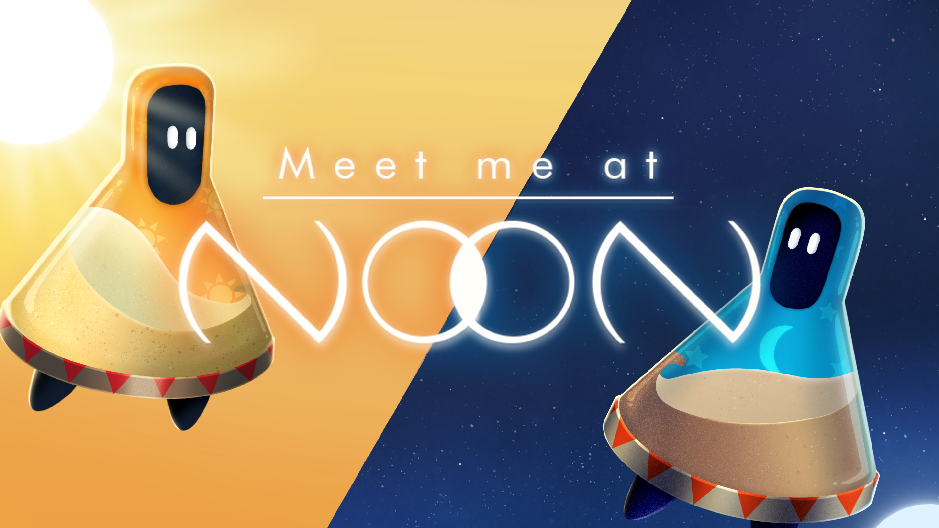
I’m a gamer who loves to engage his brain. Whether it’s prepping combos in tactical RPG combat or a deck builder that requires careful planning, I enjoy it when a game takes my intelligence seriously and gives me plenty to think about. I was happy then when the adorable turn-based puzzler Meet me at NooN landed on my desk, where some serious thought is required to make it through every level. Pandaroo Interactive certainly put my brain through a serious workout!
At A Glance
| Scores | |
| Visuals | 5* /10 |
| Sound | 4* /10 |
| Gameplay | 6 /10 |
| Overall | 6/10 |
| Positives | + Clever and unique mechanics + Alterations on the core system to add variety + Pretty, storybook aesthetic with adorable characters |
| Negatives | – Mechanics not fully explained – Random difficulty spikes – No variation in soundtrack and visuals |
| Price (When Reviewed) | £7.19 |
| Our Playtime | 3 hours 30 mins |
| Available On | PC |
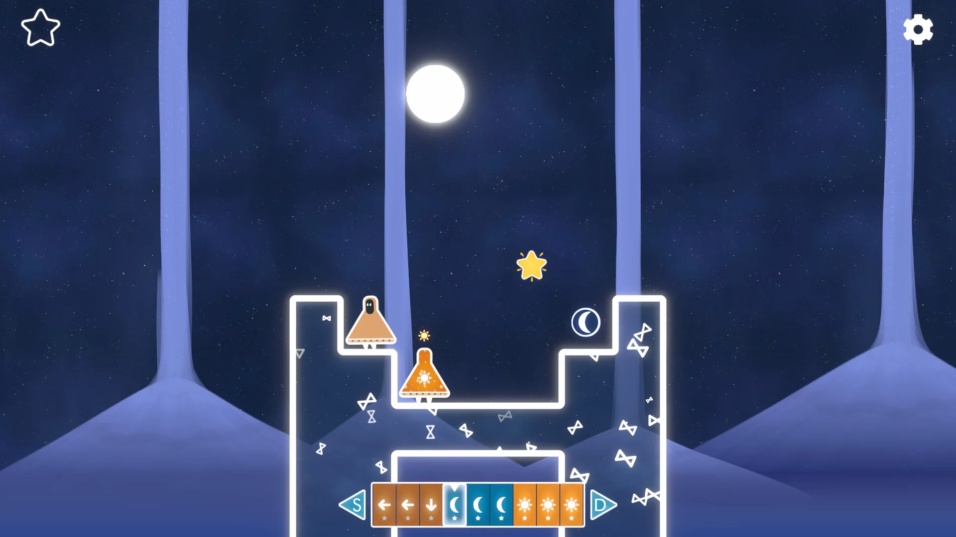
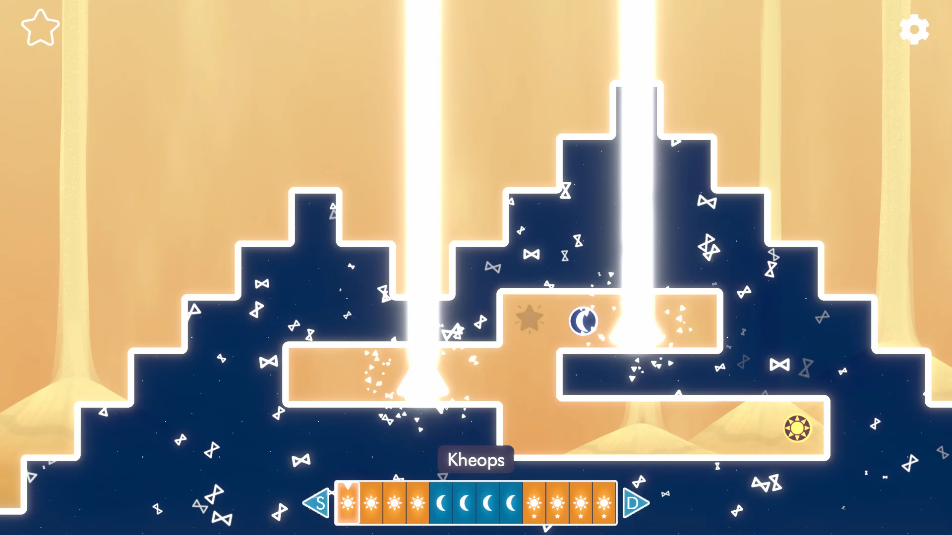
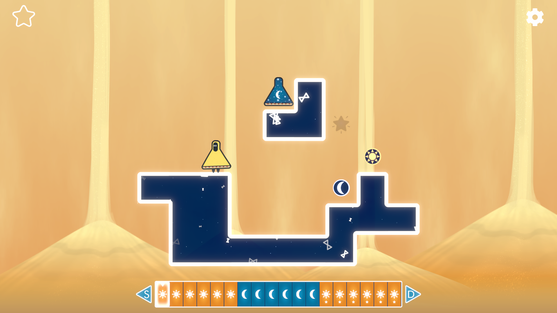
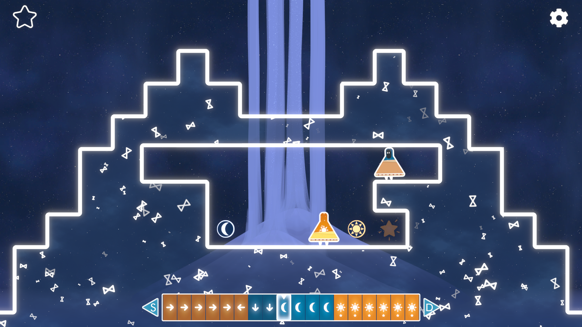
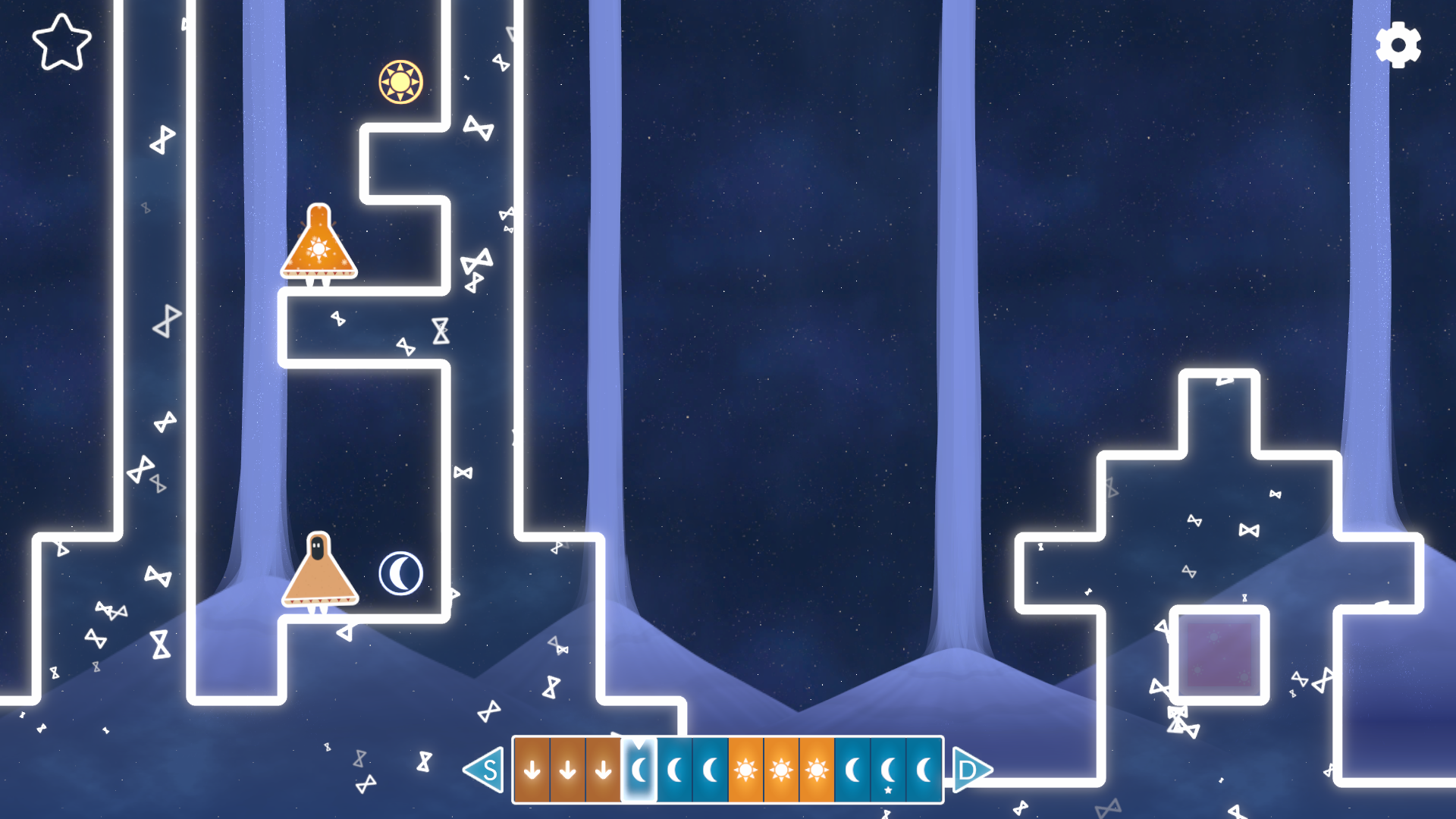
As with many puzzle games, the premise of Meet me at NooN sounds simple, but the execution is much more complicated. The player takes control of two adorable characters, each likened after one half of an hourglass; one represents the sun and the other, the moon. The idea is to move the characters around so that they each occupy a designated space in the 2D environment at the same time – simple, right?
Wrong.
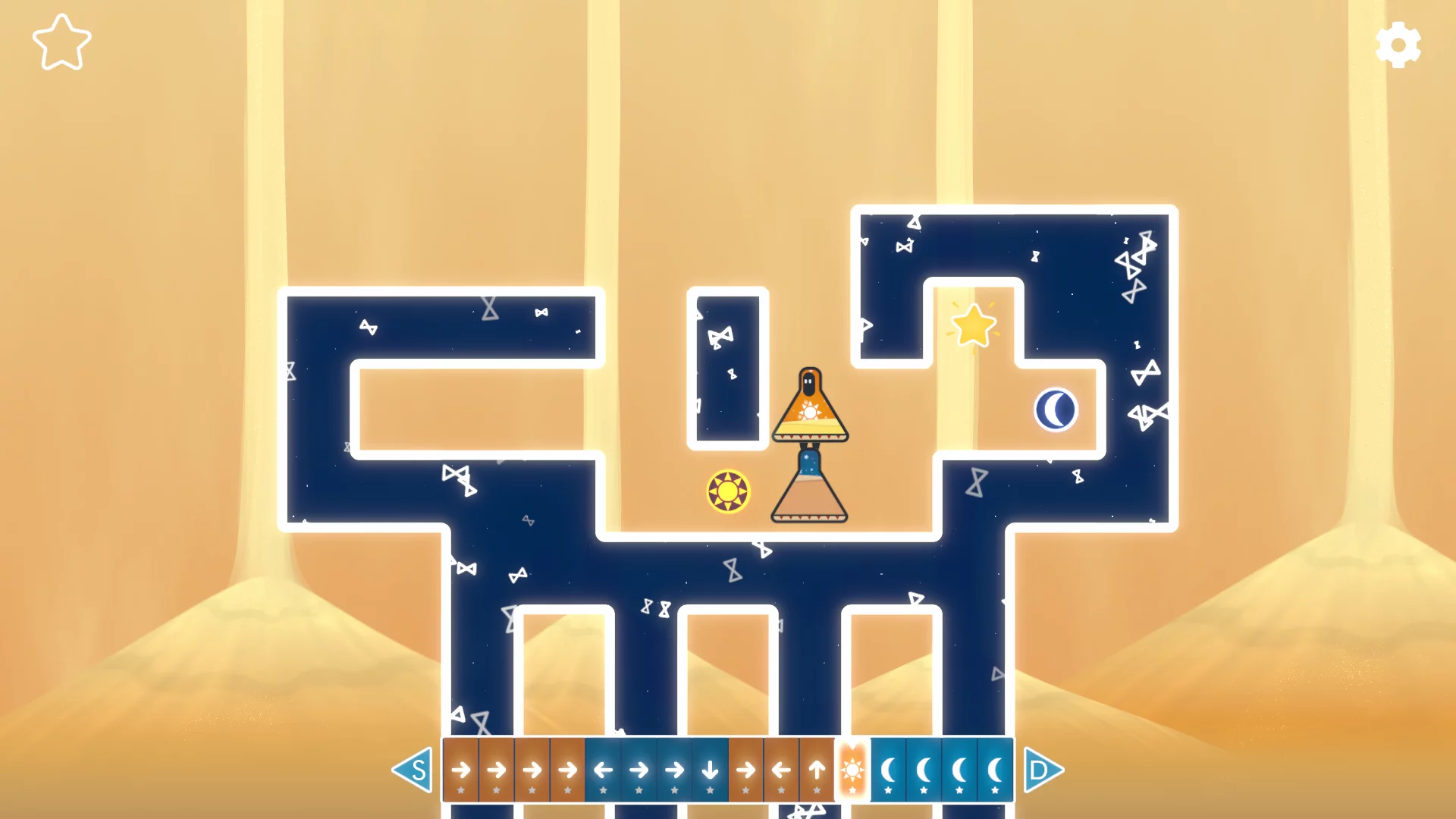
The movement is turn-based and there’s a timeline at the bottom of the screen that shows when each character can move – the sun guy can only move in the ‘daylight hours’ and the moon character only at ‘night time’. But the opposite character doesn’t just lie dormant when it’s not their turn to move – their actions actually unwind on a turn-by-turn basis! This means that you have to plan your actions in both forward and backwards time, and makes for some absolutely mind-boggling planning in some of the more complicated levels.
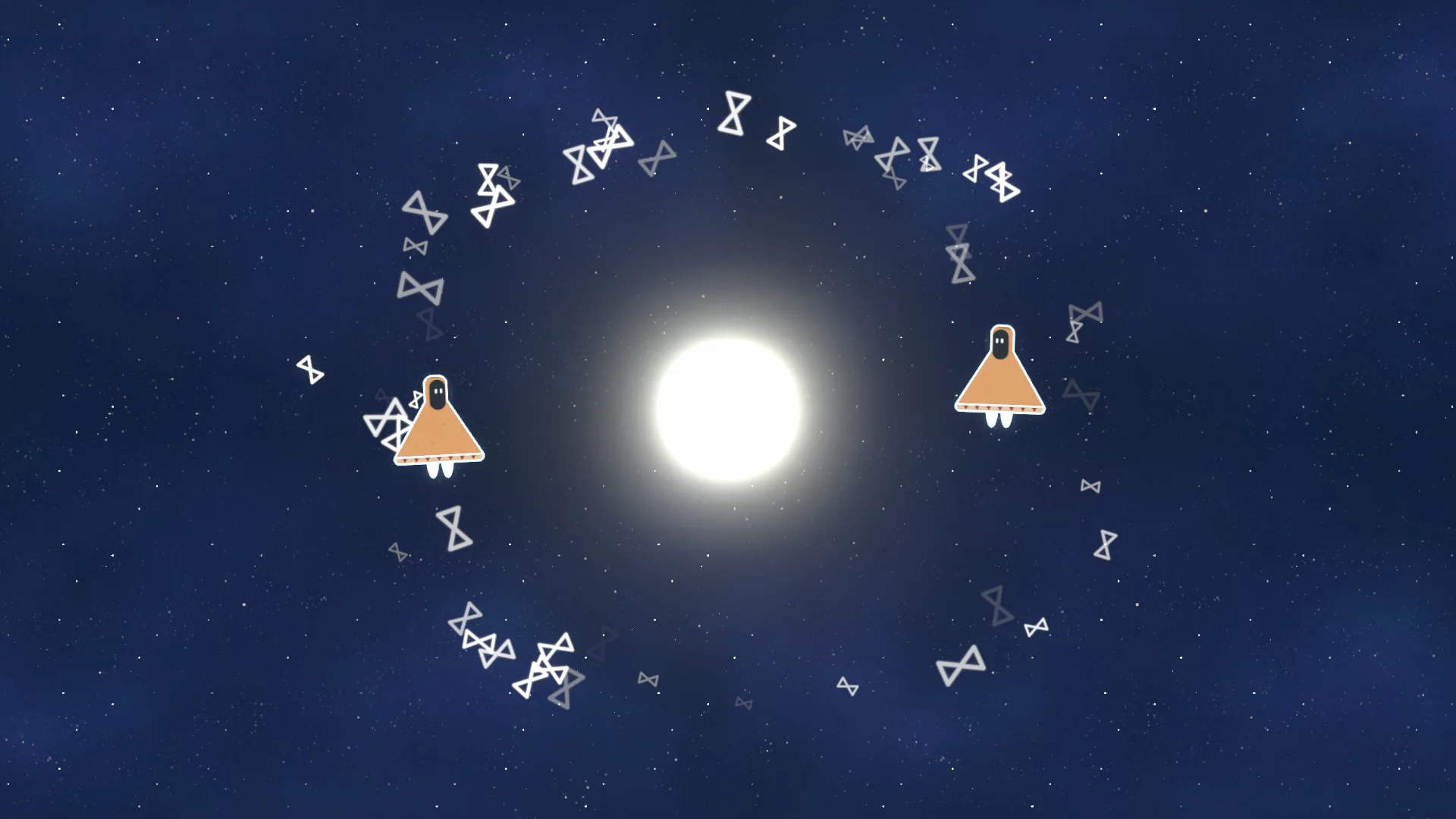
You’ll have to jump at the right time in order for your character to hang in time and allow your companion to pass, fall into holes so that your pal can use you as a lift to a higher areas and stand in their way to block them, preventing the time loop from undoing a vital move to reaching victory.
Throw in the fact that there’s an optional star-shaped collectible on each level and the added wrinkle that some of these stars can only be picked up on specific turns, and there’s a lot to consider in each level. You can ignore the stars, of course, but you’ll need them if you want to unlock all of the worlds available, and if you’re anything like me, you’ll want to get them just to prove that you can’t be outsmarted! Sadly, I have to admit that Meet me at NooN gave my pride some significant punishment in that regard!
Pandaroo Interactive have done a great job of manipulating their core mechanics as the game progresses in order to add a little variety just when things begin to get stale. Initially you’re asked to action all of the sun moves before moving onto the moon, but later in the game you’re asked to plan the moves in alternating fashion for each character, adding another moving part to the puzzle. Later still you’ll run into disappearing/reappearing platforms, and my personal favourite, time-stop worlds, where you have to plan ALL of your moves out before the characters play them back in one long list. There’s a really nice change of pace introduced with each of these tweaks, and it was refreshing to amend your thinking after scratching your head on the same problems for a while.
Sadly, these alterations only go so far, and I did find the puzzles becoming rather samey by the latter portion of the game. Aside from an indicator of where your companion will move next (based on their previous moves), there’s also no hint or assistance system to speak of, so between the repetition and some pretty stark spikes in difficulty, Meet me at NooN struggled to hold my attention as I moved through the last few worlds.
For a game with an impressive hidden complexity, I appreciate that it’s hard to go into detail with explaining the mechanics without basically playing the game for your audience, but I did find Meet me at NooN a little lacking in explanation – especially in some of the secondary mechanics. For example, it’s never explained that the moon character ‘weighs’ more than the sun character, and can not only block his moves but actually push him around, but the same cannot be said vice-versa. It becomes clear when you’re playing the relevant levels, but it’s never highlighted to you as a player and you’re expected to fiddle with things outside of the core mechanics which feels a little underhanded in a game that’s already pretty difficult to get your head around.
I absolutely love the visuals for Meet me at NooN, which would look right at home on the oversized glossy pages of a children’s story book. The aesthetic has a chunky and playful look that evokes a light-hearted mood that plays off against the (sometimes) frustrating puzzles really nicely. I particularly enjoyed the game’s colour palette; the vibrant yellow and orange of the daytime contrasts wonderfully with the rich, deep blues of the night and makes the transitions incredibly effective. The characters are sweet as hell too and would make wonderful mascots for a wider range of games, such is their uniqueness and style.
I also really enjoyed the soundtrack to Meet me at NooN, as limited as it might be. There’s some twinkly music that’s lovely and that leans into the sun and moon theme really nicely; it’s soothing and calm, and it doesn’t intrude on your thoughts while you’re trying to work out the solution to the problem. There’s some sweet little movement sounds that add to the cuteness of the characters too.
Unfortunately for both the graphics and sound departments, Meet me at NooN suffers from a lack of variety and this ultimately affected my scoring in those categories at the top of the review. There’s but a single backdrop and backing track for the entire game, and this only underlined the repetition that I felt in the puzzles, reminding me time and again that I’m doing the same thing over and over. Had there been some changes in scenery, colour palettes or backing music, this might have helped give a different feel to each world and give more of an impression of change to the player. I did love everything that I saw and heard from Meet me at NooN, I just thought it was a shame that there isn’t more variation to showcase the wonderful styling to the full.
Meet me at NooN is a unique and stylish puzzler that will be very popular among fans of the genre, particularly those who enjoy games at the higher end of the difficulty spectrum. It’s a pretty little game that will keep you on your toes with some very cleverly thought out mechanics, but the difficulty spikes and lack of variety in all areas might turn off more casual fans. Meet me at NooN has a great premise and execution but is ultimately pegged back by a repetitiveness that saps some of the enjoyment as things progress.
In the interest of full disclosure, VGamingNews was provided with a copy of the game in order to conduct this review.
Souldiers
We’ve always been big fans of a metroidvania here in the VGamingNews offices, and we’ve been seriously stoked about Souldiers after since we got our hands on a demo at this year’s W.A.S.D. event. The demo version showed off some beautiful pixel art graphics and some rather spiky combat, and we were keen to see what the folks at Retro Forge Studios and Dear Villagers had up their sleeves with the full game.
At A Glance
| Scores | |
| Visuals | 8 /10 |
| Sound | 7 /10 |
| Gameplay | 8 /10 |
| Overall | 8 /10 |
| Positives | + Fantastic pixel art graphics & throwback soundtrack + Challenging but rewarding combat + Well paced story with fun characters |
| Negatives | – Too many sub-weapons that go unused – Some of the controls are finickity – Long levels perhaps overstay their welcome |
| Price (When Reviewed) | £15.49 |
| Our Playtime | 44 hours |
| Available On | PS5, PS4, Xbox Series X|S, Xbox One, Nintendo Switch, PC |
Needless to say, the finished article absolutely built on my positive preview of Souldiers, with the full game simply expanding the experience in every direction. (I was also very glad to see that my preview save file carried over to the full game and saved me a good few hours of replay!)
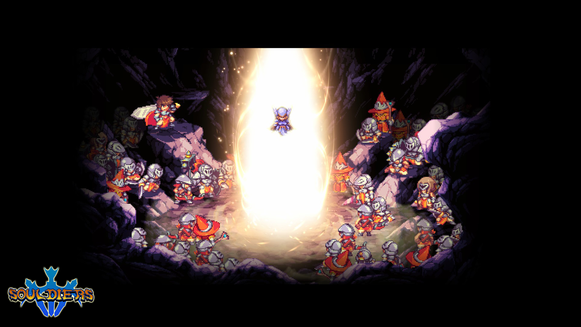
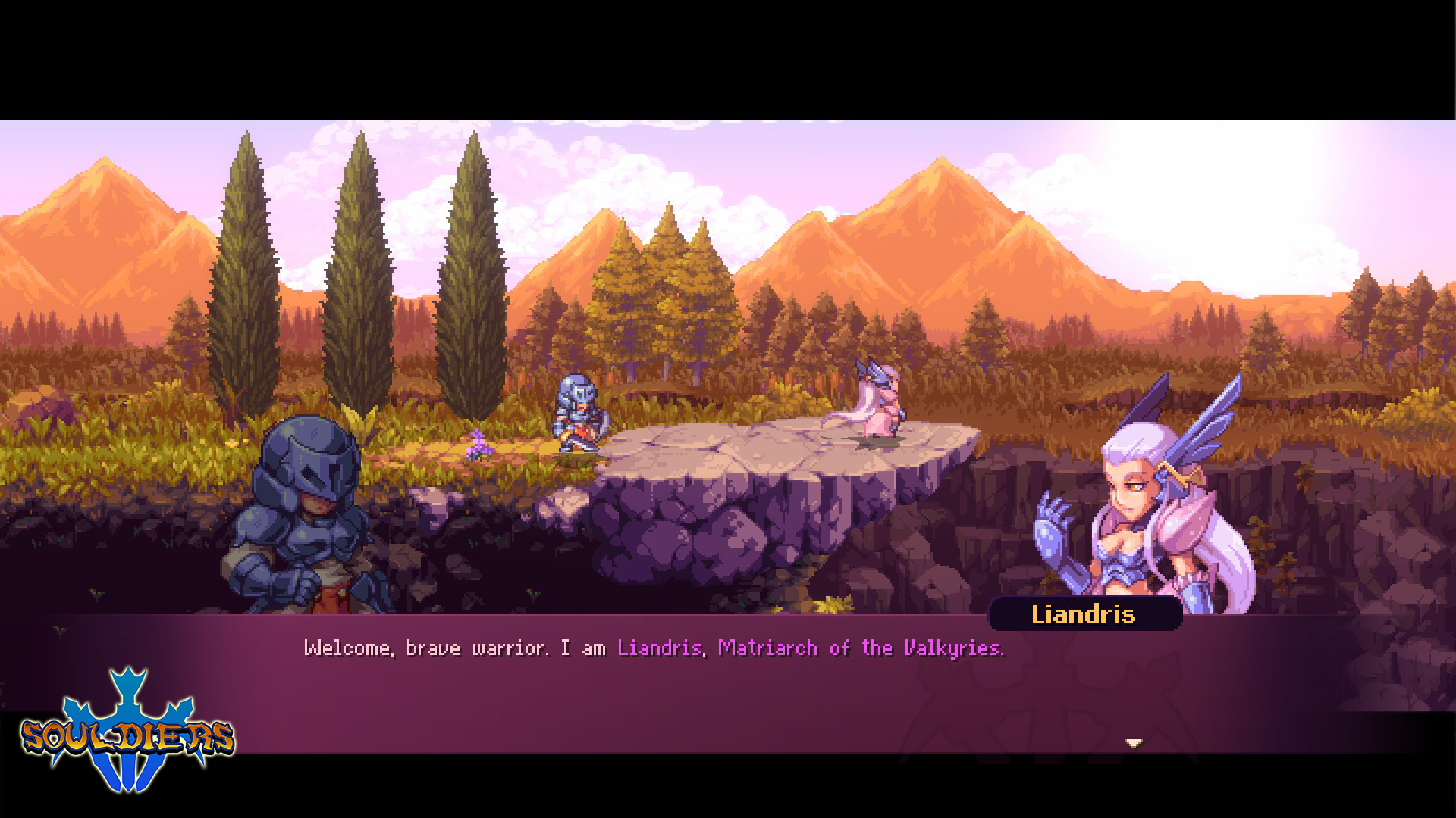
The story of Souldiers revolves around a group of warriors from the land of Varga, who are transported by a Valkyrie to the land of Terragaya when it seems that they’re in mortal danger. As your nameless protagonist explores this new world that exists between the realms of the living and the dead, you become embroiled in a larger plot and are forced to face an otherworldly foe that threatens the whole of Terragaya. The story takes some enjoyable twists and turns and introduces you to a fantastic cast of characters; I was particularly fond of the Vargan heroes Brigard and Euder – a stoic and serious general and a cocky but loveable soldier respectively, who together demonstrate the themes of Souldiers wonderfully.
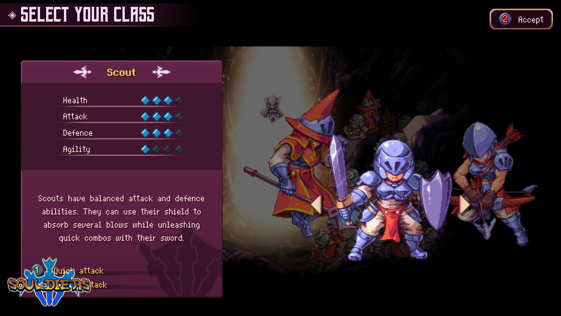
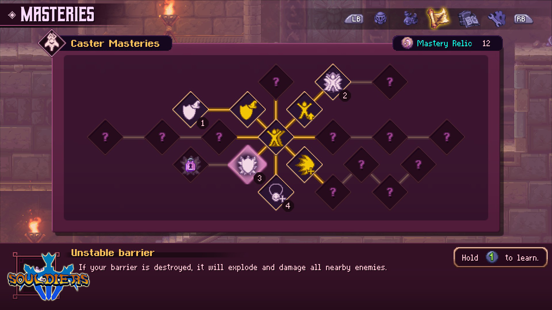
You’re offered the choice of three warrior types to use (spell caster, scout and archer) and can select one of three difficulty levels to tailor your experience to your play style. The game plays as a side-scrolling platformer with some seriously tricky combat; this earns you experience points that can be spent to unlock new abilities. Like all good metroidvania games, Souldiers asks you to collect items in order to retrace your steps and unlock new routes, and these take the form of elemental orbs. These orbs not only grant you new ways to traverse the Terragaya, but alter your elemental strengths and weaknesses too, adding a fun wrinkle to the combat without being overly complicated.
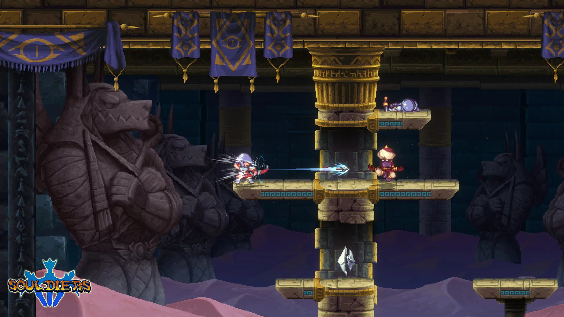
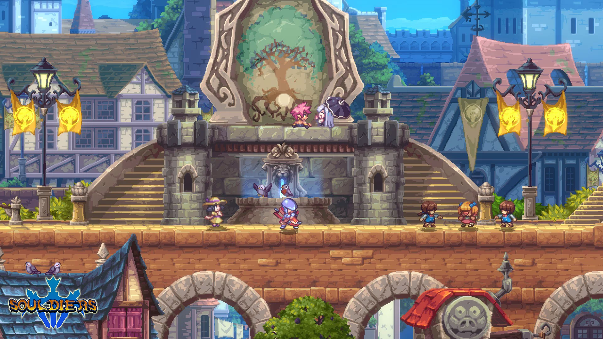
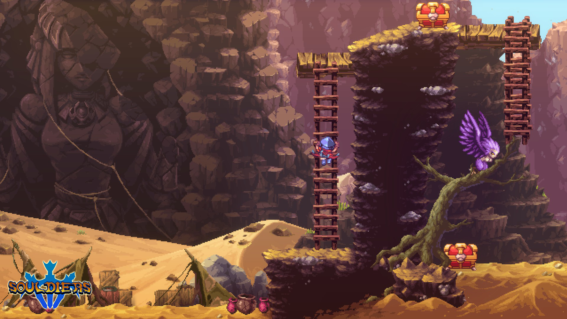
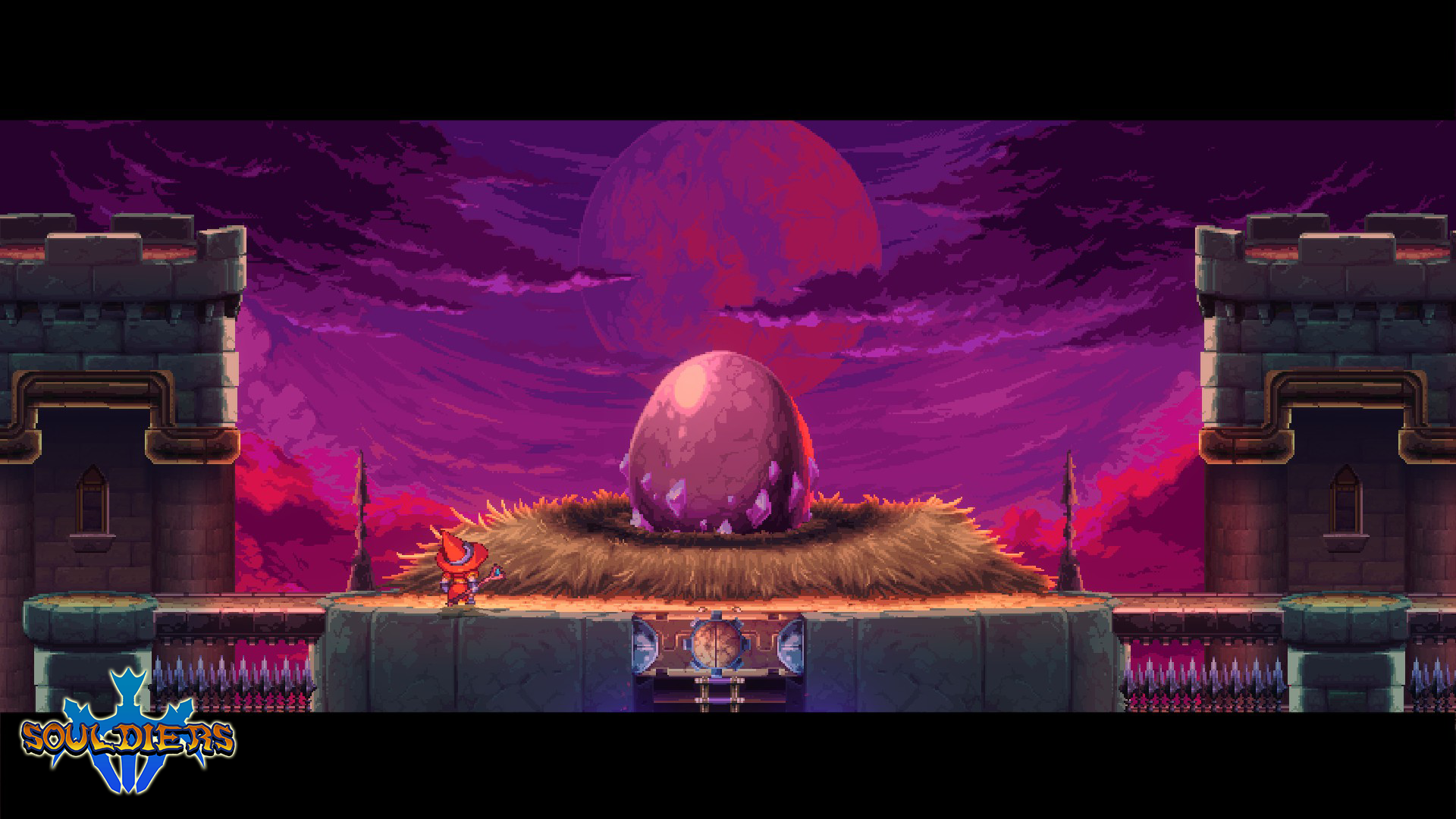
First and foremost, Souldiers looks spectacular. Whether you’re a pixel art aficionado or just a passing fan, you will immediately fall in love with the crisp visual style, detailed backgrounds and expansive colour palettes that makes the world leap off the screen. And that world has been oh so wonderfully designed, with each area carrying an individual style that makes it stand out as unique whilst also contributing to the overall vision of an eclectic universe.
The diversity of races, characters and enemies shown off throughout the game is fantastic, and nowhere is this more prevalent than in the hubbub of Hafin City. Despite being a side-scrolling affair on a 2D plane, there’s an incredible amount of depth displayed in the busy city scape, with masses of buildings fading out into the distance and the hustle and bustle of passing folks in the foreground. I often find ‘busy city’ scenes in retro-styled games a little eye-rolling; there’s rarely more than a handful of NPCs to talk to and buildings to explore which makes it all feel very fake, but the visuals here do a wonderful job of underlining the idea that Hafin is the heaving hub of the world and masks the in-game limitations really well.
One slight critique I have with the world design is that perhaps the dungeons/levels were a little too long, and by the point you were finished, you were entirely ready to get out and explore somewhere else. I think Souldiers would have benefitted from making the levels maybe 75% of their final size, and adding a couple more playable areas with the hours saved, but that’s just my opinion.
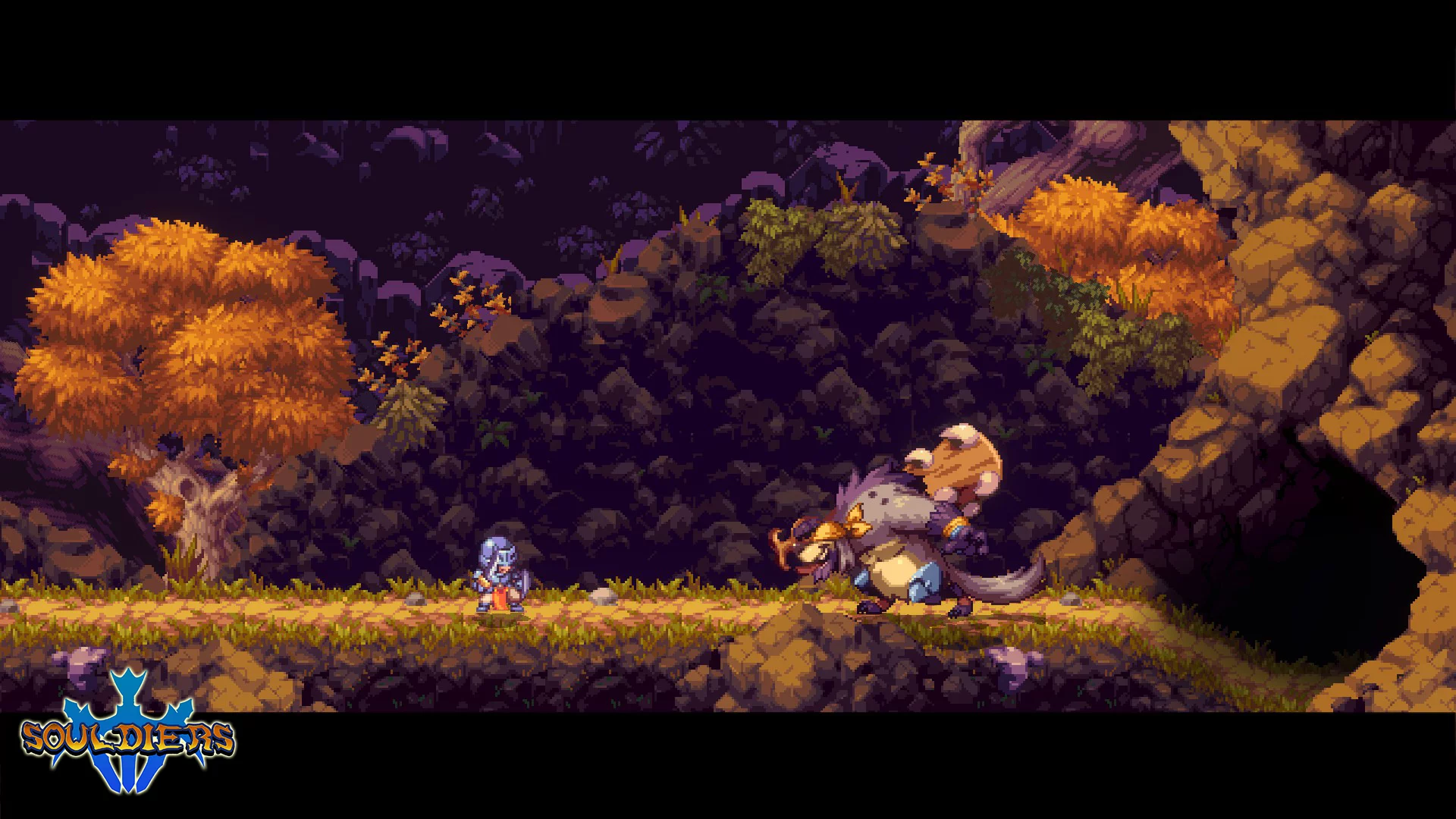
The biggest feature in Souldiers is the combat, which stands out from similar looking arcade slash ‘em ups by being at a much higher difficulty. More akin to something by the infamous From Software, even the standard minions in Souldiers can cause you real problems if you don’t take them seriously. The enemies are well designed and all boast a variety of attacks that can inflict high damage values and negative status effects. Players who neglect to learn how to effectively block, dodge and show patience in their attacks will quickly be swallowed up in battle, especially when dealing with multiple enemies at once. But whilst it’s difficult, the combat is mostly fair, and my frustrations never reached rage-quit inducing levels – though there were a few enemies who did severely test my patience!
I loved the technical approach to the combat in Souldiers, and this is no better highlighted in the multitude of boss battles that push your skills to the very limit. Designed with an inordinate amount of health, the bosses in Souldiers start with just a couple of easy to read attacks but expand their effectiveness and their arsenal as the fight progresses, until you need absolute precision and timing to overcome them. These battles are consumable-eaters and can be a suicide mission if you walk into them unprepared, and even when you are fully stocked, it doesn’t take more than a couple of mistimed attacks or dodges to entirely derail a good run.
Check out my run-in with the awesome Egyptian-styled boss, Babylon in the video below… and don’t let the tape fool you – I died about 10-15 times before succeeding with this attempt! Warning – spoilers ahead.
While I thought the combat was handled nicely, some of the traversal mechanics could be a little more problematic. I found the wall jumping frustratingly less responsive than in similar games and the automatic ledge-grab function both overzealous and infuriating when trying to evade enemy attacks. I can’t tell you how many times I died as a result of being unwantedly affixed to a nearby ledge that meant I couldn’t defend myself, or from the pull-up response that clambored me onto a ledge lined with spikes by even brushing ‘up’ on the controller. In a game where standard enemies are more than capable of killing you, I didn’t appreciate the mechanics giving them a tag team partner!
Despite the combat being very well put together, the precision required in battle highlights some of Souldiers peripheral flaws and adds a layer of difficulty that I don’t think is by design. Firstly, I found that scrolling between potions to find my healables in the midst of battle was entirely too fiddly. You can only scroll through the items in one direction, so if you panicked and pressed the D-pad one too many times, you’d have to cycle through all of the items again to find the one you wanted – dodging and blocking relentless enemy attacks all the while. And yes, you can bring up your menu and equip the correct potion there, but this breaks your flow and can ruin your timing with upcoming attacks, especially in boss battles.
Additionally, despite there being an enormous arsenal of sub-weapons in the game, very few of them see any action due to their limited ammunition and/or low damage. Aside from the bombs which you regularly use to unblock hidden routes, I hardly found any use for the other 15 or so items and found that they just got in the way as I scrolled through a huge list to find the one or two weapons that I actually wanted. Sadly, the special attacks suffer from a similar problem in that they take a huge amount of mana to employ, to the point that you don’t really get the chance to use them enough to master their usage. I understand that Retro Forge introduced both elements to try and add some variety to the combat, but they haven’t quite hit the mark and I found myself playing through most of the game without them and enjoying it just fine.
It would be remiss of me to finish my review without highlighting how great the Souldiers soundtrack is, and how wonderfully it adds to the atmosphere of Terragaya. The score has an awesome old school feel that brings fantastic layer of tension to the combat and immersion to the world; I especially liked the Floating Module’s theme, which has a technological and militaristic air, and the music for the Swamp of Hel that reeks of spooky happenings in the mulch and mists of a bayou. The entire soundtrack is top notch and puts Souldiers right at home among the legendary SNES-era games it’s inspired by.
A wonderful blend of top tier pixel art, retro-inspired music and seriously gritty combat makes Souldiers an enjoyable, though sometimes prickly, experience. It’s a title that boasts some engaging (if not lengthy) levels that are underpinned by some inspired metroidvania mechanics and filled with a myriad of well designed enemies. While perhaps overfilled with unnecessary items and burdened by a few mechanics that can’t help getting in their own way, Souldiers offers a fantastic challenge throughout, and the vibrant world of Terragaya is an absolute joy to discover.

In the interest of full disclosure, VGamingNews was provided with a copy of the game in order to conduct this review.
We Were Here Forever
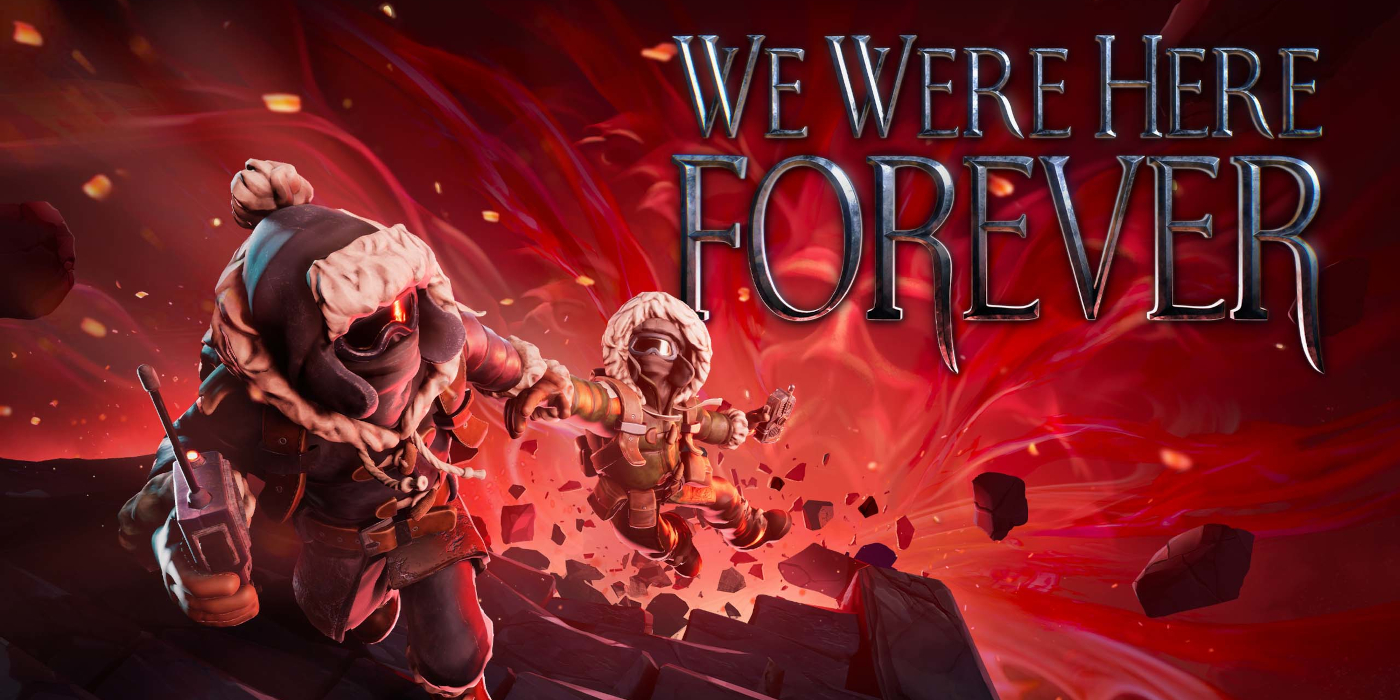

While it feels like a lifetime ago already, the W.A.S.D. event was an excellent opportunity for us to try out some upcoming titles and stoke some excitement at some of the stellar games just on the horizon. One that seriously caught our eye was We Were Here Forever, the fourth and newest entry to the We Were Here franchise from Total Mayhem Games that asks two players to escape from a fantastical castle designed to imprison them forever.
At A Glance
| Scores | |
| Visuals | 7 /10 |
| Sound | 9 /10 |
| Gameplay | 8.5 /10 |
| Overall | 8 /10 |
| Positives | + Fantastic co-op puzzle design + Well balanced difficulty level + Phenomenal atmospheric sound & voice-acting |
| Negatives | – Difficulties aligning player audio – Some puzzles can be broken, requiring a restart – Animation is odd in places |
| Price (When Reviewed) | £14.99 |
| Our Playtime | 18 hours |
| Available On | PC (Soon: PS5, PS4, Xbox Series X/S & Xbox One) |
Check out a few minutes of Gaz and Drew finding their feet early in the game. Warning – mild spoilers ahead
We Were Here Forever is an atmospheric co-operative puzzle game that requires two players to play – you take control of a pair of explorers who have to outwit the powerful king of the castle and his conniving court jester in order to escape. Unlike most co-op games the key feature here is that players are almost always split up from one another, and can only interact with each other using old-school walkie-talkies. Solving each puzzle requires elements from both players, and being unable to see what your partner is doing therefore requires each player clearly communicate what they can see and interact with so that you can understand the full picture.
Things did not start off smoothly.
Gaz and I struggled with the voice chat when we logged in for the first time, which is absolutely pivotal to being able to play the game. We were able to join one another in the lobby but neither of us could hear the other talk and the game wasn’t showing any icons indicating that the other was chatting. The problem persisted through numerous restarts of the game and headset tests in multiple other programs (which were working fine), until eventually the game just decided to work. There was no rhyme or reason to what made things suddenly work, but we didn’t spend too long pondering it – we were simply happy that we could finally play!
These audio issues continued in each play session, and we eventually realised having one player restart the game and continually join and leave the party would eventually resolve the problem. While this made the issue a little easier to manage, it didn’t change the fact that a fundamental part of the game seemingly needed the stars to align in order for you to even get started, which is very disappointing. Thankfully though, the experience itself more than made up for the technical issues once you were in and playing the game.
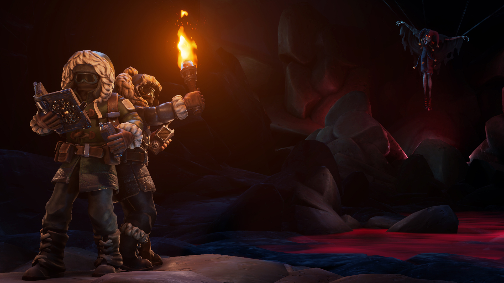
Visually speaking, We Were Here Forever has a pretty playful art direction – there’s a certain chunky-charm to the characters and assets that somehow reminds me of Warcraft, only scaled-up and presented in first person perspective. The environments you explore are fantastical and diverse, and players who enjoy free-form fantasy are in for a treat as they muddle their way through enormous toy box-prisons filled with portals, sinister villages and their surroundings, and an underwater biosphere to name but a few.
This isn’t a game that’s going to blow you away with high-definition textures and interactive scenery, but the visuals are attractive enough to sell the style and atmosphere of the levels without being especially demanding on your hardware. There are a few animations that have been questionably omitted considering the general level of polish, leading to a few occasions where your character is seemingly interacting with an item just by walking into it like a mid-90s NPC, but these stand out because they’re the exception rather than the rule. Gaz and I did run into some lag for short periods when exploring the larger open areas, but it’s worth noting that neither of our machines is especially meaty – We Were Here Forever is a title you can still enjoy to the fullest even on the lowest settings.
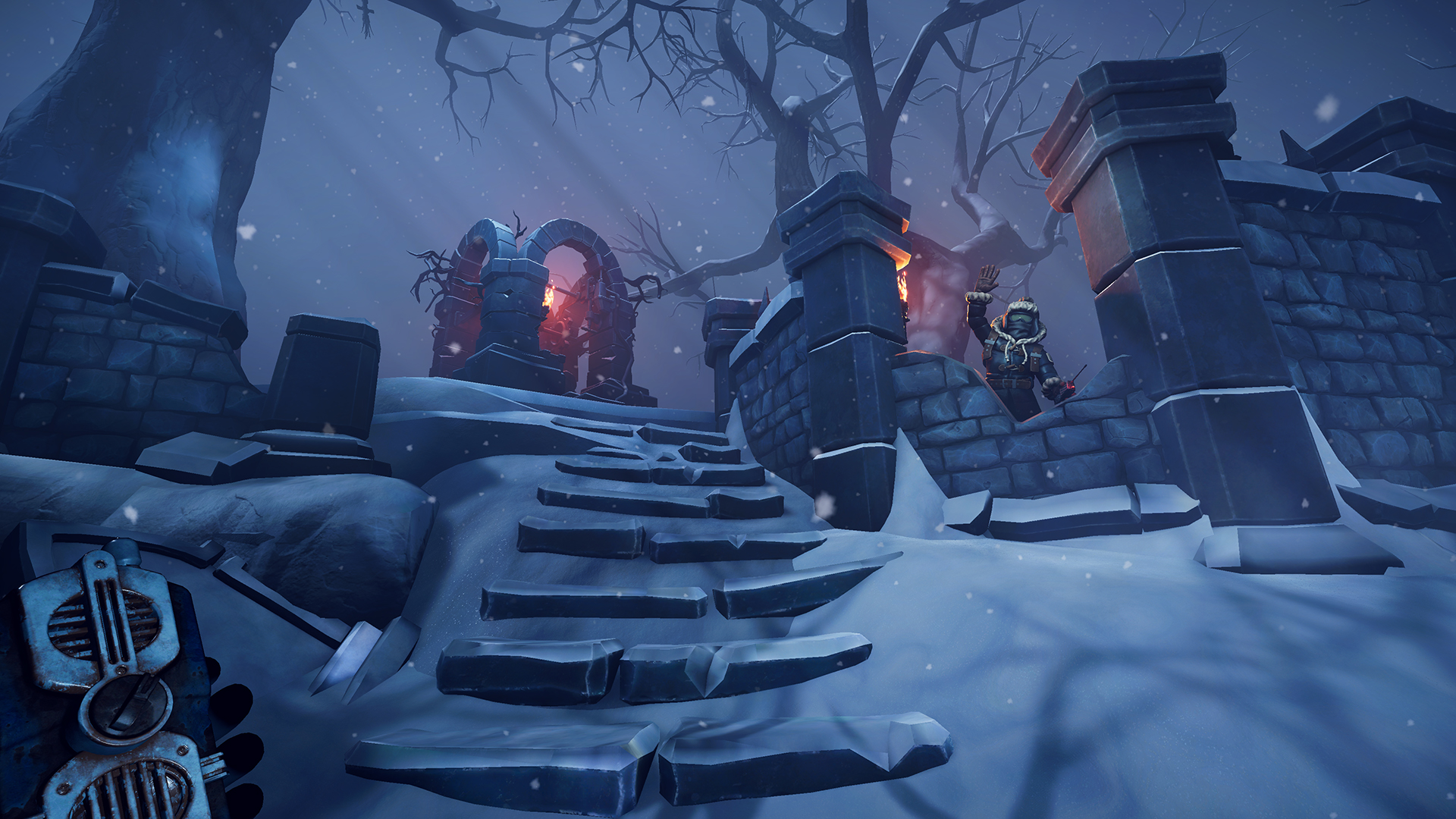
And speaking of enjoyment, puzzle fans will get a hefty helping of it from the designs in We Were Here Forever, which balance simple premises with tricky executions throughout the game. There’s an old-school tabletop role-playing feel to some of the solutions, where you have to find keys, rearrange items and mix potions in order to overcome your environment and continue on your escape. There are a lot of two-part ciphers in the game, where one player will have a code and the other the means to crack it, along with a tonne of puzzles requiring you pass resources back and forth at the right times to allow you to progress.
I have to applaud Total Mayhem Games for the job they’ve done in introducing visual clues about the puzzles without being too overt – there’s some clever stylisation that ties things together that an astute player can spot without having the answers screamed out at them. The keys to solving the puzzles are often there for you immediately – it’s all about whether you have a keen enough eye to see them and the skill to communicate them effectively with your partner so that you can get a full understanding of what’s being asked of you. We Were Here Forever might have you stumped for short periods throughout the game, but the puzzles aren’t so mind-achingly difficult that you’ll give up out of annoyance, and that’s testament to well balanced design and a pleasant, but nonlinear, difficulty curve.
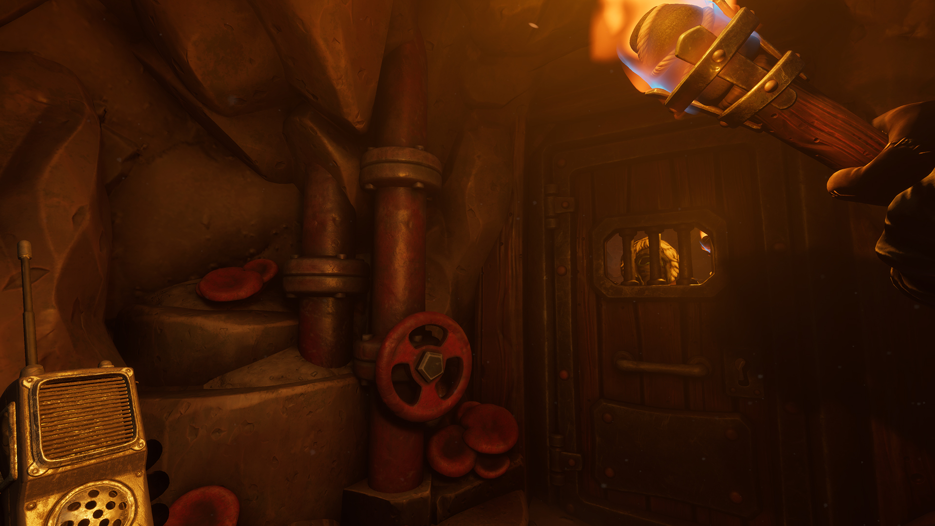
While there are a number of excellent individual puzzles in the game, the one that stands out as being the most enjoyable for us centred around “verbally”communicating with a rather spectacular NPC. Without wanting to give away too many spoilers, you’re required to listen to this character speak in an other-worldly language, translate it and accurately reply using a series of machines and doodads. It’s an absolutely fantastic series of interactions that caused us some confusion, a little stress and lots of laughs as we tried to describe the noises to one-another. It was so well implemented that we almost couldn’t believe what we were being asked to do, such was the uniqueness of the task!
It’s not all smooth sailing though, as Gaz and I did manage to break a couple of the puzzles; once requiring us to reset the game and battle with the audio connection again before re-completing the entire puzzle from the beginning. Each occasion where we broke a puzzle and got stuck was quite avoidable and seemed to be issues that just hadn’t been found during play-testing, which I can understand but doesn’t do much to mitigate the frustration in the moment! (For full disclosure, our playthrough was completed prior to the games latest patch on 10th June 2022, so these issues may already have been patched out.)
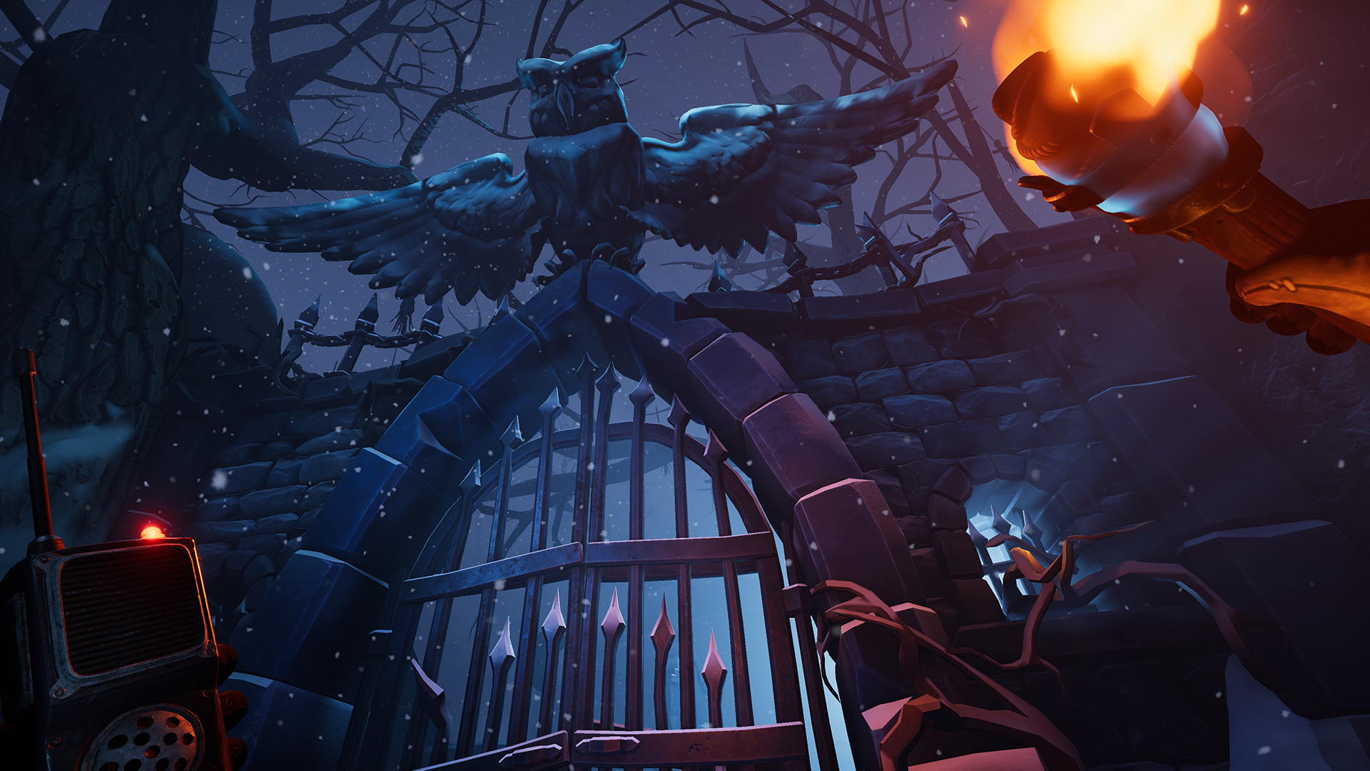
While the puzzles are nicely designed and the visual style is attractive, the real plaudits have to go to the sound design, which is where We Were Here Forever really shines. The atmospheric soundtrack and thoughtful ambient sounds do the heavy lifting in connecting the players to the surroundings in each area, and there’s great continuity with the visual themes too. Most impressive though is the voice acting, which is absolutely top-notch from start to finish. While the cast is pretty much limited to the deranged jester and the booming voice of the furious king, the script is well written and delivery is exceptional, leaving our mouths agape after almost every single cutscene. While We Were Here Forever could simply have been delivered as a series of standalone escape room-type puzzles, the impressive performances of the two major characters adds depth to the experience and drives you to appreciate the world and storyline that Total Mayhem Games have built.
Upon completion, Gaz and I agreed that We Were Here Forever’s run-time probably fell right in the sweet spot; with a play time averaging around 11 hours, you and your partner have plenty to get your teeth into without feeling like the themes and puzzle styles got repetitive or stale. If anything, we would have liked just a few more hours of gameplay, but that’s simply us enjoying the experience so much that we’re maybe being greedy!
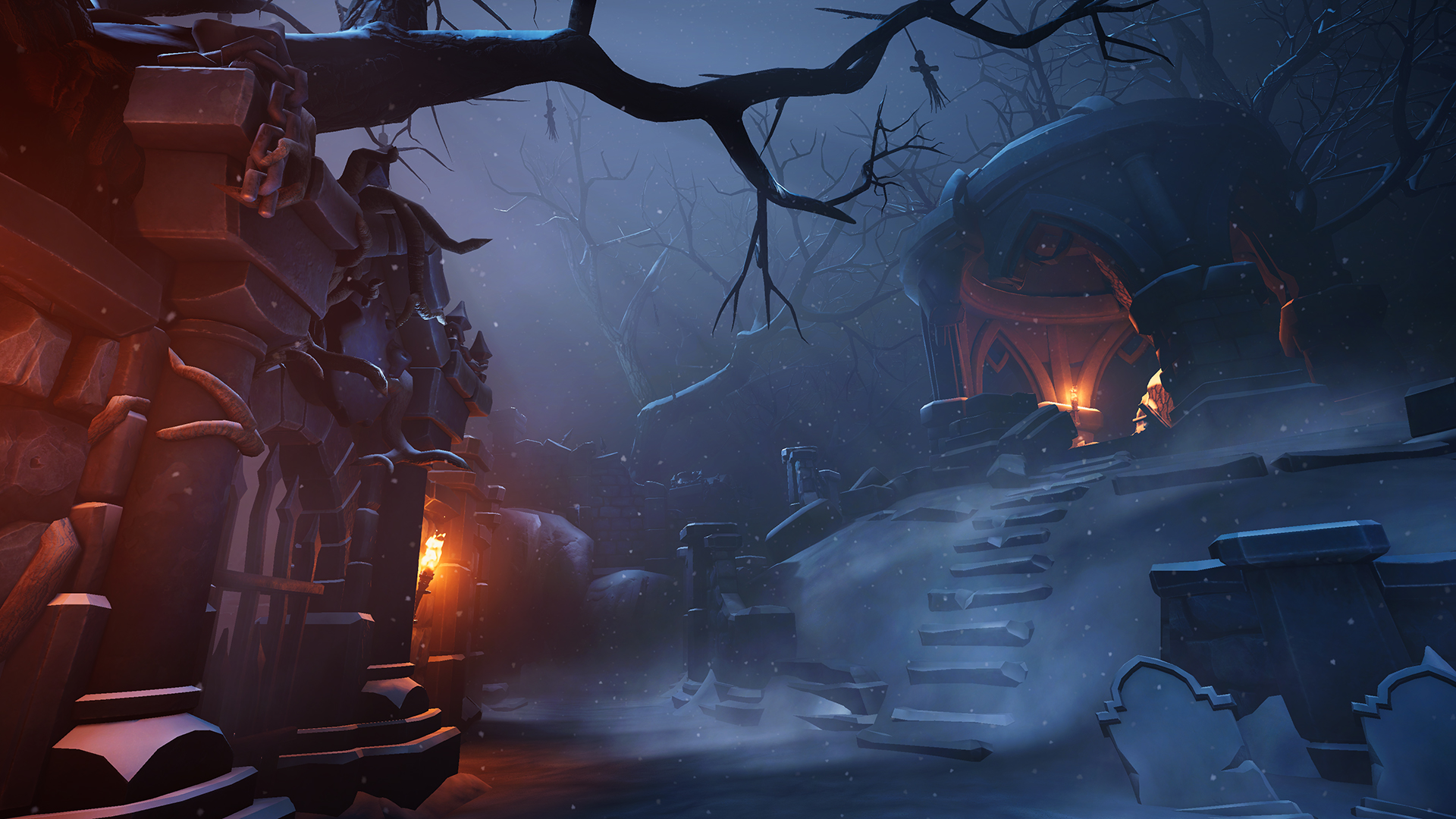
Gaz and I have known each other for decades and have played a lot of puzzlers together over the years, but we both agreed that We Were Here Forever stood out as one of our most enjoyable experiences. The creepy fantasy theme is delivered in a great visual style and hammered home by some phenomenal voice acting, and each cut-scene dragged us deeper into the lore and kept us invested in what we were doing. The puzzles are well designed (for the most part) and require enough thought to be challenging without causing frustration that disconnects you from the game. Yes, some voice chat problems and a couple of broken puzzles did cause annoyance, but that wasn’t enough to turn us off from a fantastic experience – We Were Here Forever is an absolute must for puzzle and escape room fans alike.

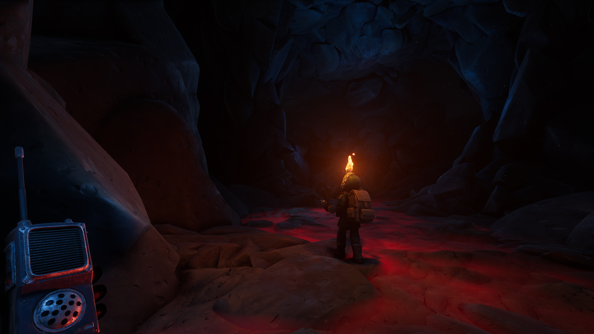


In the interest of full disclosure, VGamingNews was provided with a copy of the game in order to conduct this review.
Silt
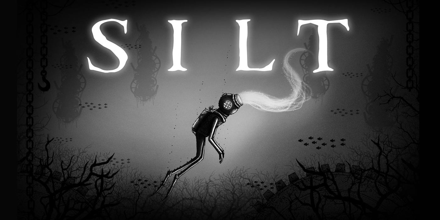
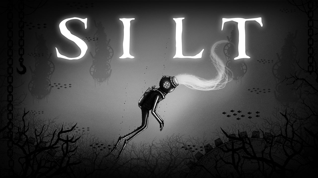
Little captures my attention like a distinct visual style in a video game and seeing the artwork for Silt plastered around the Fireshine Games booth at W.A.S.D. seriously piqued my interest. A explorative puzzler set in the crushing depths of the ocean, Silt asks you to embody a silent protagonist with a frightening mystical ability to possess other sea creatures, and you must use your wits to overcome some terrifying leviathans in an attempt to awaken a mysterious and terrible machine. After a brief chat with the two developers of Spiral Circus Games and a hands-on demo, I knew that immediately Silt was a title I wanted to get my hands on the minute it was released.
At A Glance
| Scores | |
| Visuals | 9 /10 |
| Sound | 7 /10 |
| Gameplay | 6 /10 |
| Overall | 7/10 |
| Positives | + Unique and beautifully sinister art style + Atmospheric sounds of the oppressive depths + Haunting world full of mystique |
| Negatives | – Puzzles aren’t especially challenging – Ends just when you want it to ramp up – Very vague story may turn off some players |
| Price (When Reviewed) | £11.99 |
| Our Playtime | 3 hours |
| Available On | PS5, PS4, Xbox Series X|S, Xbox One, Nintendo Switch, PC |
The story begins as a lone diver, equipped with traditional iron mask and flippers, awakens on the seafloor, chained to a weight that is holding him down. Totally unable to move and with darkness all around you, you’re prompted to ‘possess’ a nearby piranha, and once in control of the fish, use its razor sharp teeth to bite through the chain shackling you to the bottom. You swim away, rising to explore an underwater world that’s filled with deadly sea life, forgotten relics and ancient secrets. It’s a sinister introduction to a world that only spirals further into the bizarre and wonderfully sets the tone of the rest of the game.
The possession mechanic is simple enough but certainly plays out in dramatic fashion; a gleaming white tendril, like that of a sea cucumber, surges from the divers mask towards the target creature, allowing you to control your prey once you ensnare them. Once possessed, you can freely move the creature around and use any special abilities they have and can even jump from one creature to another should you wish. Possessing other creatures is the divers only means of self-defence, and you’re entirely at the mercy of the twisted denizens of the deep as you swim around and explore. All of the game’s puzzles revolve around possessing one or more animals in the right order, allowing you to access areas and perform tasks impossible to other creatures. From the smallest minnow to strongest hammerhead shark or the speediest eel, every fish has a purpose and it’s up to you to figure out just how to manipulate them in order to proceed.
Sadly this won’t take you too much thinking, as you’re only ever provided the one or two sea creatures that you need to unpick the task at hand, and the solutions are often easily identified in just a minute or two. The puzzles often revolve around using a fish’s abilities to work your way around a barrier before eventually breaking it to allow the diver to pass. It’s fun to swim around as different creatures and jump from one to the next in order to traverse the battered environments and avoid nasty predators, but there certainly isn’t a lot of challenge provided by Silt, even in the boss encounters (as undeniably cool as they are).
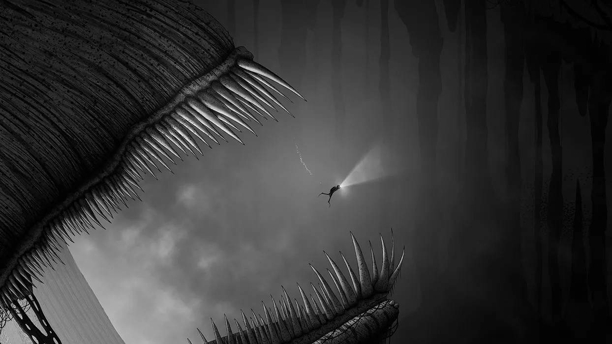
So if the puzzle solving isn’t going to knock your socks off, what exactly should excite you about Silt? In short, the incredible aesthetics and oppressive atmosphere, which are second to none.
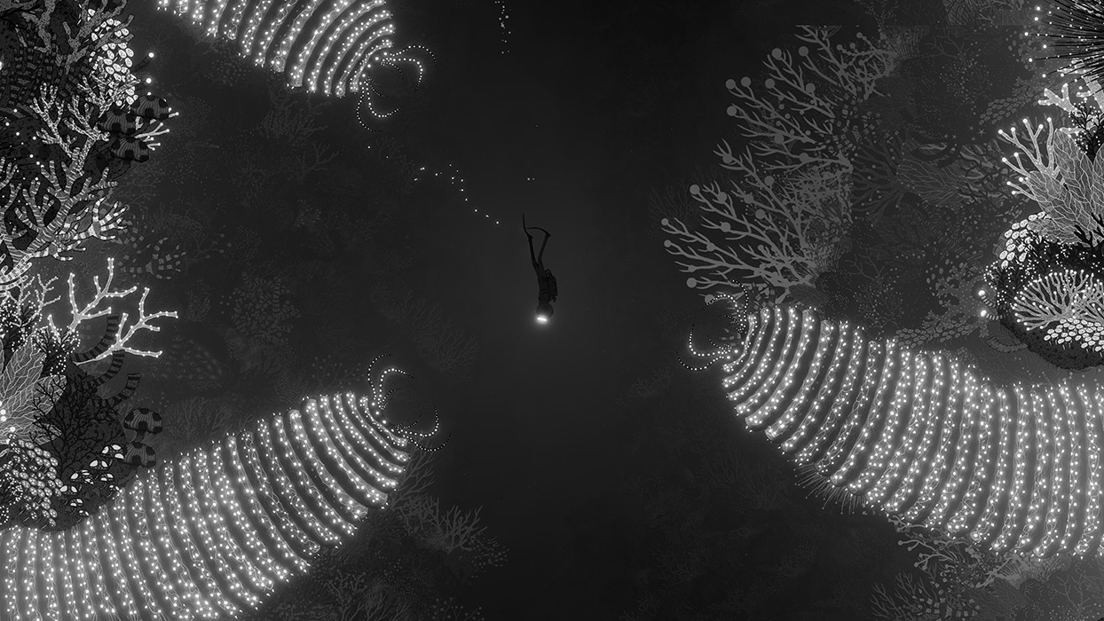
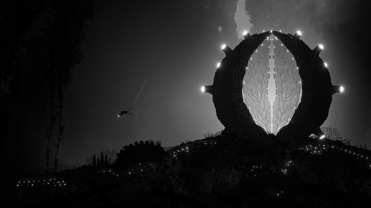
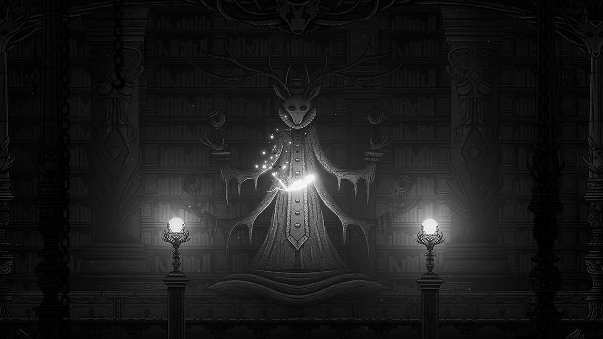
You’re submerged in the surreal and dark realm of artist Tom Mead from the get-go, and the more closely you inspect the entirely hand drawn visuals, the more impressive they become. Silt is portrayed using an entirely grayscale palette, where inky black foregrounds are silhouetted against the bright light of the divers torch, and radiant whites are used to depict raw power and energy.
Visually, the scale of the backgrounds is breath-taking. Such is the level of genuine depth and detail on display, there are moments in the game where you truly feel like a meaningless plankton amidst gargantuan and sprawling ocean scenes. It’s immediately clear that H. R. Giger was an inspiration for the visual theme; the backdrops are sinister and foreboding; littered with subtle disturbing imagery, and some of the sea life displays a level of menace that’s truly hard to describe. The Bournemouth Arts Institute product has realised a fantastic vision of deep sea dystopia, with endless mysteries hinted at beneath layers of macabre plant life and grim machinery.
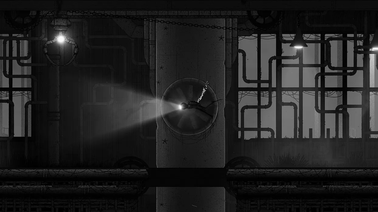
Hand-in-hand with the impressive visuals is the sound design, which manages to remain understated whilst also seriously overperforming. Most of the in-game sounds are that of the ocean, with the divers raspy breathing within his helmet and releasing air bubbles narrating the majority of the game. This isn’t relegated to background noise though; there’s a section in the middle of the game where you’re forced to listen to the diver struggling for air and the tension is seriously ramped up as his breathing quickens and becomes more ragged. I’m struggling to describe the other important pervasive sound that adds so much to the atmosphere but I’ll do my utmost! As you dive further into the depths, the sounds become more muffled and you can feel the oppressive weight of the ocean above threatening to crush you. You can almost feel the pressure build in your ears as you swim down, and I can’t emphasise enough how much this adds to the experience as you navigate the murky depths. I loved Silt’s musical score too, where muffled, sinister strings work to enhance the visual stylings and create a genuine air of menace, with sudden bursts of glorious mysticism thrown in as a reward for overcoming a trial.
I played the entirety of Silt with the lights off, headphones on, and volume ramped up, and I’d say you’ll undoubtedly get the best experience by doing the same.
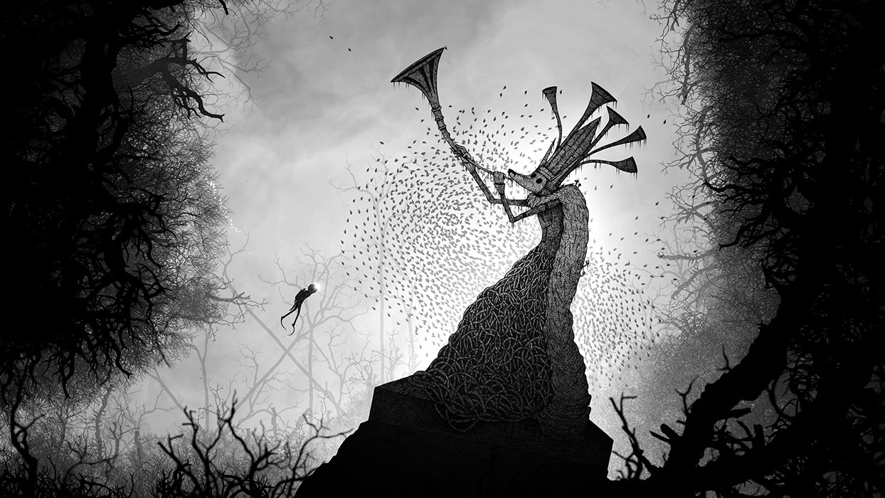
Like the art style, the storytelling in Silt is surreal and abstract. Nothing is explicitly explained to the player, with the plot hinted at through environmental means as your swim from one area to another. The environments undoubtedly exude a deep sense of history and backstory, but they aren’t offered to the player in a way that allows you to truly understand what has happened and what’s going on. You’re merely allowed a peek through a porthole at the wreckage of a ruined world, where the stories chronicling the fall have sadly been lost to time. Taking in the story of Silt is like looking at a painting in a gallery – everything is implied and you have to look carefully to piece together signs that explain what the artist is trying to convey. As an artistic soul, I loved drifting through Silt’s dark world and pondering the meaning of the environments and imagery, but I fear that players used to more direct storytelling may miss the point a little and wonder what all the fuss is about. Ultimately, Silt is delivered more as an artistic vision than a story; it aims to leave you intrigued and wanting to know more – and in that it certainly succeeds.
Unfortunately, with the vast hand drawn visuals demanding a huge amount of work, the length of the game is understandably impacted. Silt has a run time of about three hours, which is plenty of time to experience the gameplay on offer but did leave me feeling that there was scope for so much more. The world has the potential to pull you into a deep and impressive mythos, but there simply isn’t the time or narrative tools provided to fully do it justice. While I can’t deny that I sat open-mouthed at the evocative ending to the game, I quite simply wanted more – it would have worked as a wonderful springboard into more areas, more possessions, and more puzzles. More everything.
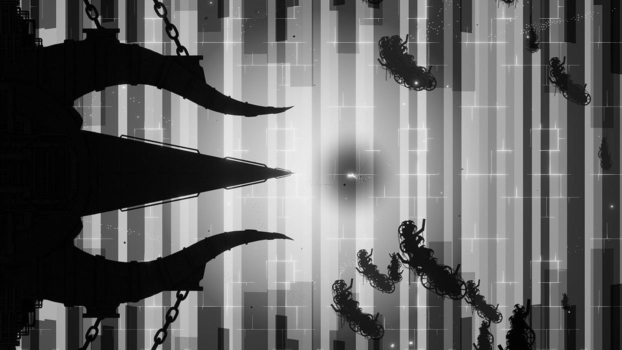
Early impressions of Silt seemed to describe the game as Limbo crossed with Abzu and while that description isn’t a million miles away, I feel it does Spiral Circus Games a disservice, with their debut title very much standing out as a great game in its own right.
Silt is a truly stunning game, with dark visuals that draw you in and impressive sound design that underpins a murky and sinister world. The simple puzzle solving acts more as a conduit for the artistic vision than to offer a legitimate challenge, but the experience is undoubtedly enjoyable despite the gameplay offering little in the way of difficulty. The story is a little vague and open to interpretation, but artistic-types will find it genuinely intriguing – the only real downside is that you’ll certainly be left wanting more, with the story reaching a haunting crescendo just when it feels like it could open the door to so much more. I would play another game set in the universe of Silt in a heartbeat.

In the interest of full disclosure, VGamingNews was provided with a copy of the game in order to conduct this review.
Skabma – Snowfall
Video games really are the best thing ever. On the one hand they allow players to do things that they can’t do in real life, like double jumping or throwing fireballs. Other times, they allow you to focus on stories that tell fantastical tales about a culture that’s not really had any mainstream exposure before. Skábma – Snowfall is one of those games that combines both of these traits into one package.
At A Glance
| Scores | |
| Visuals | 7 /10 |
| Sound | 8 /10 |
| Gameplay | 6.5 /10 |
| Overall | 6/10 |
| Positives | + Beautiful story + Relatively easy going + Excellent sound design |
| Negatives | – The camera does what it wants – Dips in performance – A bit too vague on what to do |
| Price (When Reviewed) | £15.49 |
| Our Playtime | 8 hours |
| Available On | PC |
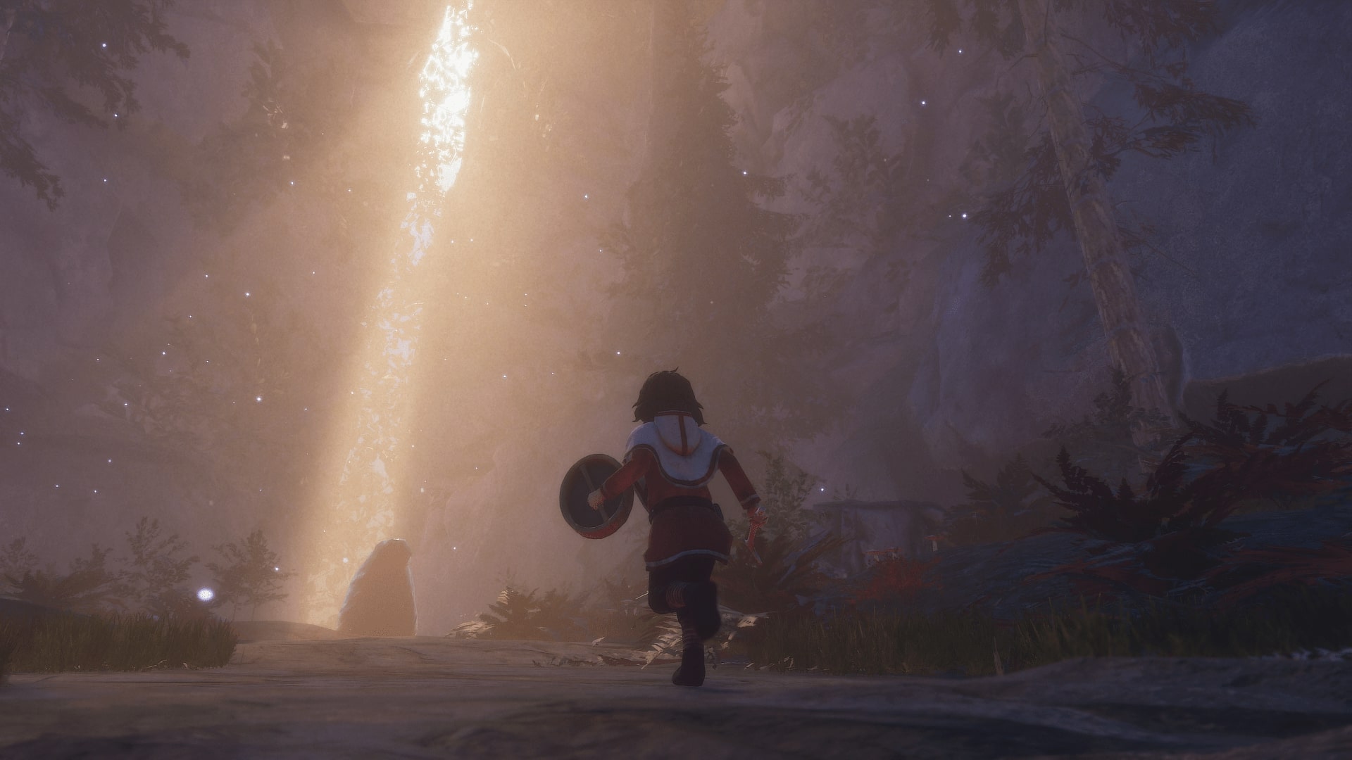
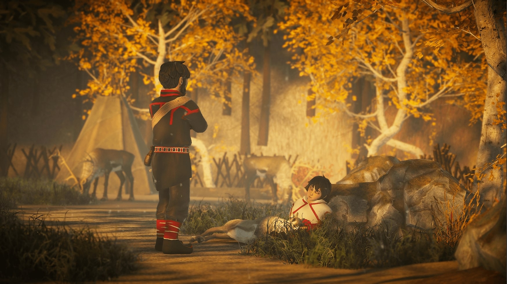
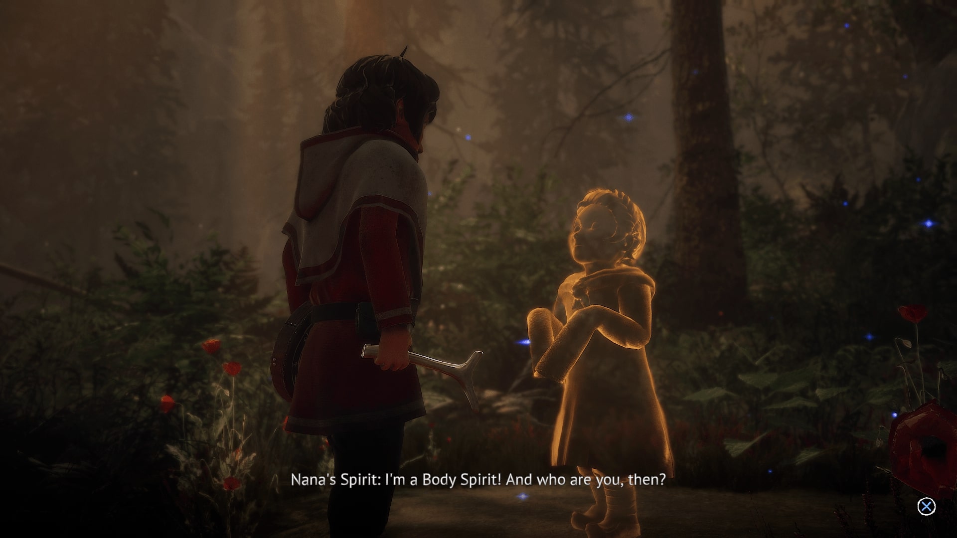
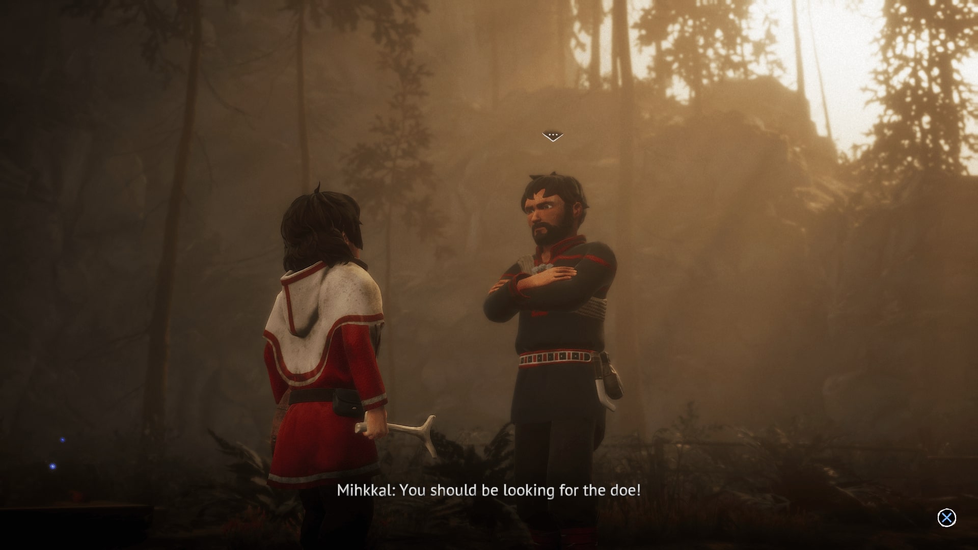
Skabma – Snowfall stars Áilu, a young member of the nomadic Sámi tribe whose only job is to look after the reindeer for his uncle. He’s the typical young boy slacker and immediately falls asleep on the job, allowing one reindeer to break loose from the camp. From here, the plot takes a sinister turn as Áilu finds out there is a pending environmental disaster looming. After finding a magical Noaidi Drum, we set off and look towards saving the small camp and the land around it.
The Sámi tribes are a semi-nomadic people who were historically located in the area north of Norway, in what is now Lapland, as well as parts of Finland and Russia. Typically their history, folklore and tales are largely oral rather than written, and this is why developers, Red Stage Entertainment, want to highlight these people and tell their story with Skabma. To do this, they’ve poured the fairy tales that were told by the fireside and combined them with the typical day to day living. This is shown with Áilu’s upbringing, raising reindeer for sale and meat are the lifeforce of the Sámi people and how they navigated survival in a time when Vikings were conquering the world. This gives a weight to his uncle’s threats to move him to a different family when the reindeer makes its escape.
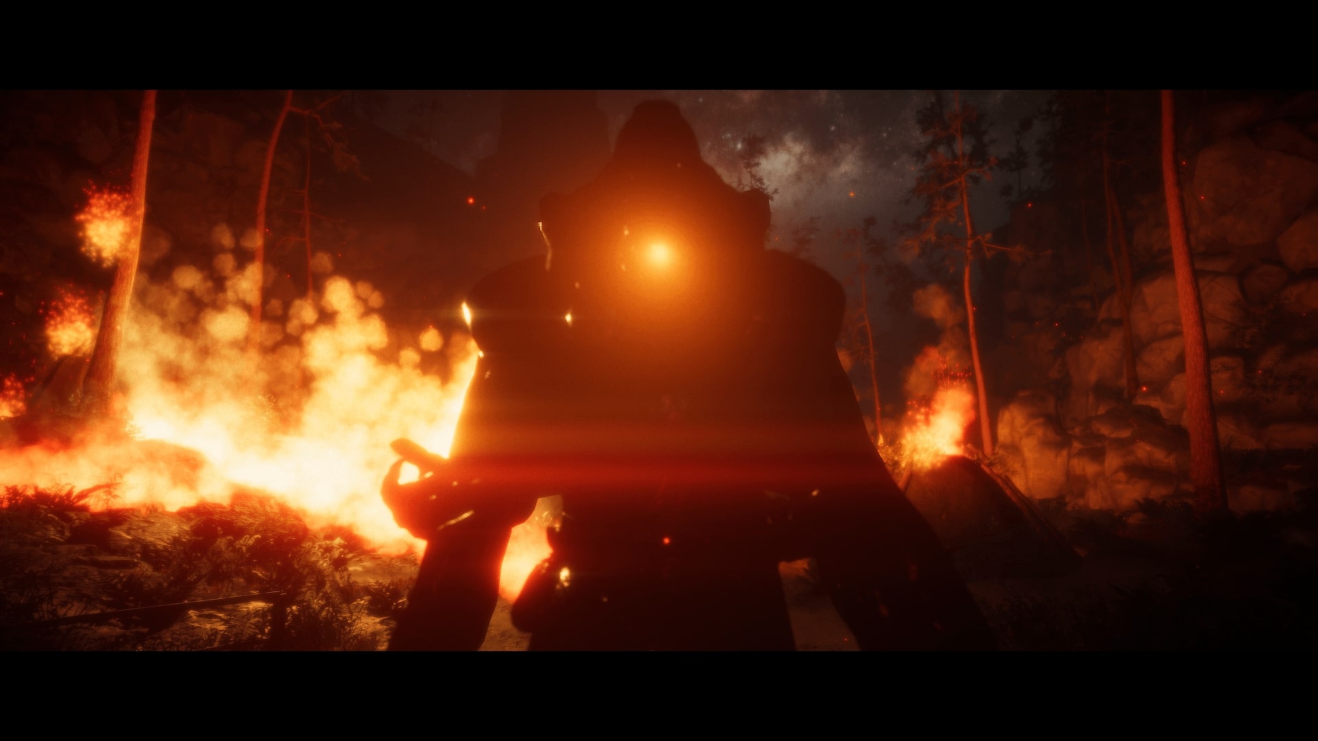
Skabma is a narrative driven game and moves from the simplicity of chasing reindeer and introduces magical elements almost immediately. After the beginning of the cataclysmic event, Áilu is visited by the spirit of a long lost protector; it informs him that there’s an ecological disaster just waiting to happen and it’s up to him to find the four Familiar spirits and stop whatever is going to happen. The key to that is the Drum. The Drum aids the exploration by highlighting certain objects and eventually unlocking powers for Áilu, such as a dash move that helps him leap across large ravines.
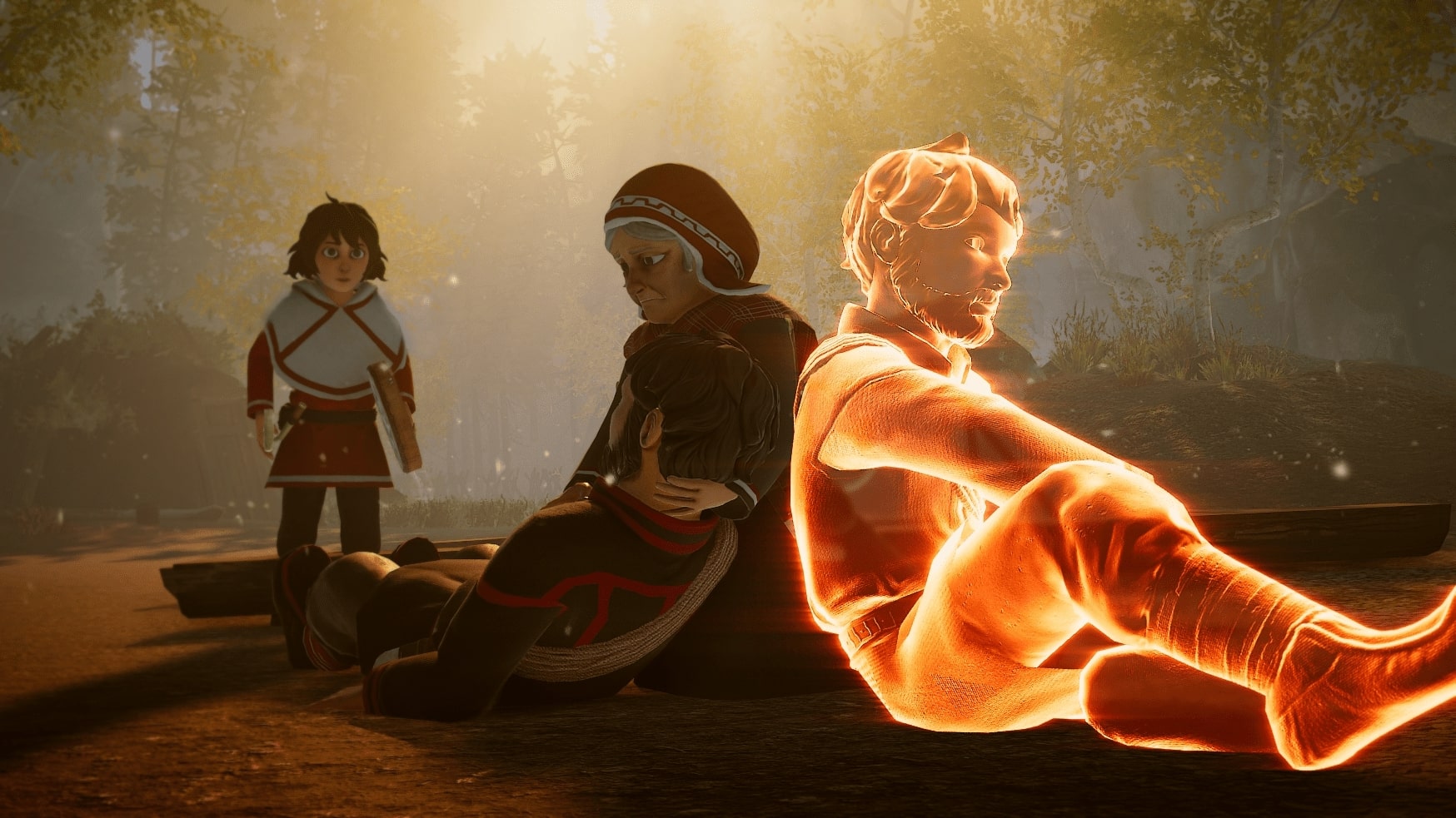
There’s no physical battles to undertake, as Skabma is more focused on telling a story of the relationship of the tribe and the world around them, but the more I explored, the more I discovered the history and mythologies around the tribe and their battles with outside influence. This might sound like heavy subject matter but because of the way the game is paced, what I learned felt natural and exciting rather than a boring history lesson firing information from start to finish. The game also breaks up the main story with humorous side quests, like finding your cousin’s lost bunny rabbits and trying to stop a teenager being horny with random strangers, all of which softens the tone and gives the game more humanity.
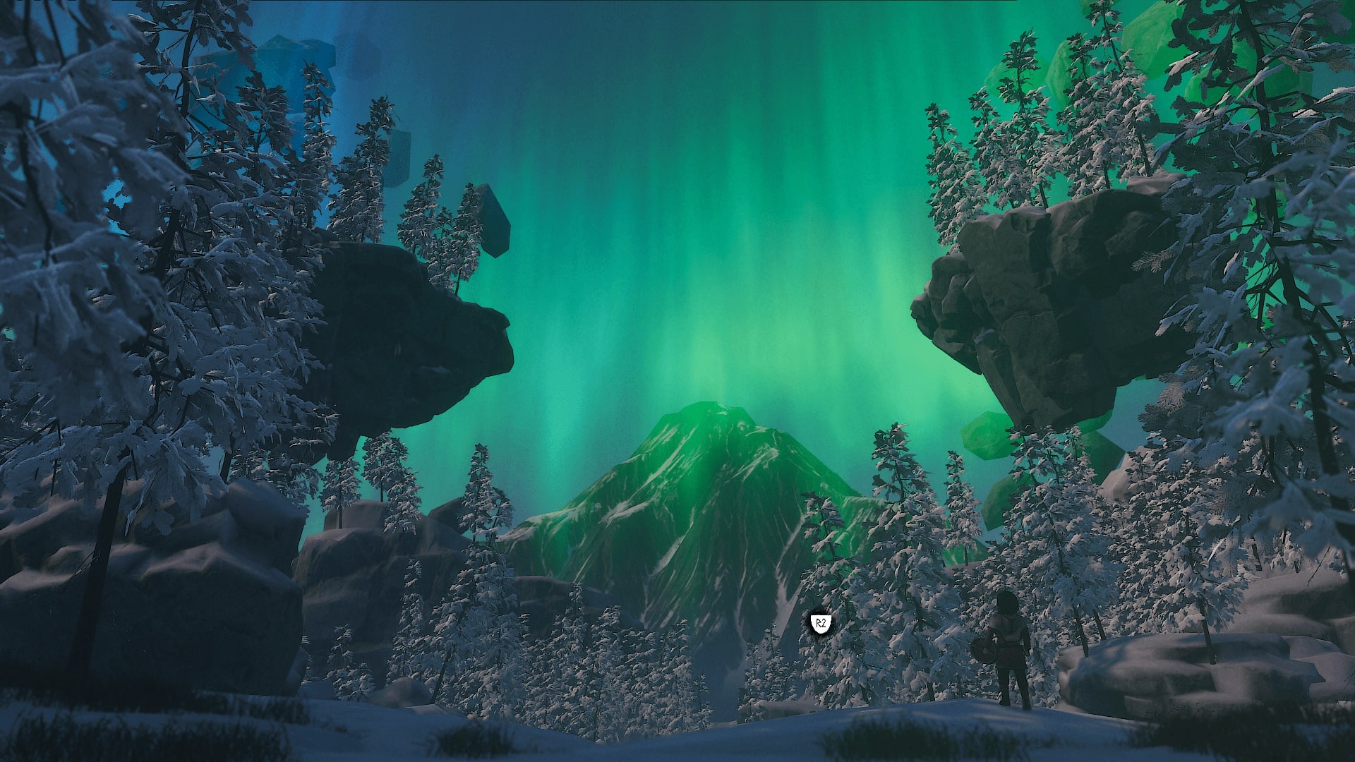
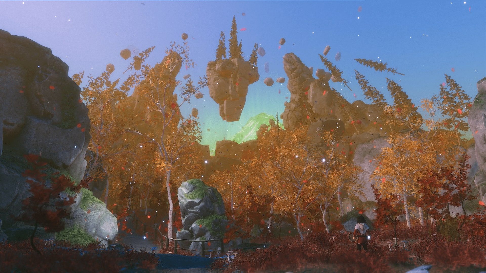
As Áilu sets off on his journey, the mountainous region really pulled me into the game. It was a beautiful vista that’s really well created and as the magic begins to happen, first coming from the Drum and later, the environments around Áilu, things only get better. There is a scene early on in the game that couples the blues and reds sparkling from the Noaidi drum and when it was paired with the view of the northern lights, it was certainly a sight to behold, even when playing on my rickety old PC.
The sound design of Skabma is equally lovely as well. There’s a tribal soundtrack set to the exploration that doesn’t overpower the game, but rather provides a sense of calm. And when Áilu is sitting around a fire, listening to grandma’s folk tales, he’d contribute his drum skills to enhance the story. While the soundtrack won’t have any classic earworms akin to something like Final Fantasy, it was a soothing experience and contributed well to the overall presentation. Where Skabma excels is that the story is narrated in the native Sámi tongue with English subtitles. While I don’t know if the voices were over the top or cheesy, I thoroughly enjoyed the immersion this brought.
As with any game, Skabma isn’t perfect. While exploring the Scandinavian mountain range, I quickly found that the camera would rather look at the ground beneath Áilu’s feet. Working with a controller, the camera simply wouldn’t stay in place and I felt I was adjusting the camera angles more than moving the character throughout. In tight spaces, of which there are many, the camera somehow got worse. It was either too close to see anything or so far away that the environment partially obscured the screen. Switching to the mouse and keyboard layout fared a little better but anything more than the slightest twitch of the mouse resulted in a complete freakout on screen.
The other sticking point was that the objectives weren’t exactly clear. Early on in the game you’re set the task of healing a character who falls ill. I progressed to a point where I thought the mission was completed – giving the medicine to the right person. Looking at the objective list though, I found it wasn’t crossed off, so I ambled around trying to work out what to do. I eventually figured out the resolution but having been guided through the objective to suddenly be left to my own devices was a bit jarring. This isn’t a one off either. In Skabma, you’re often left it; there’s no map or any form of guidance, so I often felt a bit lost trying to find the next step of the game. It wasn’t too much of a problem, as I was happy to enjoy the environment, but it was needlessly vague.
Skabma – Snowfall tells a beautiful story of the Sami people. While the story weaves through realistic situations of survival, it’s coupled with a magical and mystical folklore that has not been told in such a way before. The visuals are brilliantly represented and having the game told in the Sami language was refreshing. There are some issues with the camera and the lack of clarity on some missions did leave me scratching my head, but the message that Red Stage set out to tell works brilliantly and is an experience I’d want to play again, despite the pitfalls.



In the interest of full disclosure, VGamingNews was provided with a copy of the game in order to conduct this review.
Onde
I am not a religious person, or even an especially spiritual one, but I’ve often felt a deep connection to music that I feel comes close. There have been moments in my life where an album, a verse or even a single melody has struck a profound chord with me and helped shape who I am as a person. Knowing that music plays such an important role in my outlook on life, I was very intrigued by sound-surfing ‘platformer’ Onde from Lance and 3-50, which promises a surreal journey where music plays a huge factor.
At A Glance
| Scores | |
| Visuals | 8 /10 |
| Sound | 9 /10 |
| Gameplay | 5* /10 |
| Overall | 7* /10 |
| Positives | + Awesome ‘out of this world’ visuals + Evocative music that ‘describes’ the gameplay + Great atmosphere created throughout |
| Negatives | – Limited hands-on gameplay – Abstract style won’t appeal to everyone – Slow repetition of sections if you make a mistake |
| Price (When Reviewed) | £10.99 |
| Our Playtime | 4 hours |
| Available On | PC |
Let me preface everything I’m about to write by saying that Onde is not your typical videogame, and as such, is difficult to review in a sense that’s comparable to other titles. While this might sound a tad eye-rolling, having finished Onde, I actually consider it more of an experience than a game, and that makes scoring it as I would another game off the shelf a little tricky. I’d describe Onde as a musical traversal title with some puzzle/platform elements sprinkled in, but one that mostly asks that you sit back and enjoy the sights and sounds of the world that Lance and 3-50 have created for you.
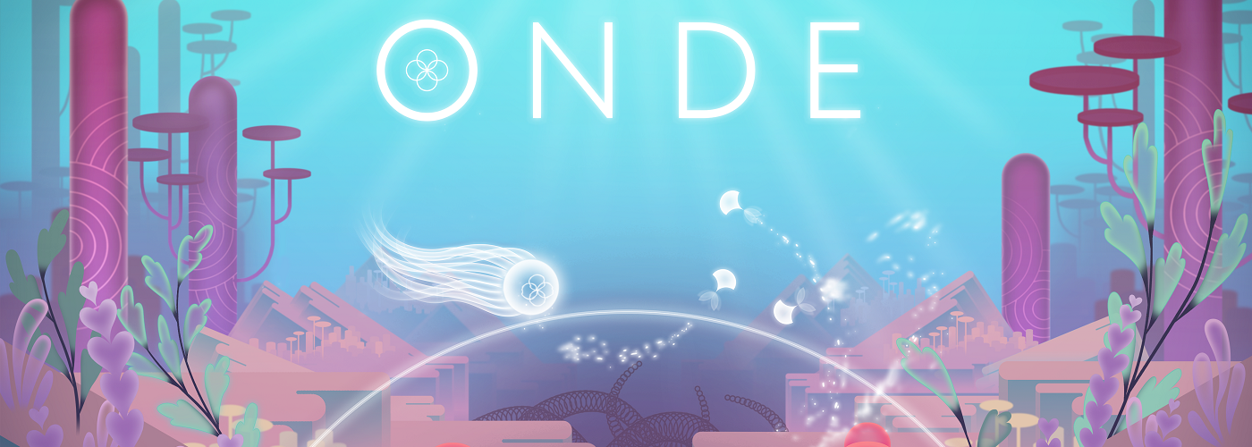
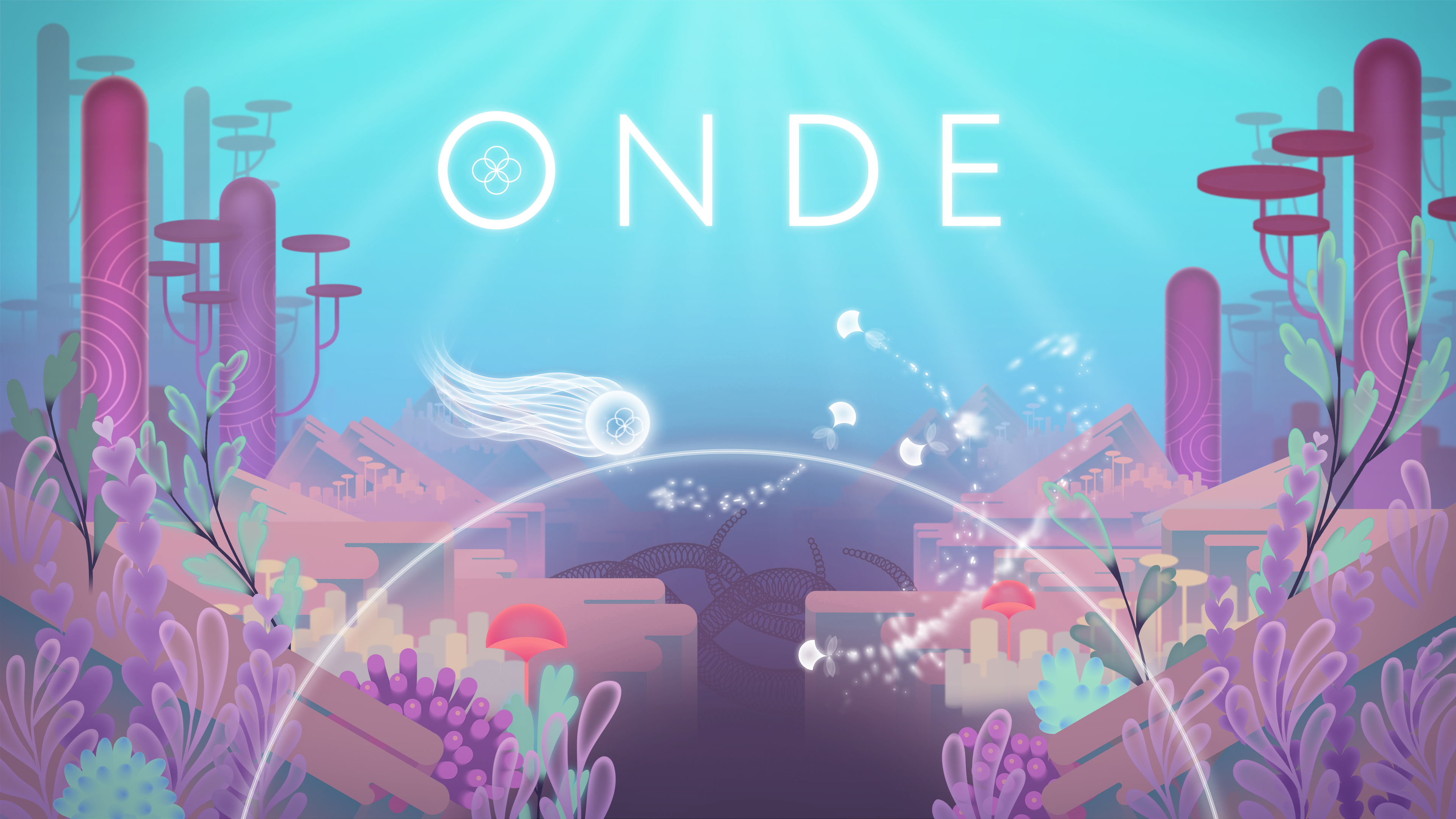
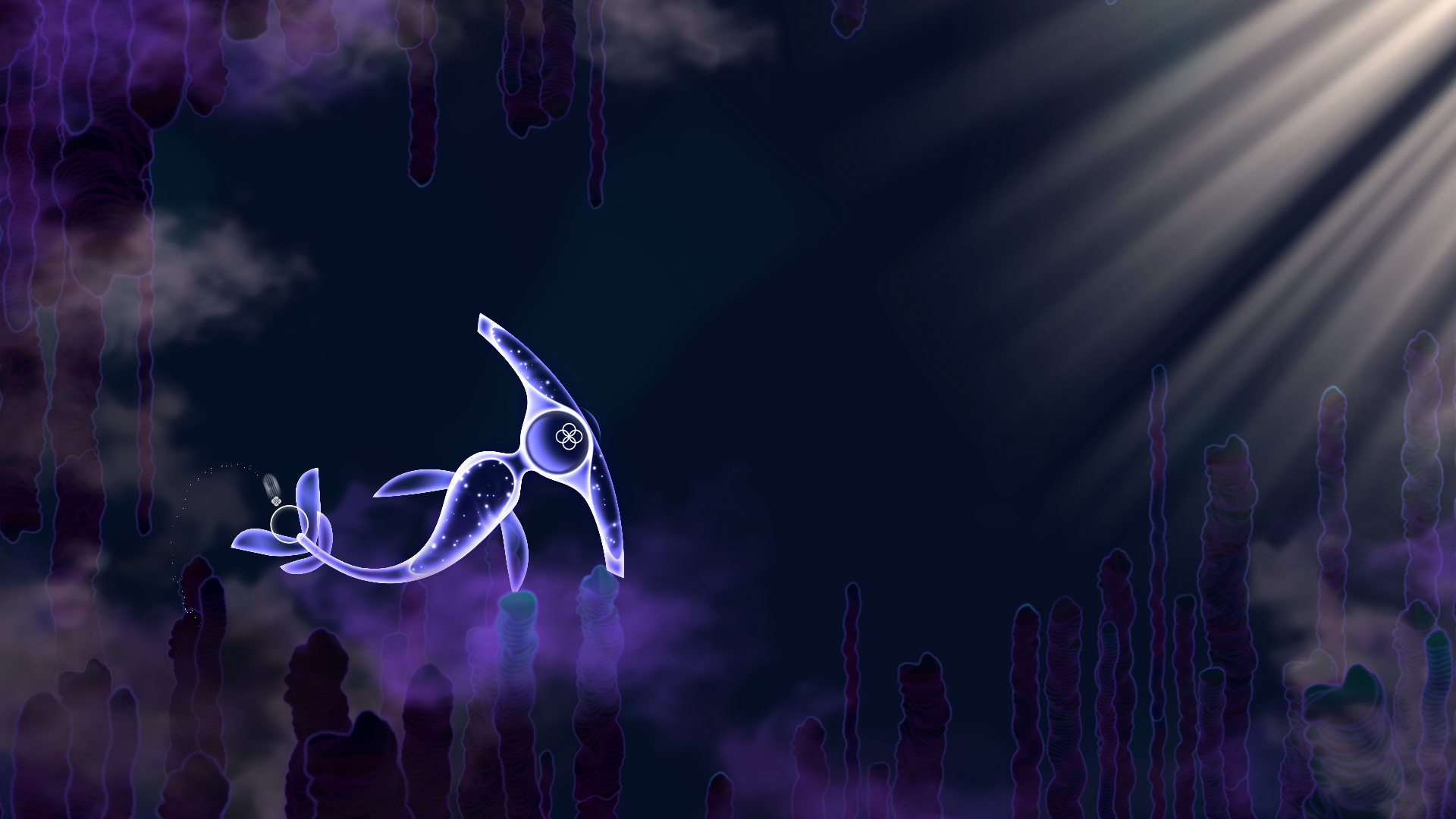
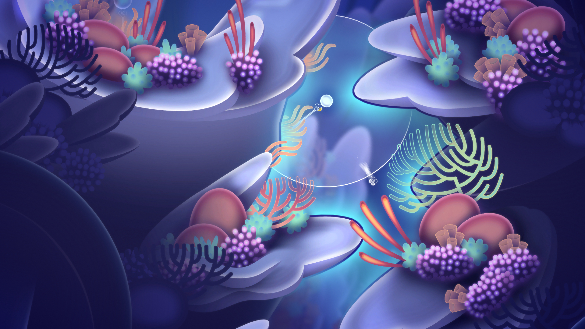
Onde, which means “wave” in French, is a very abstract affair that immerses you in a surreal, living world and manages to tell a story without ever really delivering any plot. You awaken as a small, seemingly ethereal being, freshly hatched off the limb of a great tree that’s standing in the darkness. You’re a conceptual creature that resembles four overlapping concentric circles with jelly-fish-like tentacles that trail behind you as you move. You’re brought to life by four smaller creatures that swoop around and seem to want to lead you somewhere; eventually they latch onto you -each one settling inside a different circle of your ‘body’- and then your journey begins.
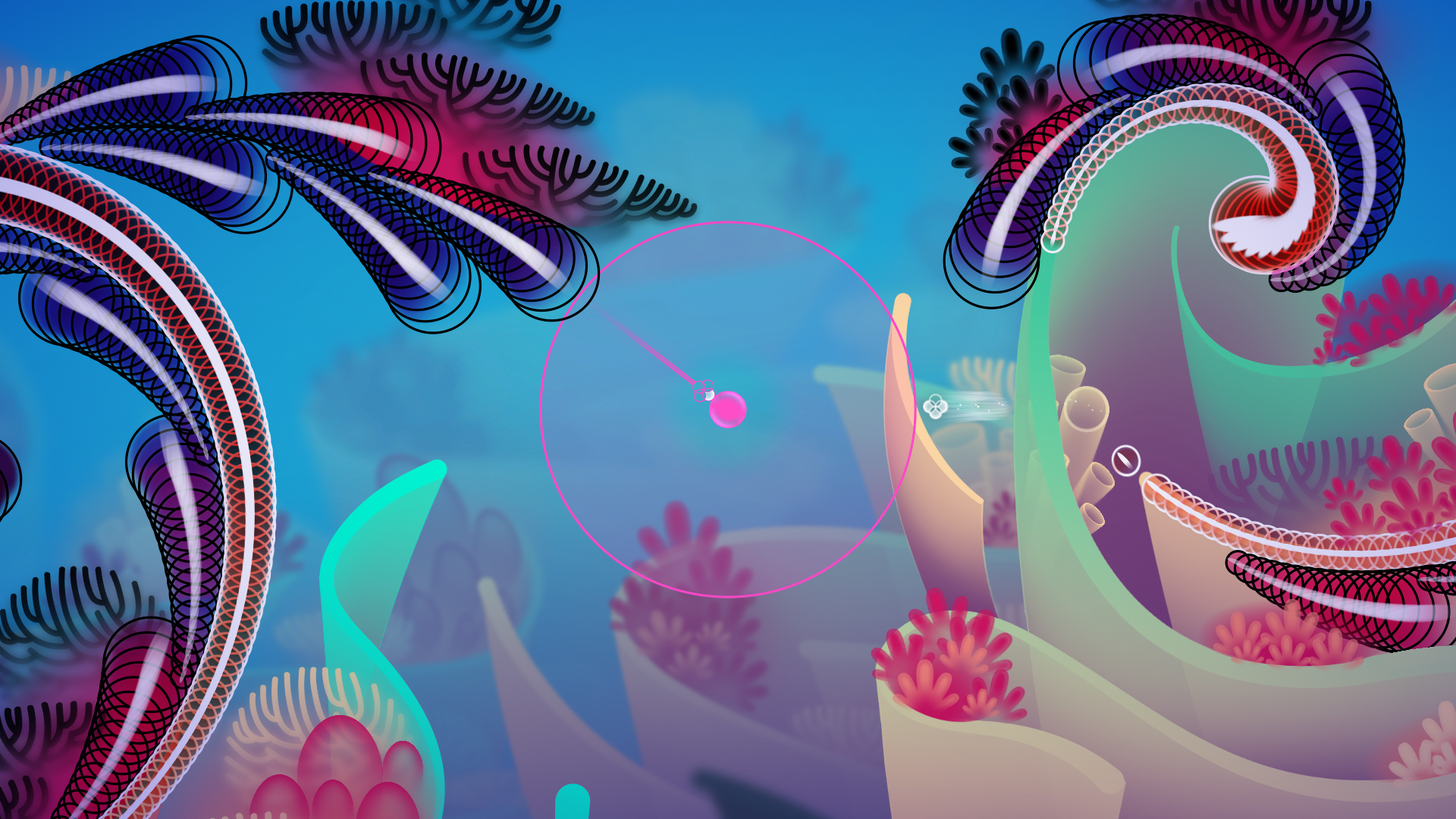
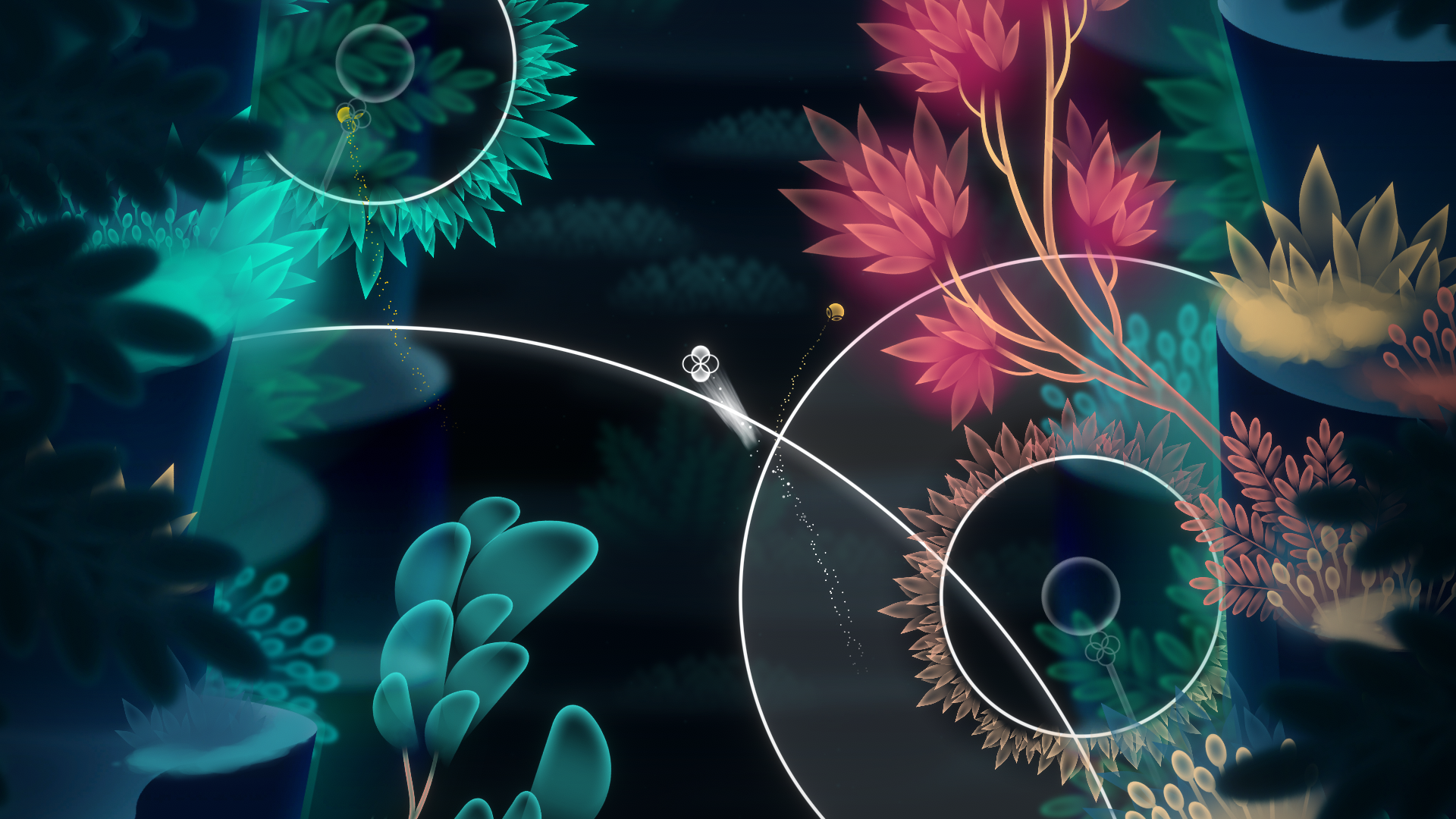
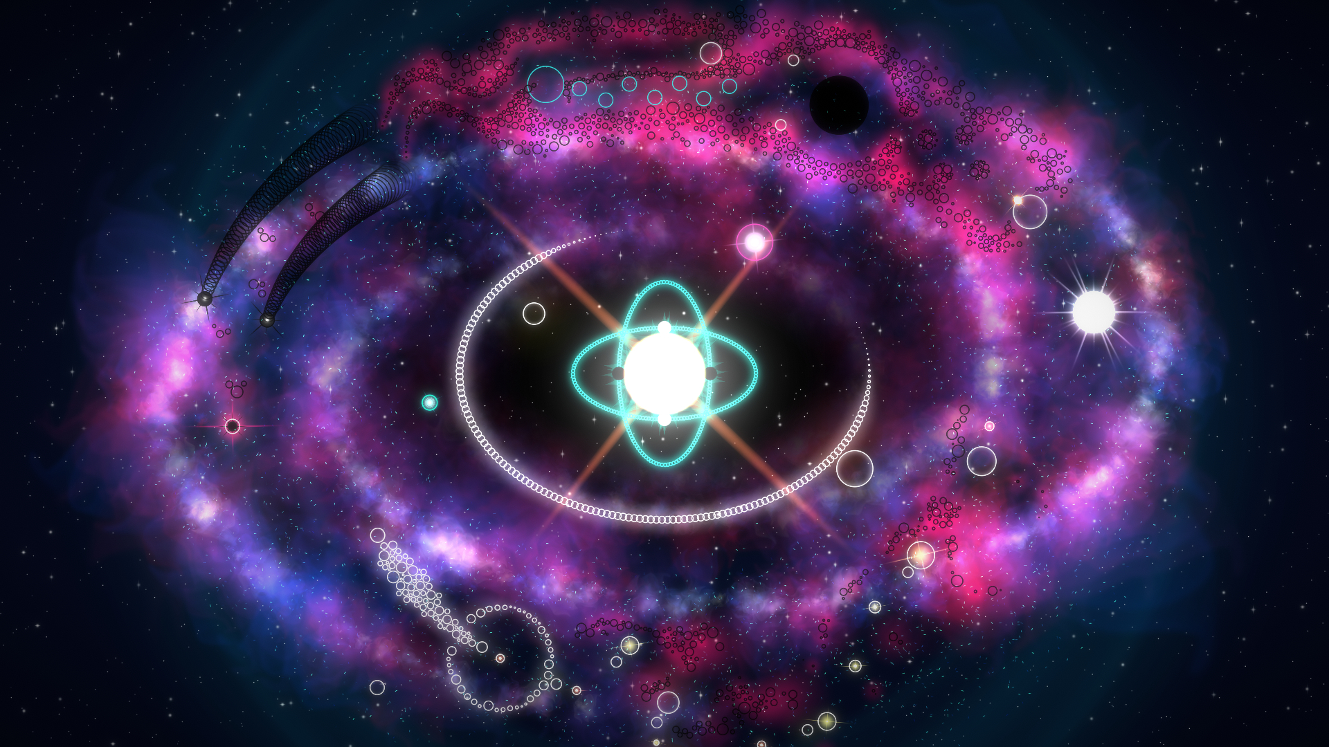
It’s not long before you’re introduced to the game’s core gameplay mechanic, which is that you must ride on waves of sound to navigate the strange and shifting landscapes. The small jellyfish-like creatures that awakened you can detach themselves from your body and latch on to small stalks dotted around the environment; by pushing the corresponding button on your controller, you can then ‘ring’ them like a bell, causing a soundwave to ripple out and carry you out with it. Each soundwave has a limited lifespan, so you need to glide around its edge and settle on another surface before it peters out and leaves you stranded in no man’s land.

While traversing the world sounds simple enough, there are some nuances that mean you need to use your head when surfing from one ring to the next. There are waves of differing colours, and each one behaves in a different way and offers alternative ways to get around. The white waves are the most common and allow you to simply ride them as they radiate outwards until they disappear. Turquoise waves stop expanding when you touch them, allowing you to navigate along their circumference at your own pace before latching onto any other waves that cross your path. And finally there’s the pink waves; these pull you back into their source and can even be used to catapult you through space, assuming you have the required accuracy.
As you’re unable to survive without the energy of a wave to sustain you, drifting through open space for more than a few seconds causes you to dissipate and respawn on the surface of the stable point that you touched. This means that you need to plan your moves carefully to ensure you always have a wave to latch on to, requiring good spatial awareness and timing, lest you miss your destination and respawn a few tricky minutes back. WIth such a sedate pace to the gameplay, this replaying chunks of traversal because of a single mistimed button press was annoying, and stood out as my lone complaint about Onde from a gameplay perspective.

The soundwaves that you create actually make up part of the game’s music, which stands out as fantastic from start to finish. Onde delivers a soothing synth score that radiates with serenity, twinkles with otherworldly mystery and, at times, trembles with dark threats. Your journey through the surreal netherscapes is reflected by (or driven by – it’s hard to tell), the musical score much more explicitly than in other games. Playing through Onde reminded me of watching Disney’s Fantasia for the first time – the visuals are the music and the sounds are the images – they’re so tightly interwoven that they become completely synonymous. The soundtrack acts as an underpinning piece of the environmental storytelling in Onde, and the entire premise would be a complete flop without such evocative and mesmerising music to accompany what you see on the screen.
And make no mistake, what you see on the screen is equally as impressive as the sounds that narrate the game. The world of Onde is delivered in bright, impressive colours and is burgeoning with ethereal imagery that is thought-provoking throughout. From your inception among the branches of an enormous tree, you’ll drift your way through a series of unique locales that flow beautifully into one another. You’ll explore crystalline rock formations and glacial caves, deep underwater recesses and even the vast reaches of space on your way ‘home’. Sometimes psychedelic and vibrant, sometimes stark and foreboding, Onde’s visuals take you on an exuberant odyssey that borders on the spiritual.

As such, it’s not always clear what you need to do in Onde, but drifting through the ether and looking for your next destination is part of what makes the experience so enjoyable. There’s a whimsical sense of exploration running through the game, punctuated with moments of enigma that require some lateral thinking to overcome. Whether it’s riding alternating waves to zig-zag to your way to your destination, or combining frozen and expanding rings to reach your goal, there’s moments of puzzling that are definitely entertaining in their own right. Such is the simplicity of the mechanics, it would be hard to call the hands-on gameplay of Onde compelling, but as I explained at the start of the review, I wouldn’t describe this as a game in the traditional sense, and Onde certainly asks enough of the player to keep you engaged with the premise all the way through.
Some of my favourite moments are the escape scenes, where otherworldly enemies reach out to ensnare you – the screen becomes filled with angry red tones and inky black shadows, and the music takes on the up tempo intensity of pursuit. It’s in such stark contrast to the rest of the zen-like experience that it makes an incredible impression as you hastily navigate your way out of harms way.
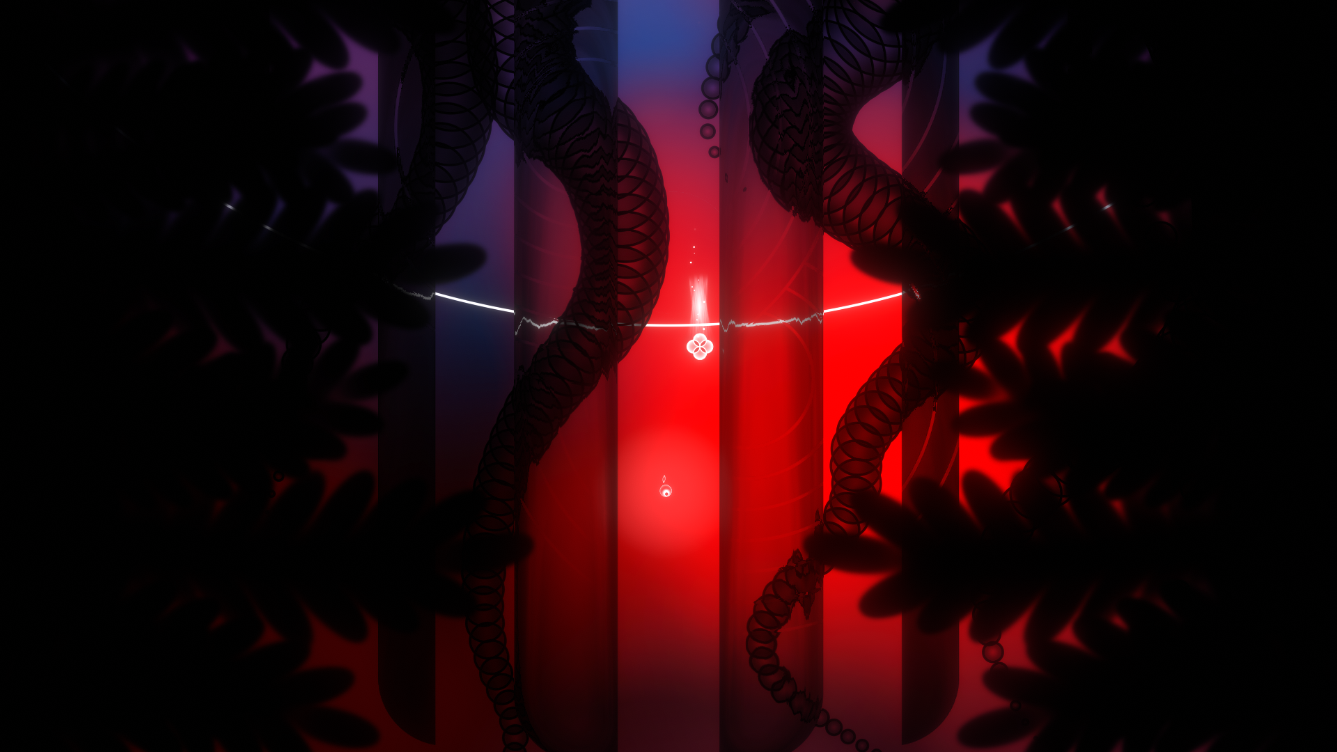
Sadly, my effusive praise of Onde comes with the slight asterisk that this won’t be a game that appeals to everyone. From conception to completion, Onde is an artistic endeavour that relies on the player making an emotional connection to the visual and aural themes, and I dare say that there’s a lot of more practical folk who just won’t ‘get it’. I offer this opinion in no way to detract from the game, but to offer fair warning to players who might be expecting a more ‘gameplay oriented’ experience filled with tricky platform/puzzling.
A charming experience from start to finish, Onde is an odyssey through the abstract mysteries of the world that’s described with evocative imagery and thought-provoking music. The score and visuals beautifully align to tell a story without a single word being uttered, and it’s a credit to the developers at how immersive the experience is. The artistic nature of the game and its limited gameplay mechanics will not appeal to everyone, but that’s okay. I may not know art, but I know what I like, and I certainly liked Onde.


In the interest of full disclosure, VGamingNews was provided with a copy of the game in order to conduct this review.
Impious Pumpkins
“Now this is where it’s going to get a little bit gory, ok?”
Gordon Ramsay’s Pumpkin Soup with Wild Mushrooms
Impious Pumpkins by Note Missing Games bills itself as a ‘Real Time Tactics Game’ which I found to be closest to meaning that it’s a tower defence game. I have a soft spot for tower defence games. In the time before mobile phones the only good games you could regularly play at high school were the ones on sites like Newgrounds. Tower defence was a very popular genre amongst people who should have actually been studying.
At A Glance
| Scores | |
| Visuals | 5 /10 |
| Sound | 5 /10 |
| Gameplay | 4 /10 |
| Overall | 4 /10 |
| Positives | + Cute characters + Easy to learn + Consistent theme |
| Negatives | – Lacks strategy – Poorly balanced – Quickly becomes an idle clicker |
| Price (When Reviewed) | £3.99 |
| Our Playtime | 3 hours |
| Available On | PC |
Impious Pumpkins shares a lot of DNA with it’s tower defence cousins. As a disembodied commander you place your army of ghosts to protect their grave sites from oncoming hordes of enemy pumpkins. It’s a short run at a tried and tested genre but unfortunately doesn’t bring anything new to the table. Using your resources, which are dripped to you slowly, the player gradually places more units and upgrades them as the enemy waves get stronger. Unfortunately it’s the ways in which Impious Pumpkins shirks the usual mechanics which let the game down. I don’t want to slate a dev for trying something new but what Note Missing Games have tried just doesn’t land.
Your first experience with Impious Pumpkins will be with the campaign mode which is broken up into 5 minute rounds. To beat a round the player needs to have more of their ghost units on the map than enemy pumpkins when the timer reaches zero. Those not so pious pumpkins spawn in random locations across the map in greater numbers as time ticks away. They will attack any ghosts they find so removing them rapidly is the core pressure point on the player to avoid a snowballing fail-state.
The camera viewpoint is isometric, overlooking a single square of terrain which will be the battlefield for the coming round. At the start of a round, the map is empty apart from some cover elements and the player starts with a few points to spend on their initial spooky defenders. More resources are dropped randomly on the map as time passes; little glowing orbs to be clicked similar to Plants Vs. Zombies sun motes. Once placed, your units act automatically and cannot be moved or interacted with, and you have four types of ghost to choose from; Warriors, Rangers, Mages and Priests. Warriors are the only ghosts that can move, they can aggro onto enemy pumpkins and move into melee range to smack them upside the head. Rangers are static, shooting rocks at long range. Similar to Rangers, the Mages cost a lot more resources but their attack ignores line of sight and does high damage in an area of effect. The last ghost type is the Priest and you may only have one active at a time; it heals all other ghosts simultaneously in a wide area around it. The pumpkin enemies all spawn following the same class-type rules with the exception of the occasionally spawning mini-boss pumpkins; these have considerably more health and an elemental theme, adding some additional hazards such as spitting poison patches onto the map which can upset your own ghost formations.
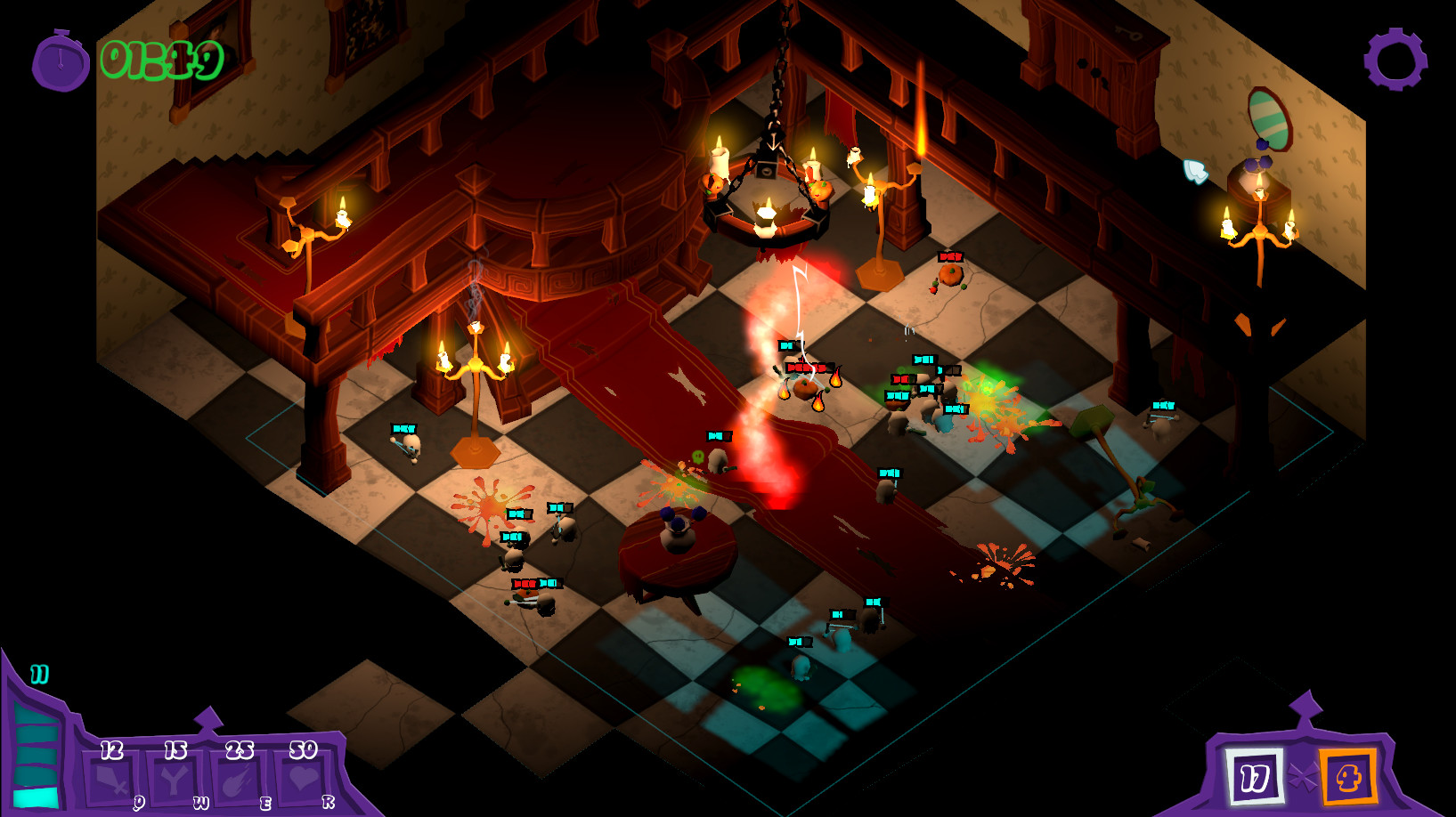
Sounds familiar? The format is a well trodden one. Different units, with point costs tied to their power level. Where Impious Pumpkins mainly comes unstuck is that there isn’t much to think about tactically. One utility unit is thrown in to get the player to think they’re being clever when they decide to cluster all their units together around the healer. A realisation which ultimately becomes pointless as the poor mechanics and balancing make trying to play tactically a useless endeavour. There are several things wrong with the power balancing and implementation of mechanics in Impious Pumpkins that lets the experience down. For example, that ‘crowd around the healer’ tactic you’re guided towards is a recipe for frustration. This means that using the warrior ghosts is inefficient as they’ll wander outside the healing range then stand still and die. Additionally some of the mini-boss pumpkins, which spawn in random locations, can often appear in the middle of your cluster of ghosts and then pop like an un-telegraphed and uncounterable tactical nuke, wiping your squad and forcing a reset. This random chance to instantly lose without making a mistake or even making a real choice is incredibly sloppy design for a tactical game.
The win state for each round completely undermines resource management or ideas around synergy with units. You win by having the most units on the map, so placing lots of ghosts is the obvious way to play. To explain why this is a problem I need to explain the upgrade system. There are 5 distinct maps which the player will battle over in several 5 minute rounds. After each round the player is awarded with an upgrade point, then after beating the final round of a given map a few extra points are awarded. You can use these upgrade points on a tech tree, one branch for each of the ghost types. Several upgrades lower the resource cost for that specific unit. Making an already cheap unit cost even less. In a puzzle where maintaining a critical mass of units is the win state, units which you can spam out faster than your opponent can kill them is utterly game breaking.
Sadly, the problems with the upgrade system don’t stop there. Even more choices are functionally taken away from you simply because they don’t gel properly with the core mechanics of the game. Being given ‘good’ options and useless options isn’t a choice, it’s railroading. You won’t get enough points in the campaign to grab all of the upgrades so it’s best to focus on one type. Since you’re only able to place one healer, that branch is useless to you, similarly the mages cost too many resources to be useful. Between those two problems, half of the entire tech tree is meaningless, forcing the player to choose between a strategy that makes the game trivially easy or practically unwinnable. The best choice is to pick one of the cheaper units, either the ranger or the warrior and spam it for 5 minutes while you click on glowing orbs. I elected to use rangers which are cheap enough with upgrades that even when placed randomly all over the map can quickly lead to a runaway win with the map filled with ghosts able to instantly alpha strike any pumpkins that spawn, preventing them from doing any meaningful damage. That’s the rub, I was able to beat the game by clicking around randomly for 5 minutes at a time which is a fairly unforgivable flaw for anything calling itself a tactical game.
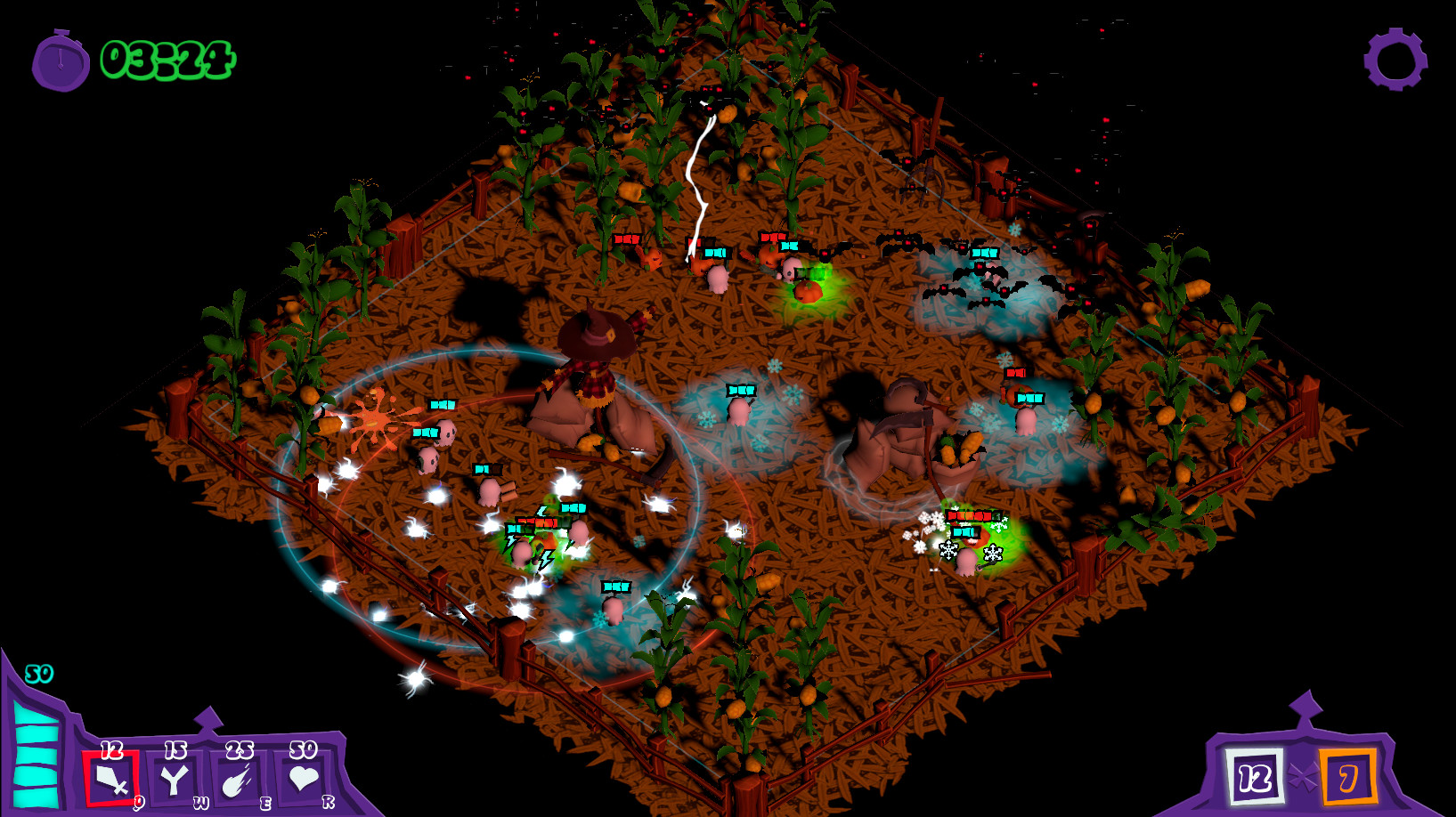
A tactical puzzle that’s sorely missing from Impious Pumpkins is the ‘Defence’ element of a tower defence game. (I know it was me who decided it’s in the tower defence genre but Note Missing Games say on the Steam page that the ghostly army is ‘defending their resting place’), so I think it’s a fair jump to make. There aren’t any game elements to defend. If you decide to place no units then the enemy pumpkins will continue to spawn for the duration of the 5 minute round, slowly filling up the map, attacking nothing. You would lose because there are more pumpkins on the map than your zero ghosts and not because of some tangible failed objective. There isn’t really a tension point with any meaning on the game board itself. The story that your ghostly units are defending their gravesites is mostly in service to the Halloween theme the devs have adopted for the world. This spooky theme is consistant throughout; the little ghost and pumpkin minions are cute and Missing Note Games have done a good job with the art style, music and sound effects,making each map feel like a tiny bottled world with a cartoony battle taking place rather than the pumpkin genocide that it becomes. Keeping it light and breezy helped me ignore the game’s flaws for long enough to beat the campaign and save the ghosts from having to put up with having healthy foods like vegetables or fruits (whatever pumpkins are) in their immediate vicinity, an ideology I can sympathise with.
If Impious Pumpkins was a mobile game that you could poke at for 5 minutes while you’re waiting for a bus then it would be a nice little distraction. At the time of writing however it’s a Steam only release and I can’t recommend it as anything more than an excuse to turn off your brain for a few hours.
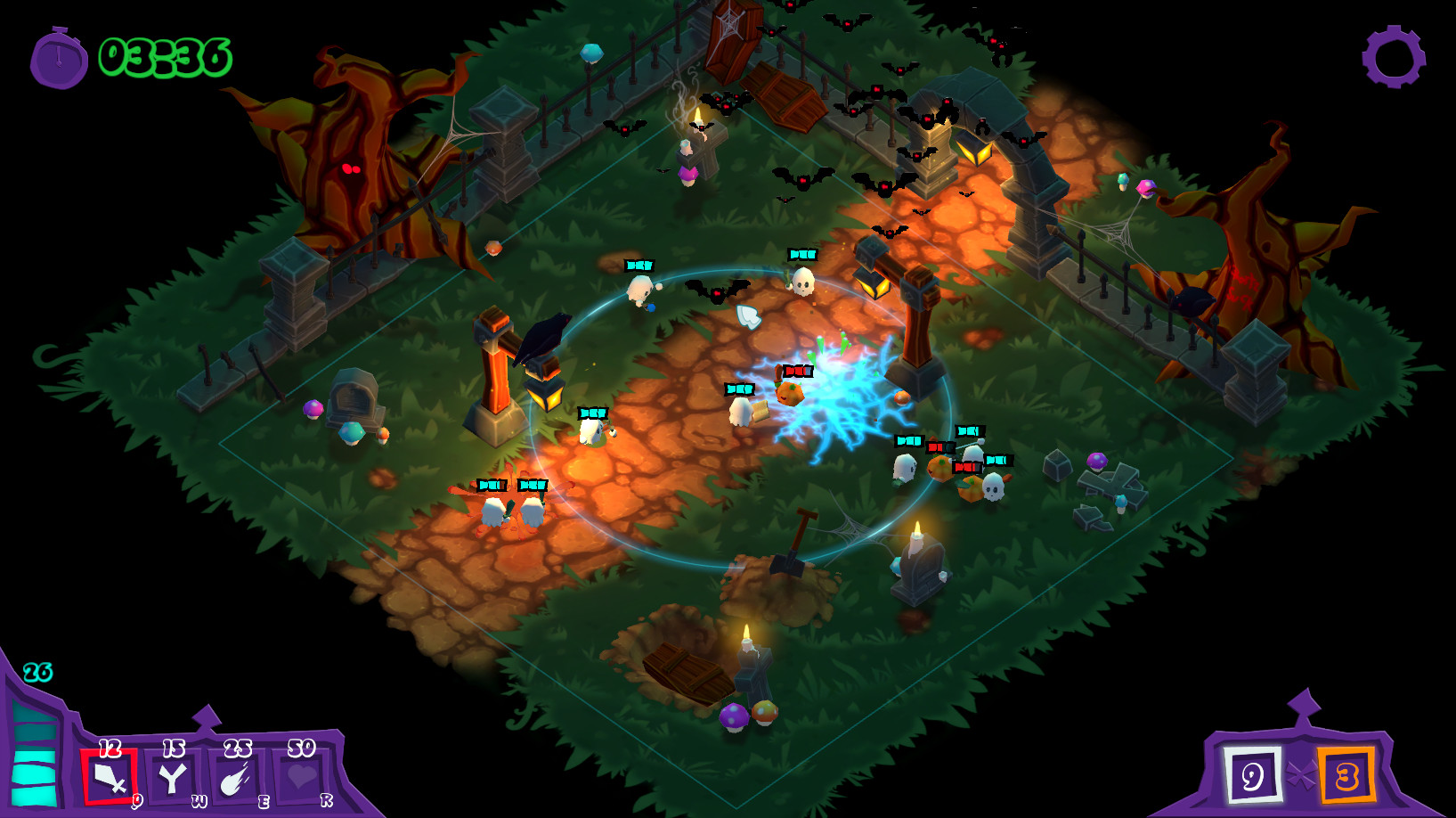
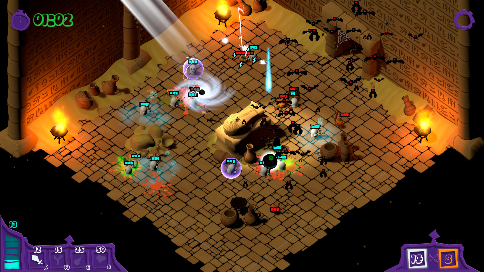

In the interest of full disclosure, the publisher provided VGamingNews with a copy of the game in order to conduct this review.


